The network for creativity
Join 1.25M professional creatives like you
Connect with clients, get discovered, and run your business 100% commission-free
Creatives on Contra have earned over $150M and we are just getting started
Back to feedPost
I redesigned Leifheit's product page. Then built it in Instant (link in comments).
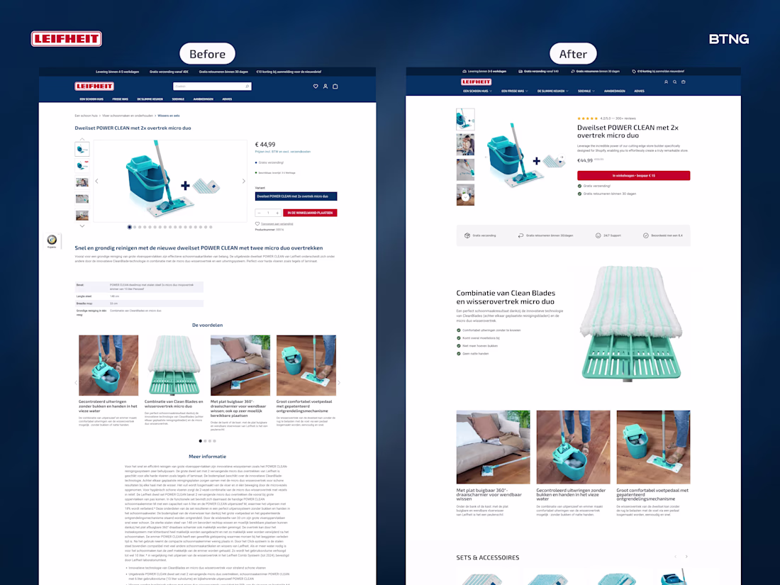
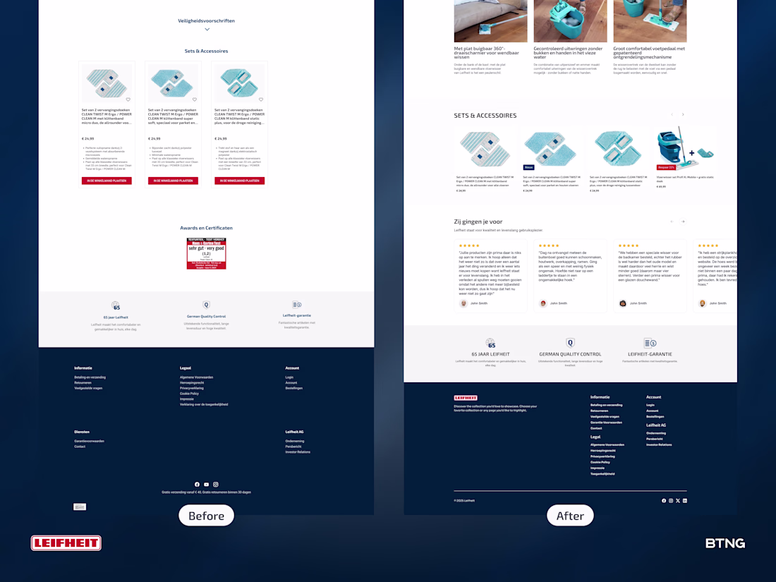
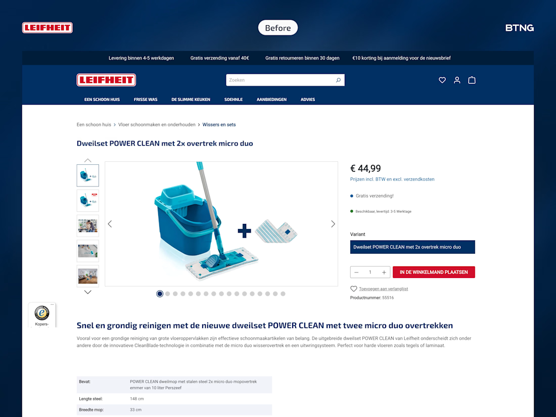
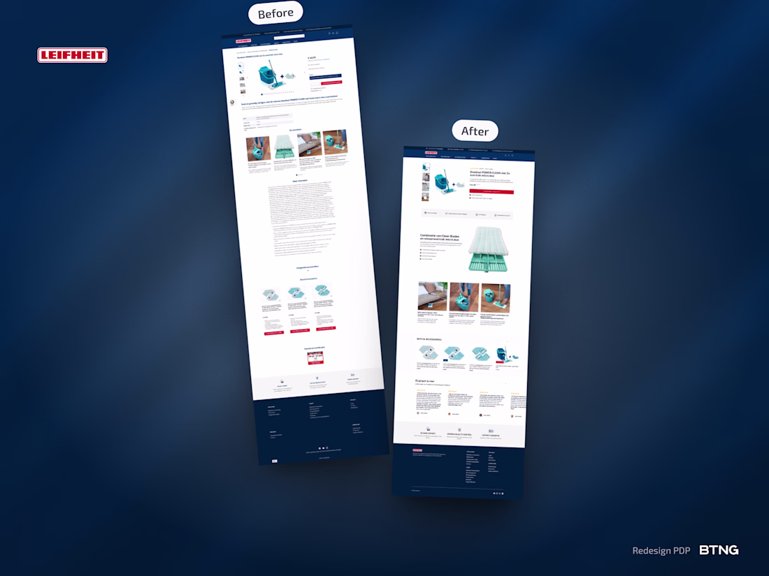
Most product pages scatter info everywhere. Title here. Price there. Reviews floating.
What changed:
Product title was above the gallery. Everything felt disconnected.
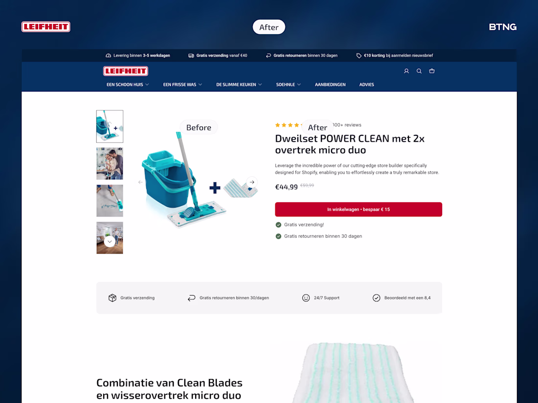
I grouped critical info on the right. Title, reviews, price, add to cart, USPs. One clear block.
Specs are boring for a mop. Nobody cares about dimensions first.
Started with USP bar. Big zoom showing fibers and tech. Three benefit sections showing it in use.
Not what it is. What it does.
Result? Cleaner experience. (No pun intended.)
Scattered to structured. Specs to benefits. Product page to sales page.
What's one thing you'd test first on your product pages?
A side-by-side Top & Bottom view.

You can check out the Instant PDP inside this Shopify store:
In more detail: The Before & After.
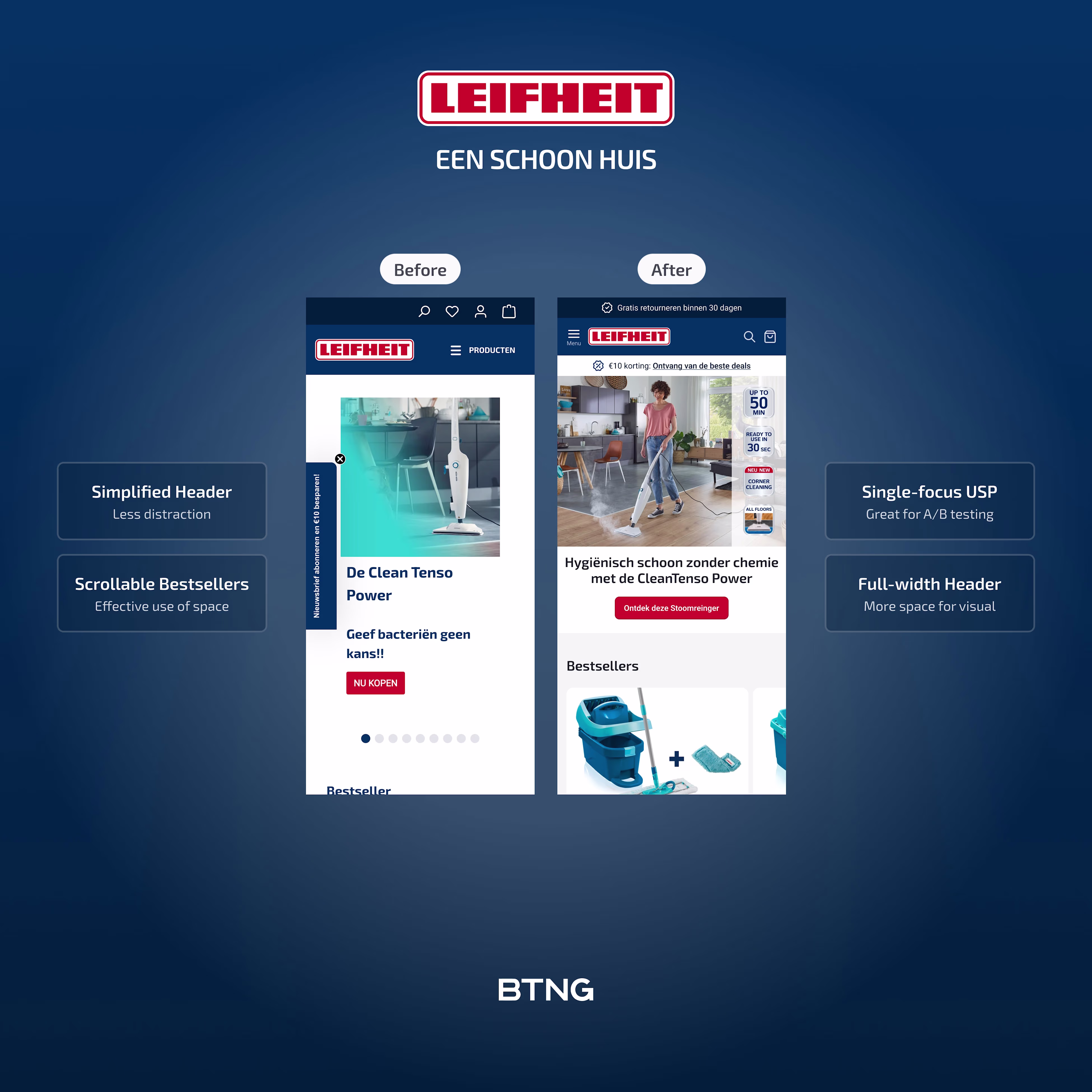
A fullpage comparison and a small retouch for the homepage on Mobile.
The network for creativity
Join 1.25M professional creatives like you
Connect with clients, get discovered, and run your business 100% commission-free
Creatives on Contra have earned over $150M and we are just getting started
Trending
Claude
Claude has entered the design space. How are you using Claude Design?
Contra University
Learn from expert creatives how to earn more using next-gen AI tools.
MagicPath
The canvas is infinite, and exploration is becoming the workflow. How are you using MagicPath?
creativeaiflow
Creative AI workflows are evolving. What tools do you use, and what are their strengths and weaknesses?
freelancerlife
Freelancer life is wins, pivots, and everything in between. What’s yours right now?