The network for creativity
Join 1.25M professional creatives like you
Connect with clients, get discovered, and run your business 100% commission-free
Creatives on Contra have earned over $150M and we are just getting started
Back to feedPost

Yobel Client Portal — B2B Operations & Logistics Dashboard
A client portal isn't corporate eye candy; it’s where Yobel's clients go to manage stock, check invoices, track KPIs, and fix issues. If the interface gets in the way, operations stall. Running parallel to the regional site project, we redesigned this portal from the ground up to align the experience with the new rebranding and bring order to data visualization.
- The Challenge (1-month sprint)
1-month timeline: 4 weeks to conduct a UX audit, restructure the information architecture, define UI components, and align everything with the new visual identity.
Zero operational friction: Move away from cluttered tables and heavy interfaces toward clean data visualization (bar, line, and pie charts) that lets users grasp inventory status in under 3 seconds.
B2B consistency: Adapt Yobel's new branding without sacrificing legibility, visual hierarchy, or critical information density.
- My Role (What was built)
UX/UI Designer
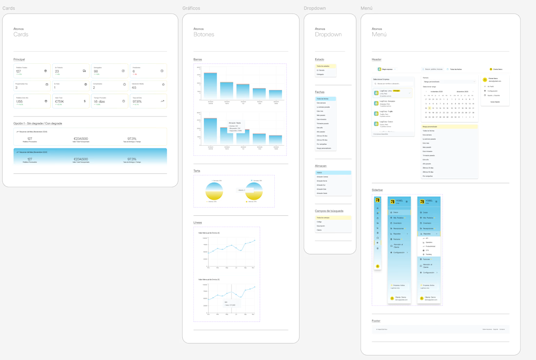
Atomic Design System: Created the component library (Design System / UI Kit) from scratch: buttons, dropdowns, menus, search filters, company selectors, and chart components.
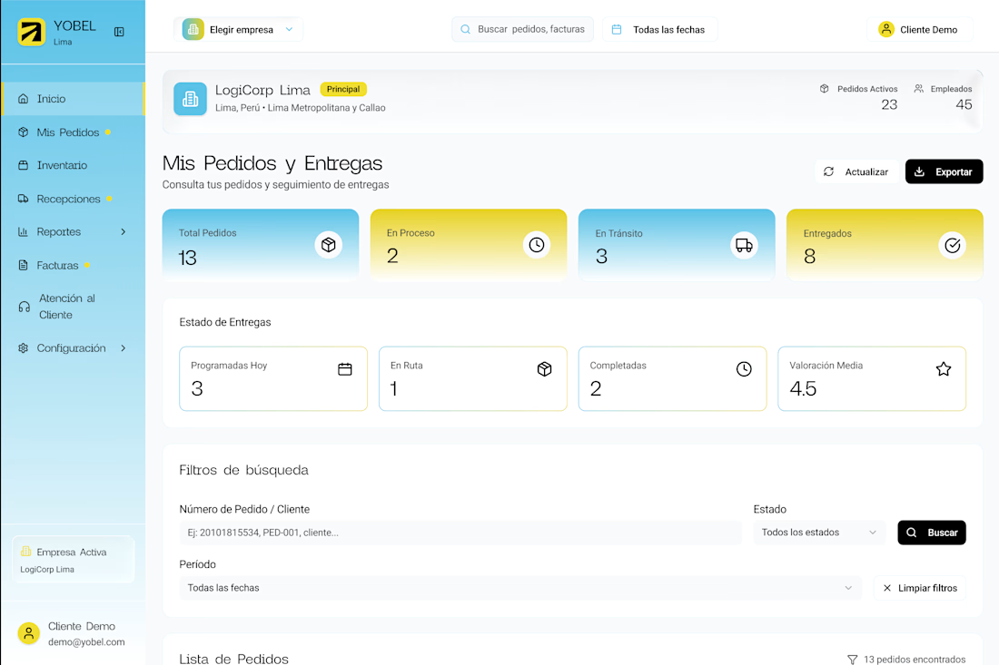
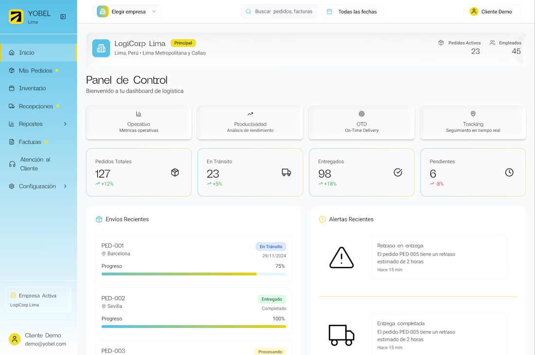
UX/UI Architecture: Redesigned the main dashboard, collapsible sidebar, top navigation, and filter structures for complex searches by warehouse, date, and document type.
Data Visualization: Designed visual components for stock reports, active orders, and invoicing.
- The Solution (No-BS Design)
Atomic organization: Built a scalable component system (atoms, molecules, and patterns) so developers didn't have to guess margins or colors.
Fluid navigation: Clean sidebar menu with clear states, contextual location switching (LogiCorp Lima, Arequipa, Trujillo, etc.), and quick date-range pickers.
High-density dashboard without the clutter: Unified top filters, key metrics on the right, and clean charts at the center. Fewer clicks, zero distractions.
- The Result (Shipped on time, no excuses)
A modern, intuitive B2B portal aligned with the global rebranding, delivered in exactly 1 month. An interface built for users who need immediate data, not pretty screens that waste their time.

The network for creativity
Join 1.25M professional creatives like you
Connect with clients, get discovered, and run your business 100% commission-free
Creatives on Contra have earned over $150M and we are just getting started








Related posts


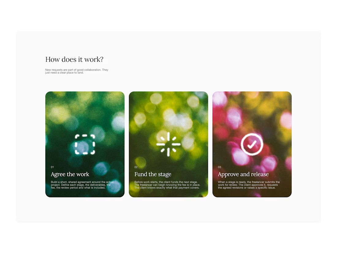

Your web sections always have such strong art direction. Great to see the brand carried right into the layout.


Hiring: UX / Product Designer (remote, ongoing)
I run Novatur Design, a product design studio based in Malta. We work with startups through to enterprise clients such as The Daily Mail, across a range of industries from EV to Crypto, Fintech to IoT.
I’m looking for an all-round UX / product designer who can take a problem from user flows through to polished hi-fi UI. Figma, auto layout and design systems should be second nature.
This is ongoing contractor work on a monthly basis, not a one-off project. If it works well on both sides, there’s potential for it to go full time.
Remote, so you don’t need to be in Malta. Individual designers only, no agencies please.
If you’re interested, the application takes about 6 minutes:
https://tally.so/r/yXZ2dB
Ralph

Love the variety of industries you work with. Sounds like an amazing opportunity for the right designer.
I created a brand identity concept for Velora, an AI productivity platform. I explored the logo, colors, typography, and how the brand could look across a website, mobile app, and everyday products. I wanted everything to feel consistent, modern, and easy to recognize.

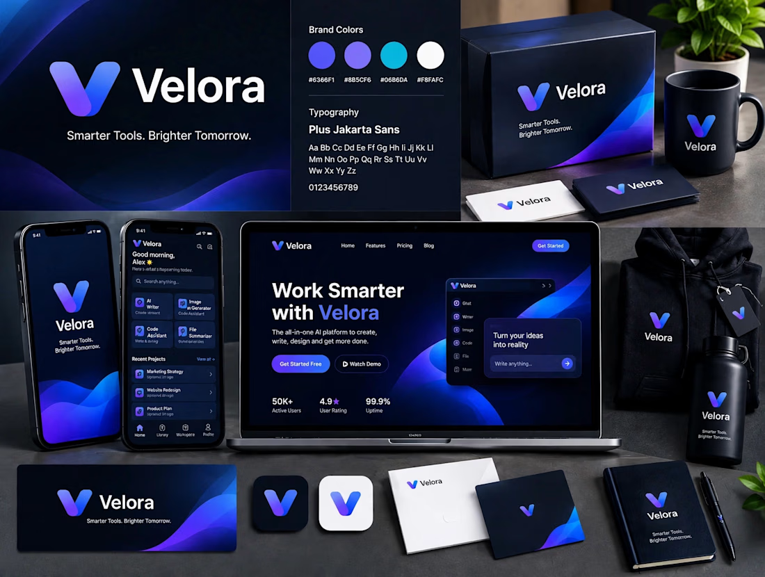

The blue is perfect for this. I’ve seen so many AI brands do boring black/white but this gradient gives it energy. And Plus Jakarta Sans was a great choice, keeps it friendly.