The network for creativity
Join 1.25M professional creatives like you
Connect with clients, get discovered, and run your business 100% commission-free
Creatives on Contra have earned over $150M and we are just getting started
Back to feedPost

I wrote this beginner-friendly guide to explain candlestick patterns and how they can help traders understand price movements.
The article breaks down a technical stock-market concept into simple, easy-to-follow language while using an SEO-focused structure to make the content useful for search and readers.
This project showcases my experience in financial content writing, SEO writing, and explaining complex investing concepts in a simple way.



The network for creativity
Join 1.25M professional creatives like you
Connect with clients, get discovered, and run your business 100% commission-free
Creatives on Contra have earned over $150M and we are just getting started



Related posts

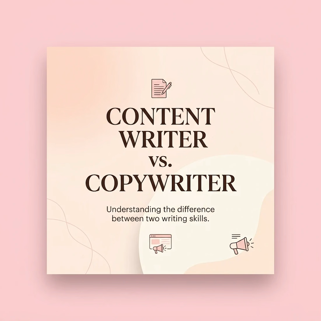
Content Writer vs. Copywriter: What's the Difference?
People often use these two terms interchangeably, but they serve different purposes.
Both involve writing, but the goal behind the writing is different.
1. Content Writer ✍️
A content writer creates useful and informative content to educate readers, answer questions and build trust.
Examples:
Blog posts and articles
Website guides
Educational social media posts
Informative newsletters
Main goal: Give readers valuable information.
2. Copywriter 📝
A copywriter writes words that encourage people to take action. That action could be buying a product, signing up for a service or contacting a business.
Examples:
Product descriptions
Website sales pages
Advertising captions
Email marketing campaigns
Promotional content
Main goal: Encourage readers to take action.
Let's understand with one example.
Imagine a skincare brand launching a new moisturiser.
A content writer might write:
"5 Benefits of Using a Moisturiser Every Day"
A copywriter might write:
"Give Your Skin the Care It Deserves. Try Our New Moisturiser Today!"
See the difference?
One focuses on informing the audience, while the other focuses on encouraging a decision.
Can someone do both?
Absolutely!
Businesses need both types of writing. Content helps people understand a brand, while copy helps turn interest into action.
The takeaway: Good content builds trust. Good copy encourages action. And both can help a business grow.



The dark brown serif title on the peach card with a pink frame is easy to read, and the two small icons set up the comparison well. Do the next slides show the two example texts side by side?

Paid social graphics that grab attention fast.
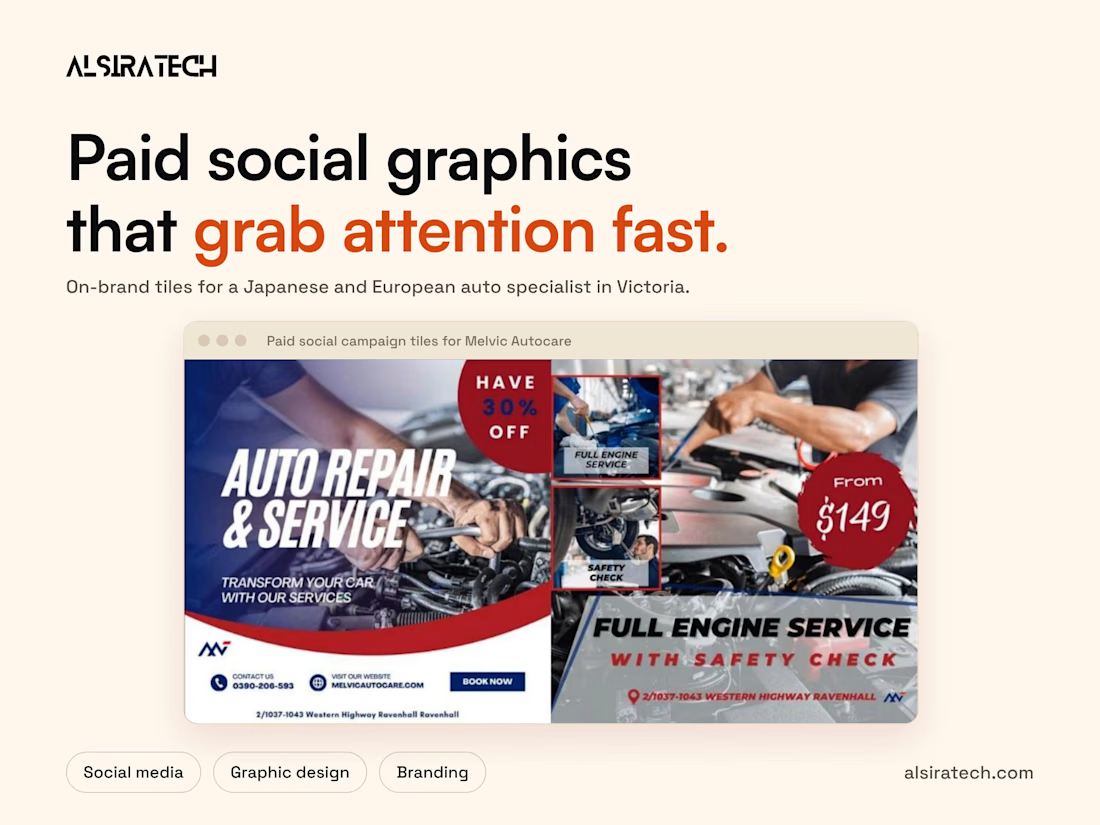
We designed a set of graphics for the paid social campaigns of Melvic Autocare, a Japanese and European auto specialist in Ravenhall, Victoria. They needed eye-catching tiles that stay true to their signature red and blue gradient brand style.
What we designed
1. A series of tiles for paid social campaigns that are visually striking and on-brand
2. Clear promotion of their most in-demand services, from Full Engine Service to Aircon Recharge and Re-gas ahead of summer
3. Designs built around their reputation as a Japanese and European auto specialist
4. A spotlight on their 30% promotional offer, with strong visuals and a clear call to action
5. One red and blue gradient style across every tile, so the set feels modern and consistent
The result is a set of modern, on-brand designs built to grab attention quickly online and show off the quality of their services.
The full case study is on our profile.
What makes someone stop scrolling when they see your ad?
For me it's a clear price in a bold badge plus one offer line. Your $149 badge on the engine service tile does that well, and the red and blue gradient keeps the whole set consistent.

Meet Goldhour ☀️, a Framer template for fintech & savings apps.
Warm, editorial, and built to feel calm with money: interactive savings simulator, emergency fund sizer, CMS blog, scroll-driven storytelling.
Live preview → goldhour.framer.website
