The network for creativity
Join 1.25M professional creatives like you
Connect with clients, get discovered, and run your business 100% commission-free
Creatives on Contra have earned over $150M and we are just getting started
Back to feedPost


The network for creativity
Join 1.25M professional creatives like you
Connect with clients, get discovered, and run your business 100% commission-free
Creatives on Contra have earned over $150M and we are just getting started

Challenges
View all


Related posts

Just came across this website and really liked the way they’ve combined clean design with immersive interactions.
The smooth animations, typography, transitions, and product storytelling make the whole experience feel premium without being overwhelming.
Website: otsuka-air.jp
What stood out to me:
• Smooth and thoughtful interactions
• Clean visual hierarchy
• Strong product storytelling
• Minimal yet engaging UI
• Great use of motion throughout the experience
Would love to know what you guys think about this design approach.
What’s your favorite detail on this site? 👀


Amazing!


workout tracker app


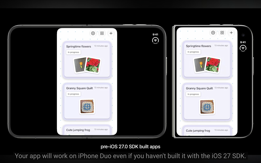
The iPhone Duo launch is the fastest way to spot which apps are actually maintained.
Hardware shifts are the ultimate filter for premium brands, if they don't adjust for the Duo format asap, they're telling their Duo users they just dont care.
I'm taking on 2 more projects this month, if you have an app that needs help with adjusting for Duo, send me a DM.