The network for creativity
Join 1.25M professional creatives like you
Connect with clients, get discovered, and run your business 100% commission-free
Creatives on Contra have earned over $150M and we are just getting started
Back to feedPost

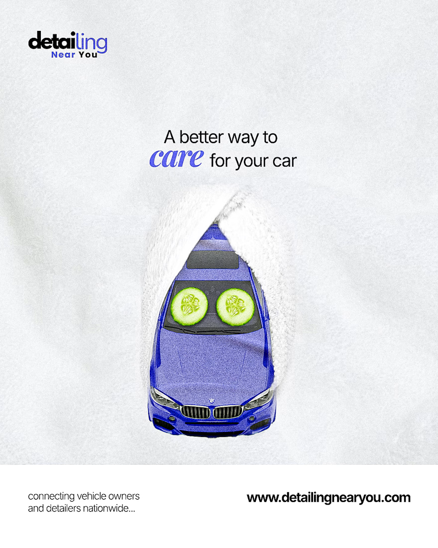
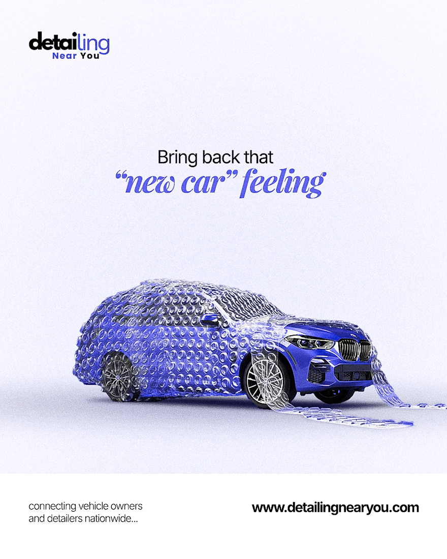
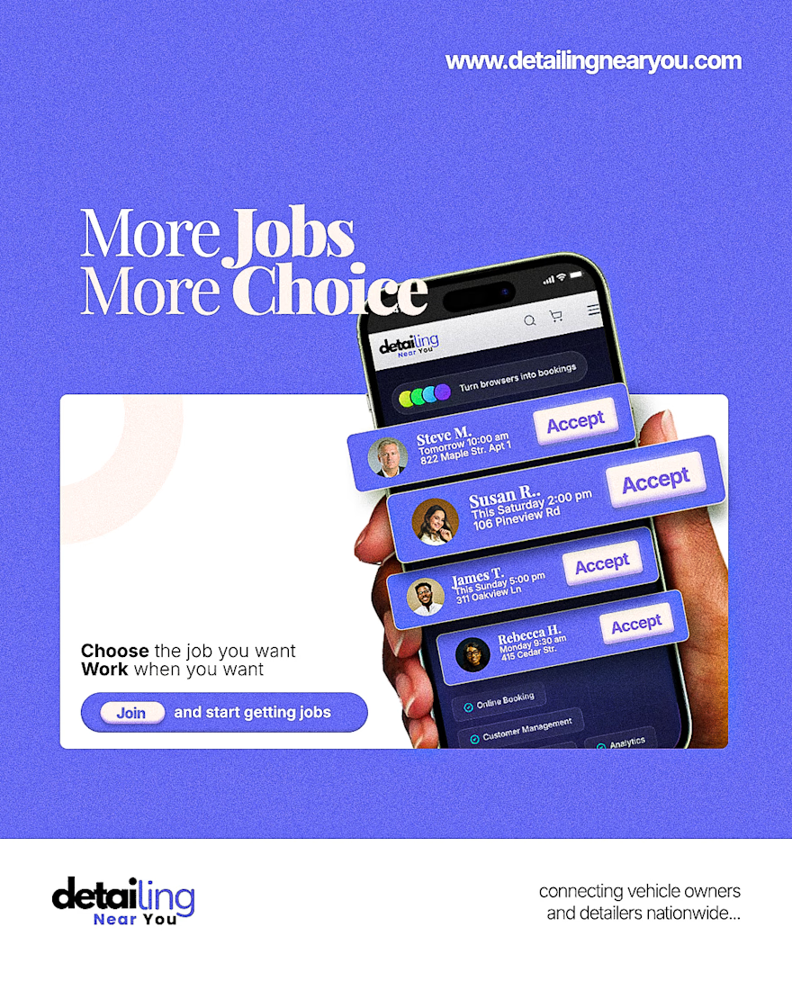
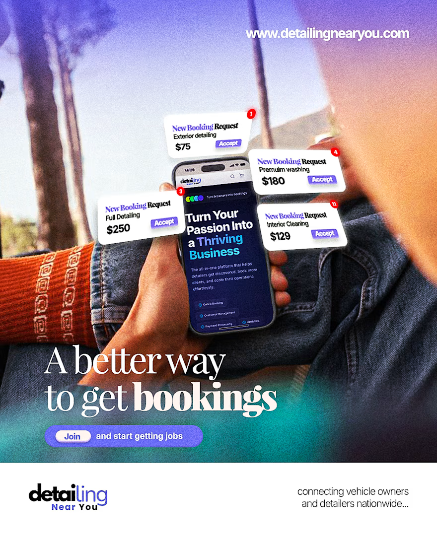
Creative AD campaign for Detailing Near You
Detailing Near You is a detailing and car servicing brand in the US that specializes in special care and treatment of cars.
They also provide a platform where fellow detailers can get jobs easily and give them that liberty to choose from a plethora of options
For Detailing Near You, the challenge was simple: create a campaign that speaks to two completely different audiences: vehicle owners seeking premium care and professional detailers looking for consistent, flexible work.
The solution was a series of concept-driven advertisements built around emotion, aspiration, and opportunity.
Different Audiences, Different Conversations
Rather than relying on generic promotional messaging, each ad was built around a relatable human insight, transforming services into stories people instantly connect with.


The network for creativity
Join 1.25M professional creatives like you
Connect with clients, get discovered, and run your business 100% commission-free
Creatives on Contra have earned over $150M and we are just getting started






Related posts

Refreshing my portfolio and revisiting one of my favorite projects from 2025 🧡💙
Bilsoft has made accounting software for over 20 years, and 100,000+ businesses use it every day. When we started, the trust was there, but the brand had grown piece by piece until it looked like several different companies.
The tricky part was a tension most fintech brands face. The software has to feel precise and serious, but the people using it are small business owners who just want things to be simple. So I drew the wordmark on a strict grid and softened every corner. The name does the rest: “Bil” means knowing, “Soft” means steady. Then I built it into a system the team could use without a designer in the room.
While putting the case study together, I added something new: a motion piece where the logo builds itself letter by letter.
Curious how others here handle this: when a client’s product is serious but their users want simple, which way do you lean? 👇
Full case study on my Contra profile.


Niiiiice 🔥


What if digital payments had a visual identity that felt as seamless as the experience itself?
Meet FluxPay a fintech brand identity concept built around trust, speed, and simplicity. From logo design to typography and brand applications, every detail is designed to make the brand stand out.
#BrandIdentity #FintechBranding #VisualIdentity #BrandDesign #Contra


That's amazing Fintech brand visual identity logo design typography that great 🔥🔥🔥

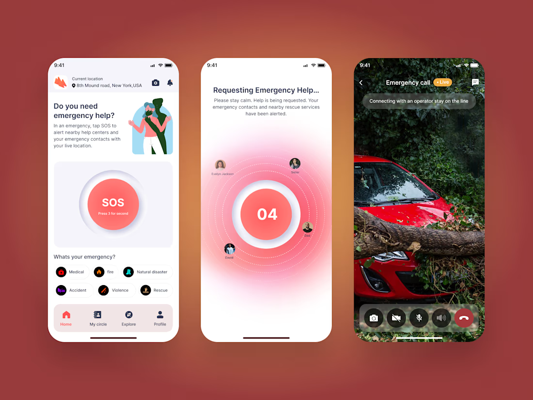
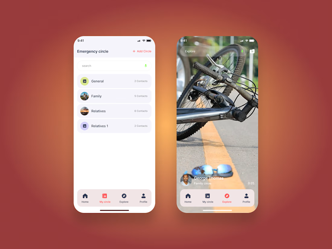
Emergency SOS App | Mobile UI/UX Design
A modern emergency assistance mobile app designed to help users quickly access emergency support and stay connected with their trusted contacts.
The experience includes emergency circles, SOS activation, emergency categories, location-based assistance, live emergency communication, and real-time support flows.
Designed in Figma with a focus on clear navigation, accessibility, and a calm interface for high-pressure situations.
Tool: Figma
Focus: Mobile UI/UX, Emergency App, Safety App, Interaction Design, Product Design

Great UI and UX design 🎉🎉