The network for creativity
Join 1.25M professional creatives like you
Connect with clients, get discovered, and run your business 100% commission-free
Creatives on Contra have earned over $150M and we are just getting started
Back to feedPost

Anyone can be visible. Few are memorable.
Designers who stand out have a recognizable style.
Tech brands people remember solve problems clearly.
Media houses with strong branding are trusted sources.
Startups that win stay top-of-mind.
Branding is what makes people remember you tomorrow.


The network for creativity
Join 1.25M professional creatives like you
Connect with clients, get discovered, and run your business 100% commission-free
Creatives on Contra have earned over $150M and we are just getting started


Related posts


The little green dot moving through the grid is so satisfying

Hey Everyone! I've been a little quiet on here lately, but I'm finally back with lots of amazing branding and packaging design case studies which I was working behind the scenes.
Keep an eye out for lots of verified case studies coming your way. 👀
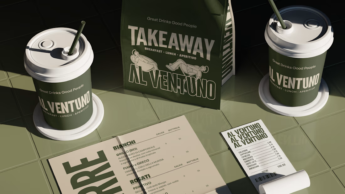
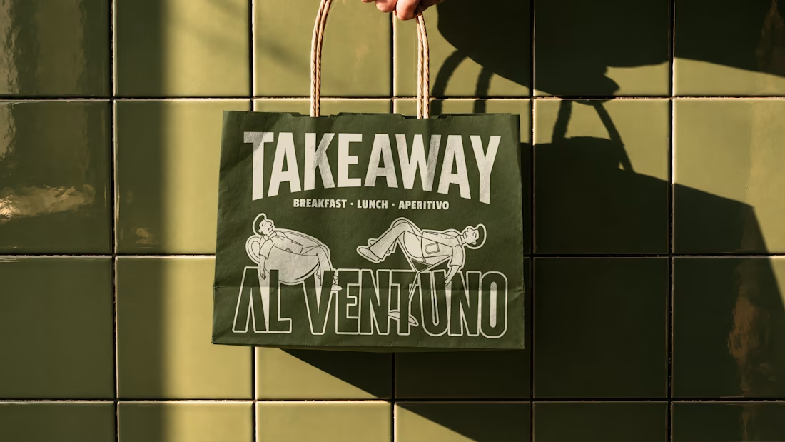
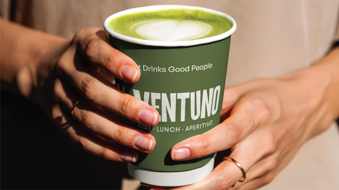
For now, here’s a little peek at some of the work I’ve created lately for a contemporary Italian cafe in Lecce.

Love it! Great work!

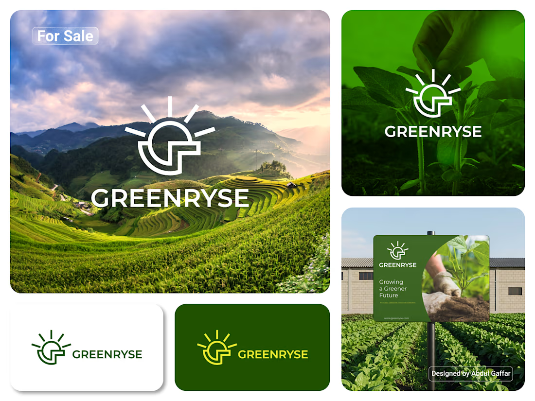
GREENRYSE – G Lettermark, Sun Logo Design, Sustainable Agriculture.
Introducing GREENRYSE, a modern logo concept inspired by nature, agriculture, and the power of growth. The symbol combines a geometric letter G with a rising sun, representing new beginnings, natural energy, and a brighter future for agriculture.
The presentation explores how the logo works across different backgrounds and applications, including agricultural landscapes, product imagery, and outdoor signage. Its clean geometric structure and fresh green color direction create a natural yet professional look.
Designed for agricultural companies, organic farming businesses, crop production, sustainable agriculture, and modern agritech ventures.


Stunning!