The network for creativity
Join 1.25M professional creatives like you
Connect with clients, get discovered, and run your business 100% commission-free
Creatives on Contra have earned over $150M and we are just getting started
Back to feedPost

For GlowHaus Studio, an Atlanta beauty studio, I designed the feel first and the screens second. The brief I gave myself: quiet luxury, like walking into a calm room with warm light.
The palette is a warm cream background with one deep terracotta for buttons and accents. I used nothing else, so the page stays restful and the booking button is always obvious. Headlines are in a high contrast serif, with one italic phrase in the hero (“Tailored for You”) for a handwritten touch. Body text stays in a clean sans, and the small tracked uppercase labels give it the feel of a printed menu. Cards are flat with thin borders instead of shadows, and the photography is soft and sunlit so the site looks like the studio itself.
The booking flow is four steps, one decision per screen. Each service shows its price, duration and exactly what’s included, so there are no surprises later.
The owner suite uses the same cream and terracotta but is quieter: a “Good morning” greeting, today’s appointments, pending requests to approve or decline, and the next 48 hours. It’s meant to be glanced at all day, not admired.
Built with React.js, Tailwind CSS and Lovable.dev.


The network for creativity
Join 1.25M professional creatives like you
Connect with clients, get discovered, and run your business 100% commission-free
Creatives on Contra have earned over $150M and we are just getting started



Related posts

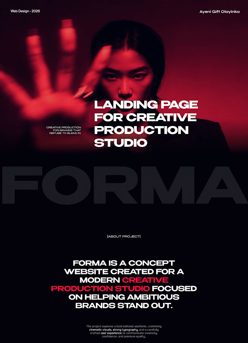
FORMA | Creative Studio Website Design
A bold, cinematic website concept for a modern creative production studio.
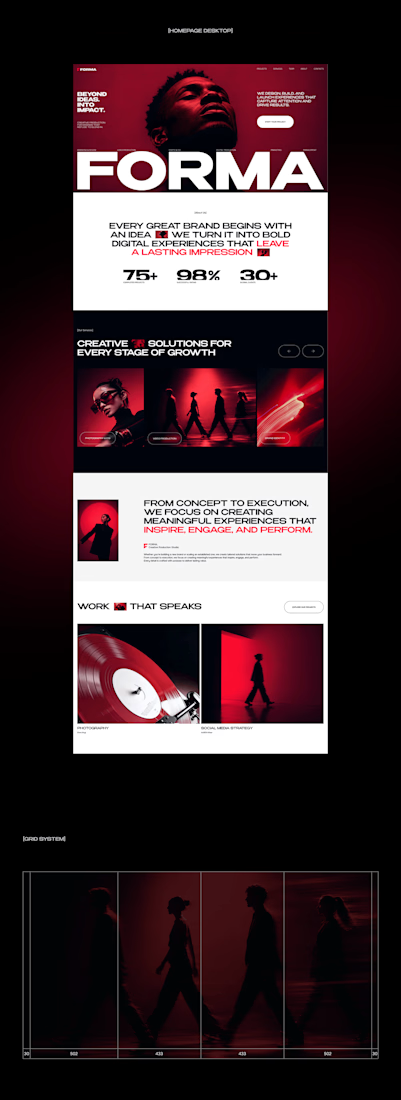
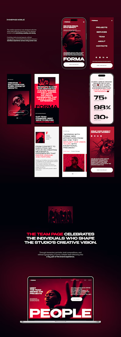
FORMA is a concept website that shows how strategy, design, and digital production come together in one immersive brand experience. The design is built on three things:
Editorial layouts that give the content room to breathe and set a confident, magazine-style rhythm
Cinematic red-lit photography that gives the brand a dramatic, memorable visual identity
Expressive typography that carries the studio’s voice and guides the eye through each section
The goal was a site that feels like the studio’s work: striking, intentional, and made to leave an impression.
My role: UI/UX Design, Visual Direction, Landing Page Design
Tools: [Figma / Photoshop / etc.]
#CreativeAgencyWebsite #CreativeStudio #LandingPage #WebDesign #WebsiteDesign #UIUX #UIDesign #EditorialDesign



Cool direction for the studio.


Selected work, 2026
Five recent sites, in one place:
→ Verq: a motion-led studio website (Next.js, GSAP, Strapi)
→ CloudEVA: an AI SaaS site, concept to launch in 3 weeks
→ OneLenz: a static design turned into a custom WordPress theme
→ Rapyder: technical SEO across 200+ pages, site health 42% → 95%
→ Point Tintz: a booking-ready Wix site for a studio in Colorado
The case studies are on my profile, under Work.
#WebDesign #SaaSWebsite #Portfolio #NextJS #WordPress

Great range of work here.

Brand identity for an ongoing project
A look at the visual direction, from the logo and color palette to typography and brand applications.
More to come as the project takes shape.

Great work