The network for creativity
Join 1.25M professional creatives like you
Connect with clients, get discovered, and run your business 100% commission-free
Creatives on Contra have earned over $150M and we are just getting started
Back to feedPost


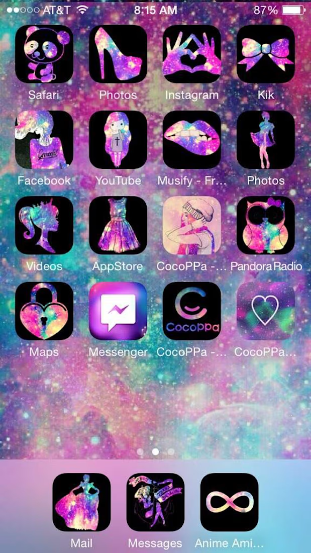
In 2016, a wallpaper wasn't enough. To get that "Tumblr Hippie" look, we used CocoPpa to overhaul everything. 🌸
Before widgets were "official," we used clunky hacks to replace icons with kawaii pastels and glitter. It wasn't about speed; it was a digital scrapbook, a unique extension of who we were.
Today, we have Liquid Glass. It’s polished, frosted, and fast, but often feels uniform. As tactile textures trend again, it's clear: we’re craving that "bubbly" personality once more.
Like if you spent hours on CocoPpa! 🙋♀️
¿ Are you Team DIY Nostalgia or Team Liquid Glass?? Let’s discuss below! 👇

The network for creativity
Join 1.25M professional creatives like you
Connect with clients, get discovered, and run your business 100% commission-free
Creatives on Contra have earned over $150M and we are just getting started

Challenges
View all


Related posts

A little visual experiment inspired by the nostalgia of Hindi film posters -mixing typography, texture, colour, and a few of my favourite things. 🎧✨

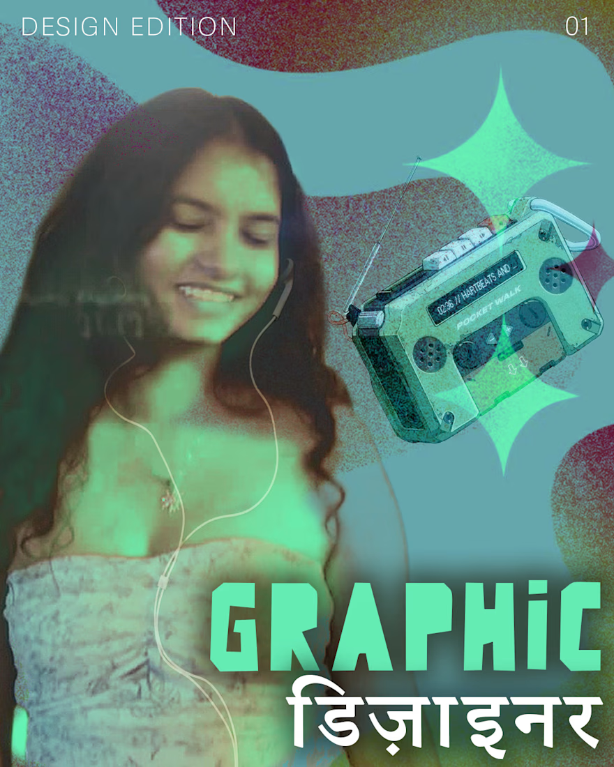

Setting डिज़ाइनर at the same weight as the Latin is what keeps it reading as one masthead instead of a translation parked underneath. The hand-painted posters this nods to had to carry across a street at night, which is where those brutal colour separations came from — are you...

A quick taste test.
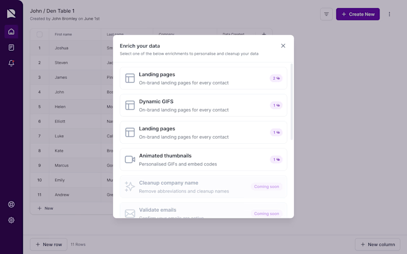
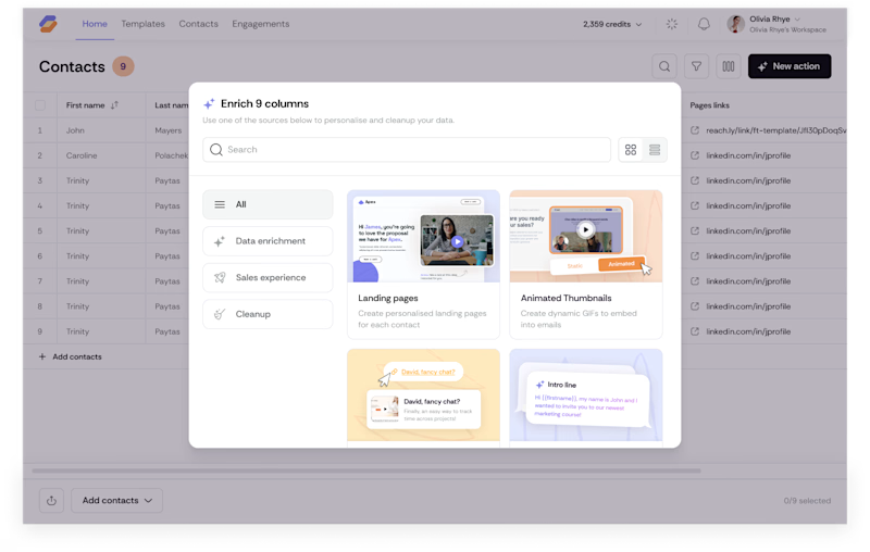
I rebuilt this enrichment picker to scale from 6 flat rows to 40+ options without slowing anyone down spot what changed beyond the coat of paint. Icons replace credit counters so people scan by type, not by a number that means nothing until you click in. A search bar shows up because a list that works at nine choices breaks at forty. Tabs split by intent (Data enrichment, Sales experience, Cleanup) instead of dumping everything into one scroll, and the cards carry a visual preview instead of a text label, so you know what you're picking before you commit credits to it.
Nothing here is decoration. Every pixel is doing a job.
What's the first difference you caught?
9 votes
Ends in 1d

The intent-based grouping is doing a lot of work hereespecially the visual preview before committing credits. That’s a thoughtful way to make a dense enrichment flow feel scannable.

I love it