The network for creativity
Join 1.25M professional creatives like you
Connect with clients, get discovered, and run your business 100% commission-free
Creatives on Contra have earned over $150M and we are just getting started
Back to feedPost
Mastering Fluid Mobile Breakpoints
📱 Mobile Optimization: Fluid Scaling for Luxury Consumers
Over 60% of high-net-worth
clients browse custom boutique travel offerings directly from mobile viewports.
If your mobile layout relies on basic auto-stacking, you are leaking valuable
client conversions.
The Optimization:
· Built Faro with completely fluid layout rules from desktop down to mobile
viewports.
· Engineered a lightweight, beautiful custom mobile overlay menu drawer.
· Fixed font line-heights and touch-target padding to prevent chaotic layer
clipping.
Need a pristine, high-converting
mobile presentation for your digital product? Test the responsive breakpoints
live below:
🔗 Framer Marketplace: https://www.framer.com/marketplace/templates/faro/
🌐 Live
Preview: https://farotravel.framer.website/


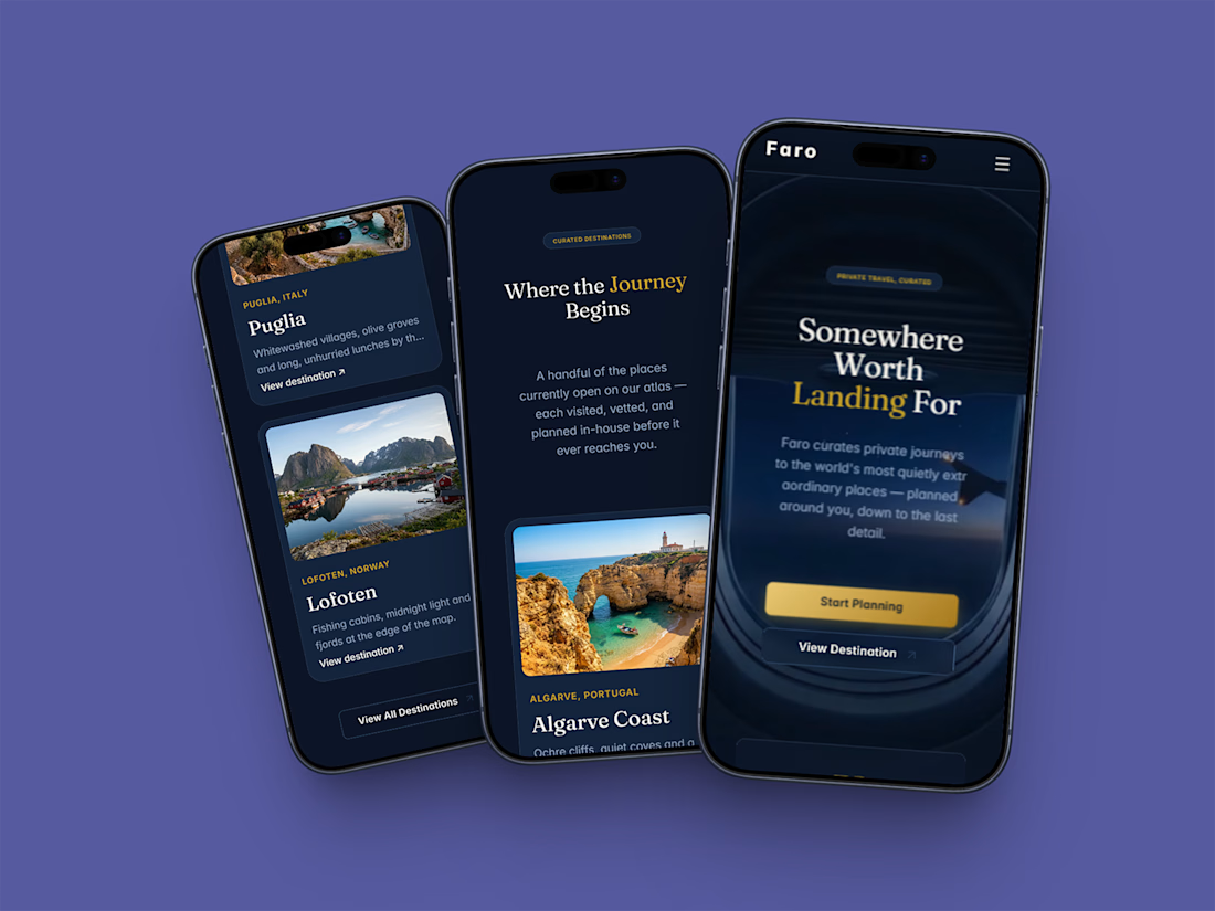


Thanks, Dev! Appreciate the kind words. Since so much premium travel traffic browses entirely on mobile viewports while on the go, I wanted the responsive mockup presentation to feel just as intentional as the desktop build. Stoked that the layout layout composition resonates! 📱🙌
The network for creativity
Join 1.25M professional creatives like you
Connect with clients, get discovered, and run your business 100% commission-free
Creatives on Contra have earned over $150M and we are just getting started



Related posts

Updated the Dreamy effect for Framer, now it’s faster, smoother and more flexible
Grab it here
Really like what I get. If you are web designer, or brand designer would love to hear your feedback

Nice update, Denis. Making it faster and smoother is what matters most when an effect like this ends up on real client sites.


The movement flow so naturally, it feels effortless to watch.


The little green dot moving through the grid is so satisfying