The network for creativity
Join 1.25M professional creatives like you
Connect with clients, get discovered, and run your business 100% commission-free
Creatives on Contra have earned over $150M and we are just getting started
Back to feedPost

A perfume visual built around golden-hour light.
ÉCLAT is a self-initiated key visual for the NeuroDNA portfolio, created with ChatGPT. A glass bottle, sunset reflections and flowing fabric set the mood in a coastal setting.
Shown here as a static advertising concept.
For a fragrance launch, would you keep this scenic setting or choose a simple studio background — and why?



I’d keep the scenic setting! The golden-hour light and coastal atmosphere give the fragrance a warm, luxurious feel.
The network for creativity
Join 1.25M professional creatives like you
Connect with clients, get discovered, and run your business 100% commission-free
Creatives on Contra have earned over $150M and we are just getting started




Related posts

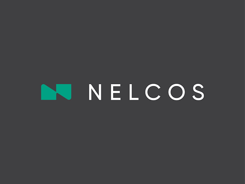
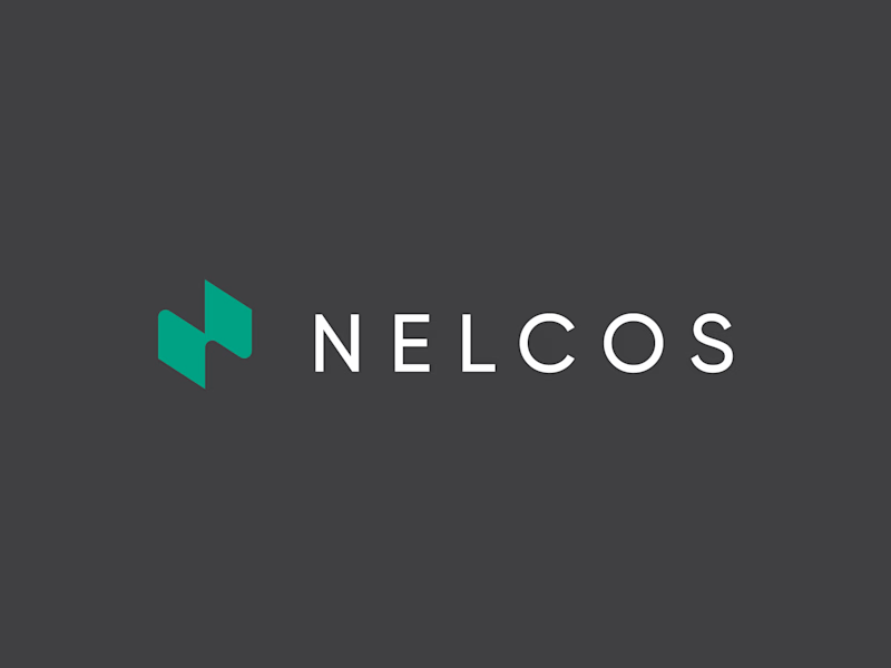
Which N works better? 🗳️
Worked on a logo for Nelcos, a Canadian company that refinishes interiors with architectural film instead of replacing them.
The idea: an unrolled roll of film that turns into the letter N.
The green is there to highlight eco-friendliness: less demolition, less waste.
Two directions for the symbol:
A: rectangular, compact
B: hexagonal, more dynamic
Vote and tell me why in the comments 👇
logodesignlogodesignerbrandidentityLogo DesignBrand DesignGraphic DesignAdobe IllustratorAdobe Photoshop


6 voted
43%
8 voted
57%
14 votes
Closed

Love the concept! The rectangular N feels more architectural and stable, which fits interiors. Hexagonal feels too techy. The unrolled film idea is brilliant - green for eco is perfect. I'd vote rectangular for this brand. Great work! 👏

⚽ ONE KICK. THREE BRANDS. ONE ANIMATION.
What if one animation could tell three completely different brand stories — without rebuilding it from scratch?
Introducing ONE KICK, my third entry for the SVGator Animation Template Challenge on Contra. 🚀
The idea was simple: Build once. Design to change.
I created a football-inspired animated template that transforms across three distinct brand identities while keeping the same core motion, timing, and animation structure.
🟠 FIZZA — Bright, playful, and full of personality.
🟢 STRYKA — Bold, energetic, and performance-driven.
🔵 MATCHDAY+ — Dynamic, modern, and built for matchday excitement.
What's behind the concept?
One reusable animation system featuring seven scenes, adaptable branding, customizable text, colors, logos, and visual assets — designed to make brand personalization faster and easier.
From the opening kick to the final branded call-to-action, the goal was to show that great motion design doesn't have to be created from zero every time.
Where it shines: Sports campaigns, promotional ads, social media content, product launches, and animated brand storytelling. The template is designed for creators who want polished motion while keeping the freedom to make it their own.
The challenge I set myself: Could one animation feel like it was custom-made for three completely different brands?
The showcase is my answer.
3 BRANDS. 1 TEMPLATE. 0 REDRAWS.
Built with SVGator. Designed for reuse. Made to work again.
Would love to hear which identity you think works best! 👀
@SVGatorApp #svgatorchallenge #SVGator #Contra #DesignChallenge


Brilliant concept! ⚽🔥 This is a great example of how reusable animation systems can save time while still giving each brand its own personality. The balance between consistency and customization is what makes this approach so powerful!

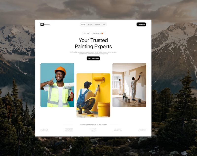
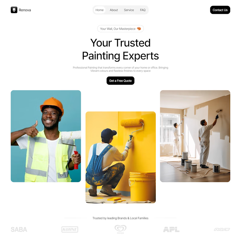
Work in Progress: Renova 🎨
Every great website starts with a strong first impression.
I'm currently designing the hero section for Renova, a painting service brand, with a focus on clean visual hierarchy, bold typography, balanced spacing, and imagery that communicates the brand's service at a glance.
The goal is simple: create a welcoming, professional experience that builds trust and encourages potential customers to take action.
This is still a work in progress, and I'm excited to keep refining the details as the design develops.
Looking for a UI/UX designer to bring your website idea to life?
I design thoughtful digital experiences for businesses that want to stand out, communicate clearly, and turn visitors into customers.
Let's work together.

0 voted
0%
1 voted
100%
1 vote
Closed
