The network for creativity
Join 1.25M professional creatives like you
Connect with clients, get discovered, and run your business 100% commission-free
Creatives on Contra have earned over $150M and we are just getting started
Back to feedPost
Taste Test
Just created a small logo animation in Rive. Made two versions: dark and light. Which one do you like better?

18 votes
Ends in 1d

Dark version for me


Good choice!


Hahah thank you!
Pssst… it has sound! 🤫

Voting light, it makes the logo mark itself pop more for me instead of getting absorbed into the background. Was the animation timing/easing identical between both versions, or did you tweak it separately for each palette?
Thank you! No, it is applied the same way.

Both 👍
Thank you!

omg! it's 50/50!

Both are good ❤️

Dark version

We need both of them! But I prefer Dark

Dark Version


I choose Dark Version

Nice work as usual! The dark version is incredibly clean would look so sharp sitting right in the sticky navigation header of a modern web layout.
The network for creativity
Join 1.25M professional creatives like you
Connect with clients, get discovered, and run your business 100% commission-free
Creatives on Contra have earned over $150M and we are just getting started
Related posts

This is our team submission (Me, Megg, and Anna) to the Rive x Contra Interactive Character Animation Challenge. It’s a tamagotchi inspired experience based off of Moomin, Megg’s american bully dog. Moomin isn’t my dog but I’ve played with him, hand fed him, and took turns in potty training him. And boy does potty training a puppy sure does take a lot of patience, and I mean a LOT. Moomin’s a good boy, sometimes a naughty boy, and sometimes a bad boy. I’m not a dog person and the experience has been a little bit frustrating (especially when Moomin refuses to listen 🙄), but also rewarding, and overall sparks joy. And that’s the goal of this Rive app, to share that whole experience with Moomin to anyone who plays around with the app. We tried to capture Moomin’s mannerisms when he eats, when you pat him, and he really does flop to the ground when he refuses to listen. We wanted to make the digital Moomin feel as alive as possible. And if we’ve done our jobs well, we hope you’ll be so engaged that you forget it’s an app, and feel like he’s a real digital pet.
I’m not sure if we can win the challenge because there are a lot of amazing entries (but hopefully we do, and Moomin gets a share, of course, if we win) but even if we don’t, if we’re able to make people playing with the app feel a spark of joy in a world that feels uncertain as ever, then I feel like we’ve already won.
Test it here: https://rive.app/s/CvJQJr-eGk6PN7W46_8-KA/embed?runtime=rive-renderer
We’ve made this specifically for the challenge, so we didn’t have the time to optimize for a mobile experience. This is only optimized for the desktop experience.
Hope you’ll enjoy the experience, and let me know what you think in the comments.


Really nice

Meet Cosmo, the AI mentor for the CodeSignal learning app and my entry for the Rive Character Challenge.
He celebrates your progress and gives feedback when your answer isn't quite right. Depending on the situation, he can be playful and funny, sad or disappointed, thoughtful, or full of energy.
Cosmo remains visible for most of the learning experience, either at the top or bottom of the screen, and constantly responds to user actions.
I created a system of expressions that can be mixed and matched with hand gestures to form many different combinations. This allows Cosmo to feel less predictable and react naturally to the user's actions in any situation.
To keep the runtime lightweight, I created different rigs for different poses and used the same facial animation library for all of them.
• 36 reusable facial expressions
• 10+ animated poses
• Reactions to user answers, learning progress, and achievements
• Mix-and-match facial expressions and gestures for more varied feedback
• Light and dark mode support with runtime colour switching
• UI animations
• Day Streak animation
Product: Cosmo: Learn GenAI & More
You can check out a sitting pose here: https://rive.app/s/MiVniVKA-0ODUjtcaOXRTA/?runtime=rive-renderer
This file includes 5 gestures (at the top) and a set of expressions.
Each gesture and expression has its own trigger.
To create a combination, choose an expression from the "Expression" list, then trigger a gesture. The default expression is "Correct_nod".
I hope you enjoy getting to know Cosmo as much as I enjoyed bringing him to life =)

Great

Two years ago, I started my very first personal branding project.
The idea was called City Compass a concept for my hometown, Veliko Tarnovo, one of Bulgaria's most historic cities.
The vision was bigger than just a logo. I wanted to create something that could help the city grow but I quickly realized the vision was much bigger than I was ready for at the time, so I left it for the future.
Looking back, I still love where it began.
Curious to know what you think.😊

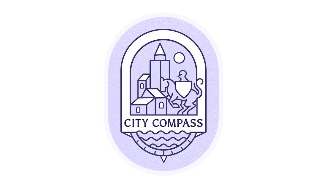

First, your city will be proud of you. You have successfully managed to combine many elements in 1 icon in the most elegant way ever. A castle, a knight on horseback, a compass, a river. Everything blends in harmony and composition! Only with 2 colors!!!








Trending

Claude
Claude has entered the design space. How are you using Claude Design?

Contra University
Learn from expert creatives how to earn more using next-gen AI tools.
fifaworldcup2026
The World Cup is here and the whole world's watching. How are you designing for the world stage?
creativeaiflow
Creative AI workflows are evolving. What tools do you use, and what are their strengths and weaknesses?
freelancerlife
Freelancer life is wins, pivots, and everything in between. What’s yours right now?