The network for creativity
Join 1.25M professional creatives like you
Connect with clients, get discovered, and run your business 100% commission-free
Creatives on Contra have earned over $150M and we are just getting started
Back to feedPost
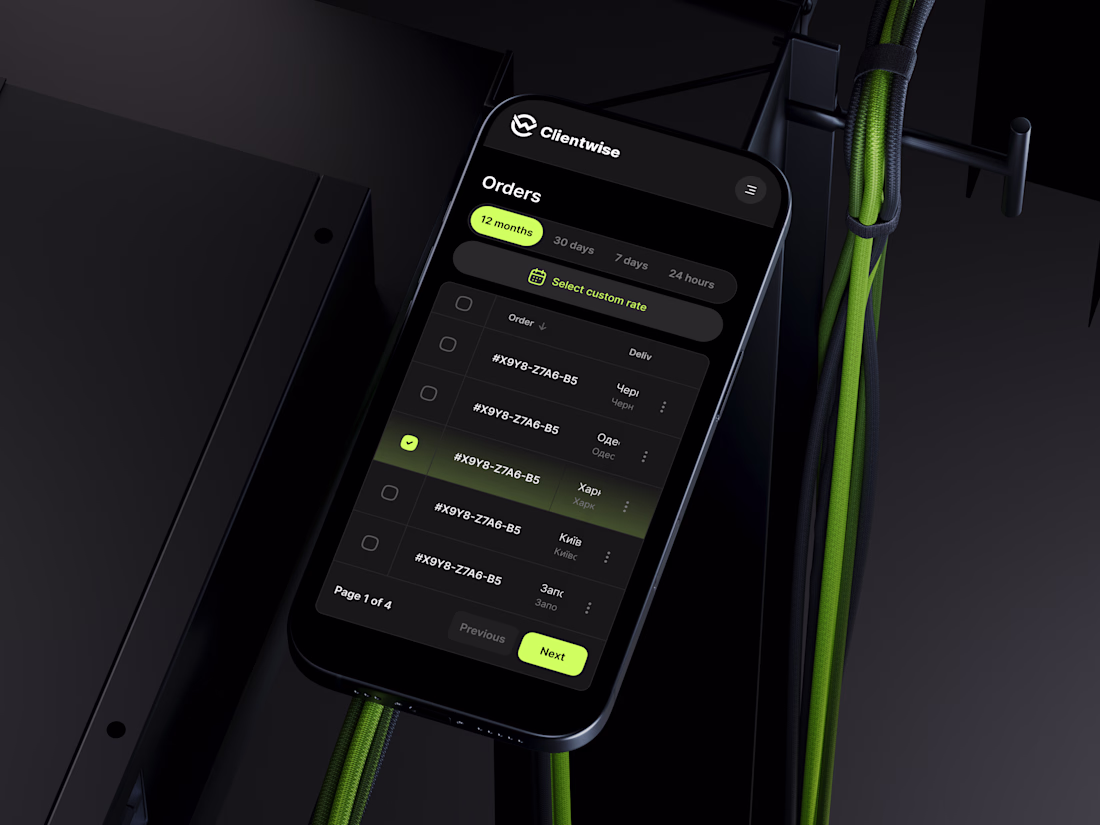
⚡️ Clientwise App Design. > It's all in the details. How do you feel about this dark mode setup with neon accents? Let me know! 👇
So so good 😍
my favorite style🖤
Absolute fire! 🔥
Love the color palette 😍
Thank you, Diana 😍
Very stylish😎
Thanks 😎
Clean and cool as always!
Much appreciated! 🖤
looks modern and stylish 🖤
Glad you like it! 🚀
It feels as a premium brand, but it also has a kind of energy
That’s so amazing to hear! Honestly, as a designer, I’m never fully satisfied with my own work, haha. So hearing this means the world! 🖤
The color palette gives luxury, but in a fresh way! Stunning 🔥
Thanks a lot for the awesome feedback! 🔥
The neon accents give it such a sleek, high-tech vibe without being overwhelming. It creates a perfect contrast, making the status tags and buttons instantly scannable. Great 🔥
Thank you so much! Balancing that neon without making it overwhelming was exactly the challenge. As a designer, I'm usually my own worst critic, haha, so hearing that it hits the spot means a lot! 🤜🤛
Next level design
Thank you! 😊
The visual style definitely catches the eye, but what interests me even more is how it supports usability.
Did the dark mode and neon accents come from user preferences, brand direction, or a specific product goal?
Thanks for the great question! Since it’s a concept, the spark came from the brand direction—I wanted to break away from standard, boring B2B layouts and give the app a bold, tech-forward feel.
However, that choice directly serves UX goals. Dark mode reduces eye strain during...
The network for creativity
Join 1.25M professional creatives like you
Connect with clients, get discovered, and run your business 100% commission-free
Creatives on Contra have earned over $150M and we are just getting started
Related posts
Cool
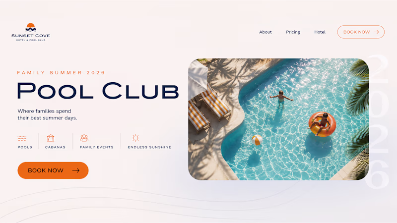
Summer inspired a small design experiment ☀️ We created two hero concepts for the same website. One follows a classic layout. The other takes a more editorial approach with oversized typography and a less conventional composition.
Which direction would you choose for a real project? 1 or 2?
72 voted
62%
45 voted
38%
117 votes
Closed
Trending
Claude
Claude has entered the design space. How are you using Claude Design?
Contra University
Learn from expert creatives how to earn more using next-gen AI tools.
MagicPath
The canvas is infinite, and exploration is becoming the workflow. How are you using MagicPath?
creativeaiflow
Creative AI workflows are evolving. What tools do you use, and what are their strengths and weaknesses?
freelancerlife
Freelancer life is wins, pivots, and everything in between. What’s yours right now?