The network for creativity
Join 1.25M professional creatives like you
Connect with clients, get discovered, and run your business 100% commission-free
Creatives on Contra have earned over $150M and we are just getting started
Back to feedPost

Traffic doesn’t automatically turn into sales.
One area I’ve been working on recently is improving the mobile buying experience of an e-commerce storefront.
The focus wasn’t adding flashy features. It was removing friction:
• Get products visible sooner
• Reduce unnecessary above-the-fold content
• Fix responsive layout and rating issues
• Simplify product/category navigation
• Improve the path from landing page → product → checkout
This matters especially for stores running Meta or Google Ads, where a large percentage of visitors arrive directly on mobile.
A technically working website can still lose customers because of small UX problems.
My approach is to look at the complete system — storefront, mobile UX, database, product workflows, SEO, integrations, and admin operations — rather than treating the website as just a collection of pages.
Stack: Next.js, React, TypeScript, Supabase, PostgreSQL and Vercel.
If you have an existing e-commerce or business website that needs improvement rather than a complete rebuild, I’m also available for audits, production fixes and ongoing development.

The network for creativity
Join 1.25M professional creatives like you
Connect with clients, get discovered, and run your business 100% commission-free
Creatives on Contra have earned over $150M and we are just getting started



Related posts

Noise Reveal, a premium reveal component for Framer
I built a component that gives Framer sites cinematic reveals for images, video and live layouts. It has a soft, film-like edge with glow and grain, and can play on load, on view, from a variant or scrubbed by scroll.
It’s built for production: the reveal is prepared before it scrolls in, it’s accessible with reduced-motion support, it falls back when WebGL isn’t available, and pages stay plain HTML when nothing is moving.
Launched on the Framer Marketplace. Open to custom Framer and interaction work.


The WebGL fallback and reduced-motion support are the parts most reveal effects skip, so it's great to see them called out. Does the fallback keep some of the grain edge with CSS, or does it drop to a simple fade?

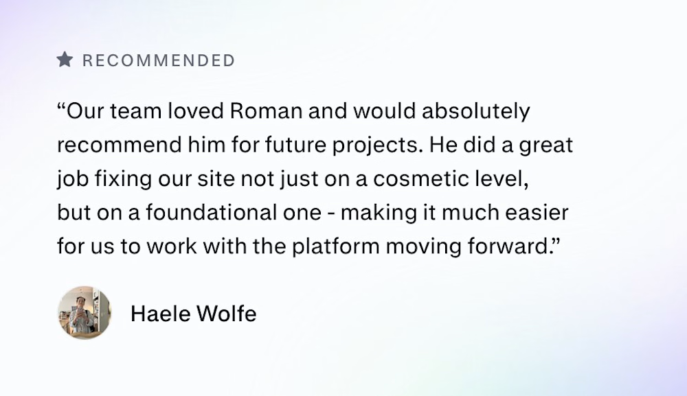
Zencastr came to us with a complex mix: they hosted their homepage on a custom server, blog on a separate platform and the rest of the pages on Webflow.
They had 3 days before the launch to tie it all together. This is their review:

Three platforms behind one domain in three days is a real test. I'd guess the reverse proxy and keeping the nav and footer identical across all three took more care than any of the page building. Did you match the shared header in Webflow or pull it from one source?

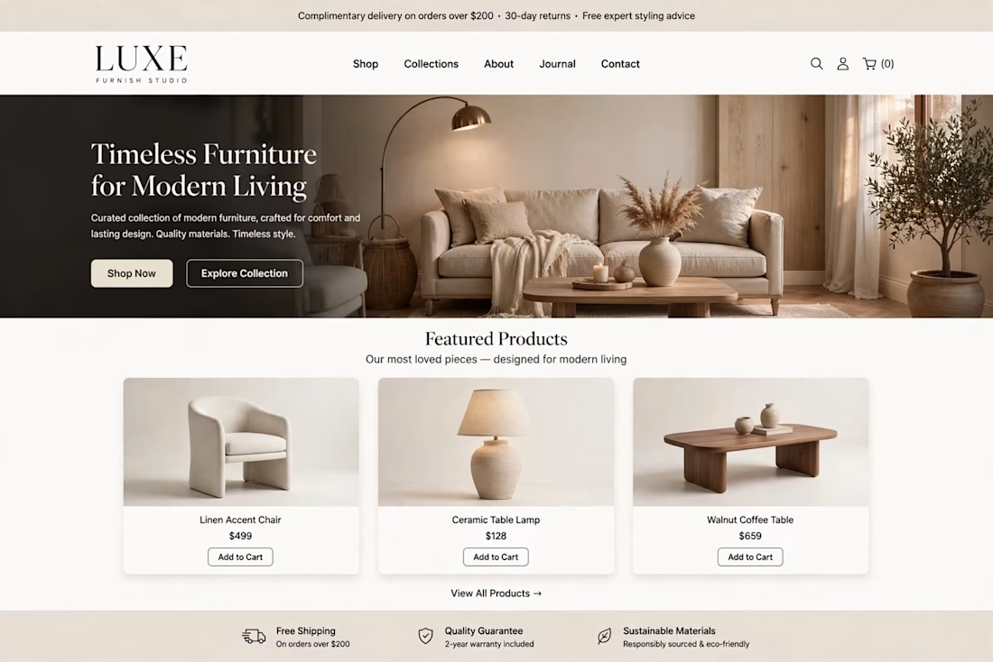
LUXE Furnish Studio is ready!!
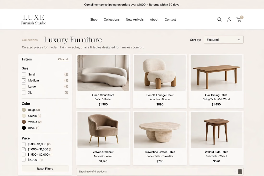
I designed & built LUXE - a premium furniture brand on Shopify.
The goal was simple: Make it feel like a luxury showroom, not just an online shop.
What I did:
Clean, premium homepage with luxury branding
Curated collections: Sofas, Chairs, Tables & Decor
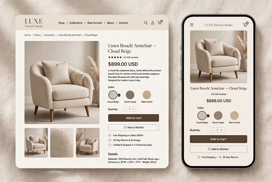
High-converting product pages with clear pricing & Add to Cart
Fully mobile-responsive - looks perfect on phone & desktop
Fast, clean navigation for easy shopping
Built on Shopify with a premium, minimal aesthetic focused on conversions.
If you need a luxury Shopify store that actually sells - let's build yours.
Live Demo: luxe-furnish-studio.myshopify.com
Password: 00
Services: Shopify Store Design, Shopify Development, E-commerce UI/UX


The warm beige palette and the sofa hero with the arc lamp feel like a real showroom, and the mobile product page keeps the same calm look. Which part took longer, the homepage or the product page?