The network for creativity
Join 1.25M professional creatives like you
Connect with clients, get discovered, and run your business 100% commission-free
Creatives on Contra have earned over $150M and we are just getting started
Back to feedPost

Interactive micro-interaction concept 🍫
An on-click chocolate box interaction designed to trigger delight and curiosity.
Focus areas:
Click-based interaction
Motion sequencing
Visual feedback & celebration states
Built as an interaction experiment that can scale to seasonal campaigns, product reveals, or brand moments.
The network for creativity
Join 1.25M professional creatives like you
Connect with clients, get discovered, and run your business 100% commission-free
Creatives on Contra have earned over $150M and we are just getting started

Challenges
View all


Related posts

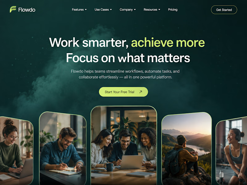
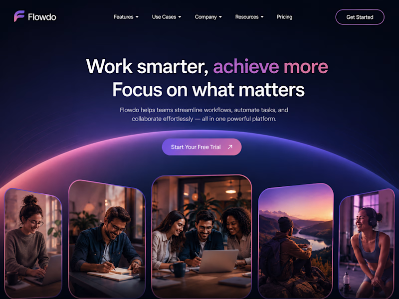
One header, two color stories.
Green: cool tones, feels productive and safe
Purple: gradient glow, feels modern and premium
Same words. Different first impression.
Which one would make you click "Get Started"?

26 voted
59%
18 voted
41%
44 votes
Closed

Went with calm and focused. The copy is literally asking people to focus on what matters, so a header that competes for attention with a glow works against its own message.


Do you ever try breaking the site you're interacting with?
I'm always thinking "what will people try to do" and then coming up with a solution for it. If I saw a card like this I'd try to pick it up. Then once I discovered it was draggable, I'd try seeing what happens if I throw it outside the browser.
What do you think?


Hot design

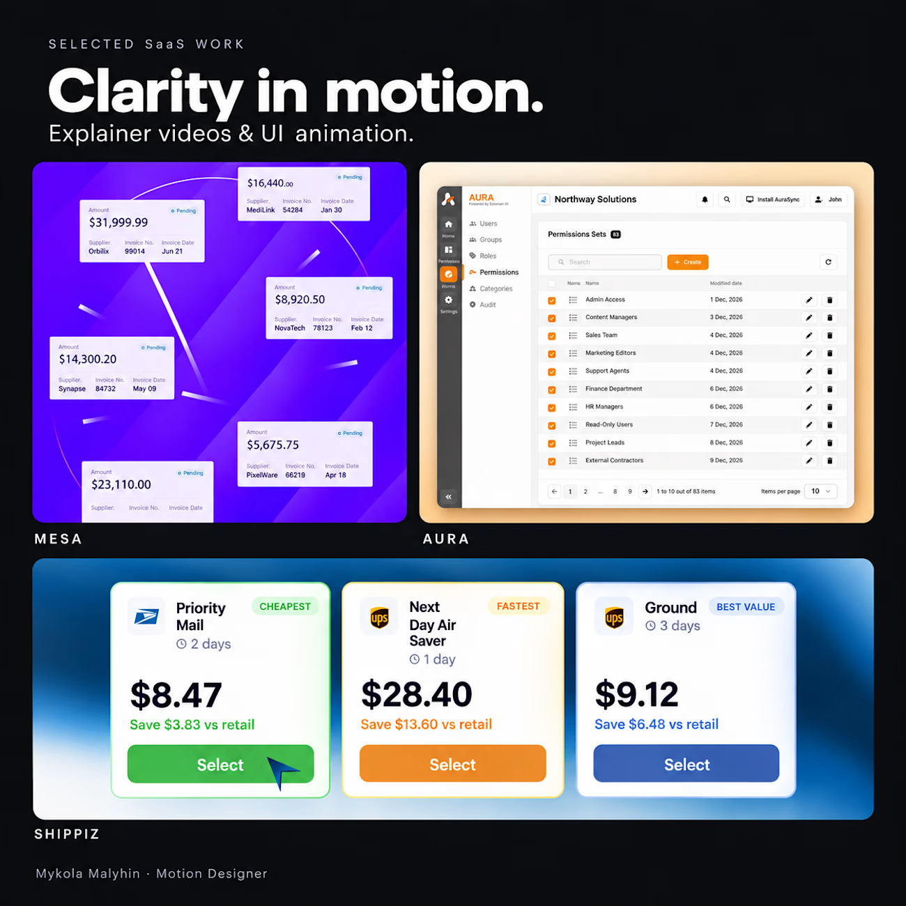
Good UI motion answers three questions:
Where should I look?
What changed?
What happens next?
That’s the checklist I use when thinking through a SaaS explainer.
A transition can connect two steps.
A highlight can direct attention.
A short pause can give someone time to understand the result.
When all three happen at once, the viewer has to work harder.
Before adding another animation, I ask: does this help someone follow the product?
A few frames from my Mesa, Aura and Shippiz projects, brought together in an AI-assisted collage. Different products, the same goal: make the story easy to follow.
What’s harder in your product videos: deciding what to animate, or getting the timing right?
#MotionDesign #SaaS #UIAnimation #ExplainerVideo

agreed that at the end of the day a SaaS explainer should explain really well what the software does with utmost clarity.