The network for creativity
Join 1.25M professional creatives like you
Connect with clients, get discovered, and run your business 100% commission-free
Creatives on Contra have earned over $150M and we are just getting started
Back to feedPost
Hey there! Just wanted to share our recent launch for Henderson & Co. - a Sydney-based design studio specialising in architecture, interiors, and identity.
The goal of this project was clarity, precision, and a premium feel without noise. No heavy animations. No distractions. Just clean design, typography, and spacing.
We handled it end-to-end - from design to development - focusing on building a system, not just pages. The hierarchy is clear, the content flows naturally, and the experience stays consistent across all screens.
A key detail is the homepage “vibe” system. Each visit introduces a different visual direction - dune, water, or snow. The structure stays the same, but the first impression shifts. It adds identity without breaking consistency.
What matters here is not visuals alone.
It’s how design, structure, and performance work together to create an experience that feels premium because it’s intentional.
If you’re planning a new website or want to improve your current one, we can review your case and suggest a clear direction.
amazing work
Thanks 😊
Thank you 🙌
The network for creativity
Join 1.25M professional creatives like you
Connect with clients, get discovered, and run your business 100% commission-free
Creatives on Contra have earned over $150M and we are just getting started
Related posts
New case study published.
Fun space/tech vibes. I got to be playful, but still kept it on-brand and functional.
Really enjoyed this quick Webflow landing page.
This came out great! I'm curious if you tested different hero directions or landed on this early? The cinematic feel works really well for this kind of page.
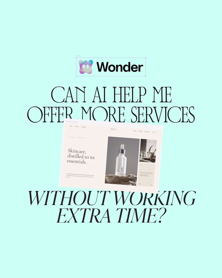
I don't have extra time to offer web design as a service but can AI actually help me offer more services by making an efficient use of my time? 🤔
I tested Wonder to create a landing page for skincare brand, something I do not offer as a service because I don't have time but that I get requested a lot.
First impression, it is fast and surprisingly intuitive to get something on screen. The structure comes together quickly, and it is easy to translate a brand into a layout.
But once you move past the first draft, things get interesting, you can't imagine how easy it is to edit! 🤯 Honestly, this sits somewhere between a prototyping tool and a real workflow extension.
Curious, would you use something like this to expand your services?
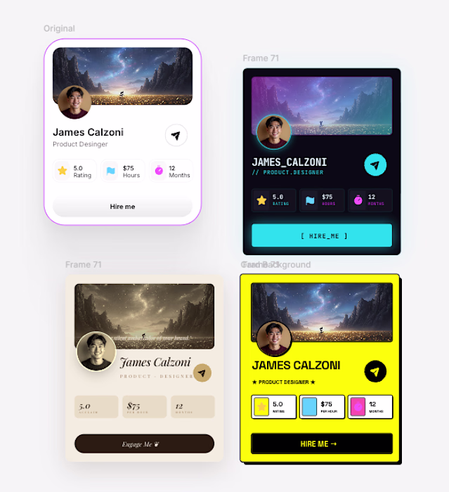
Yes its truly amazing. i use for my component variation and here it generated
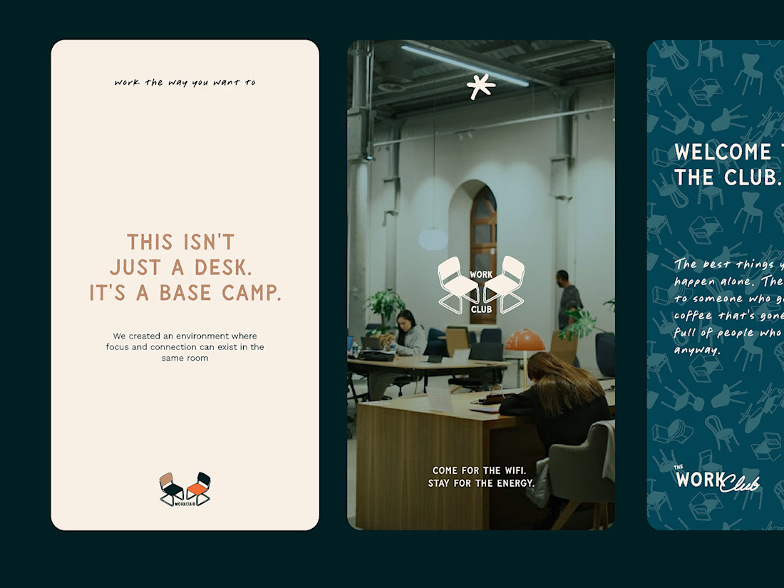
One of my favorite projects to date — meet The Work Club.
A brand born from deep strategy and vision work. Because this was never just about building a killer visual identity. It was about uncovering their secret sauce — what made them stand out, what gave them a real point of view in a sea of new coworking spaces.
That's the work we live for.
These face fronting chairs are so welcoming.
Trending
Claude
Claude has entered the design space. How are you using Claude Design?
Contra University
Learn from expert creatives how to earn more using next-gen AI tools.
creativeaiflow
Creative AI workflows are evolving. What tools do you use, and what are their strengths and weaknesses?
portfolioreview
The best portfolios tell a story, not just show a grid. Share yours for feedback.
freelancerlife
Freelancer life is wins, pivots, and everything in between. What’s yours right now?