The network for creativity
Join 1.25M professional creatives like you
Connect with clients, get discovered, and run your business 100% commission-free
Creatives on Contra have earned over $150M and we are just getting started
Back to feedPost
From Ugly picture to Magazine!
Lately, I’ve been helping a textile brand transform static mannequin shots into high-end, model-led visuals. It’s been rewarding to see how this shift to "magazine-ready" imagery has directly boosted their sales and customer engagement.
I’m truly grateful for the trust and proud to see design drive real business growth.
You can check out my work here: www.carlosizq.com
What do you think of this transformation? I'd love to hear your thoughts!


Thank you! 😃

This is awesome Carlos! I can already think of so many people who’d find this incredibly valuable for their brands 👏🏻
The network for creativity
Join 1.25M professional creatives like you
Connect with clients, get discovered, and run your business 100% commission-free
Creatives on Contra have earned over $150M and we are just getting started



Related posts

Two fun ones from this week:
a fake magazine cover for my witch Kimbo Salem, and a Japanese candy ad with zero social responsibility 🦩🧙♀️
Qwen test generation + upscale → poster → retouch in Photoshop → typography in Illustrator.😎


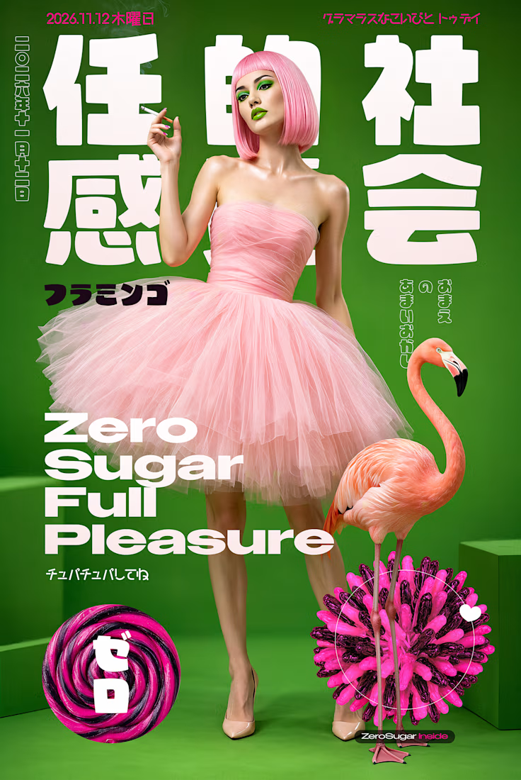
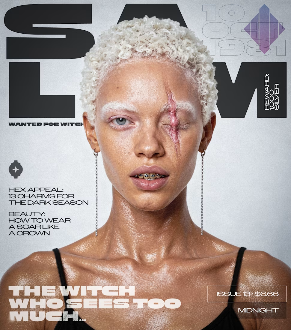


witch magazine cover is so good

The idea was immersion. LED preloader, flickering hero, dark and editorial. Made for streetwear labels and design studios


The CYCLO LAB letters lighting up one by one set the dark editorial mood right away. How long does the preloader run before the hero shows?

09 XL — From a Portrait to a Visual Story.
This one started with a simple black-and-white portrait, but I wanted to give it a little more personality. I began experimenting with contrast, grain, and shadows to build a raw, almost cinematic atmosphere.
Then came the fun part — playing around with typography, adding the black strip across the eyes, and using minimal details like 09 and XL to give the composition a subtle editorial feel.
Once the poster came together, I placed it in a real-world bus stop mockup to see how it would live outside the screen.
A little experimentation, a few happy accidents, and lots of tiny adjustments later — this was the result.

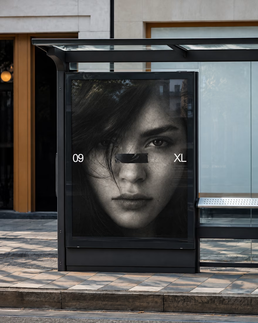
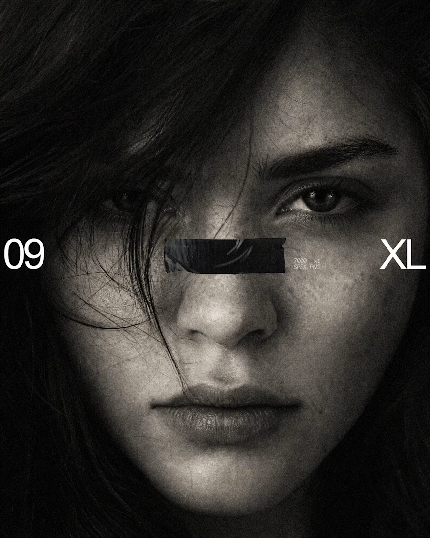
The black bar across the eyes with 09 and XL on the sides turns a simple portrait into a bold poster, and the bus stop mockup shows it works at street scale. Is the grain added in Photoshop or part of the original photo?

