The network for creativity
Join 1.25M professional creatives like you
Connect with clients, get discovered, and run your business 100% commission-free
Creatives on Contra have earned over $150M and we are just getting started
Back to feedPost

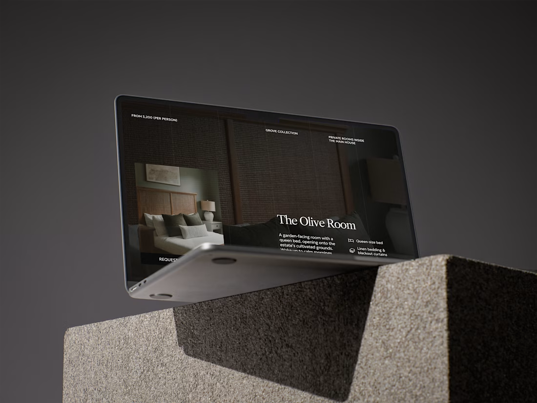
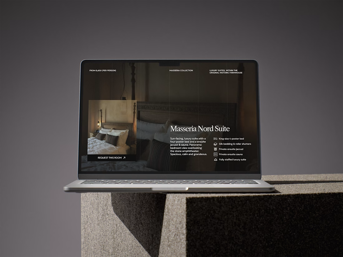
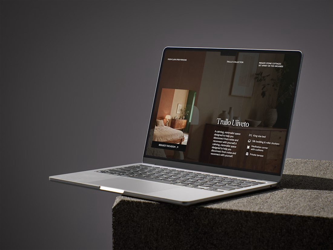
Built a CMS powered room-selection section for a retreat landingpage.
The user doesn't have to exit the page, moving onto a secondary collection page. Instead, they can simply scroll through a selection of room categories, view key featrures at a glance and explore further rooms in more detail based each category inside the CMS window.


Keeping people inside the same window instead of routing them to a separate collection page is the kind of detail that sounds small until you see the drop-off numbers on a normal browse-to-detail flow. Was that scroll-through pattern something the retreat client asked for, or...
The network for creativity
Join 1.25M professional creatives like you
Connect with clients, get discovered, and run your business 100% commission-free
Creatives on Contra have earned over $150M and we are just getting started











Related posts

A hungry customer decides in about 3 seconds.
Is your website making them hungrier, or sending them to the competitor down the street?
Marco's restaurant had great food, and empty tables every Friday night.
Not because the pasta was bad. Because the website was.
Last month, a couple searched "Italian restaurant near me" and found Marco's page. Blurry photos. A menu as a PDF that never loaded on the phone. No way to book a table. They closed the tab in 5 seconds and walked into the place next door.
Marco never knew. That's the dangerous part. You don't see the customers your website loses.
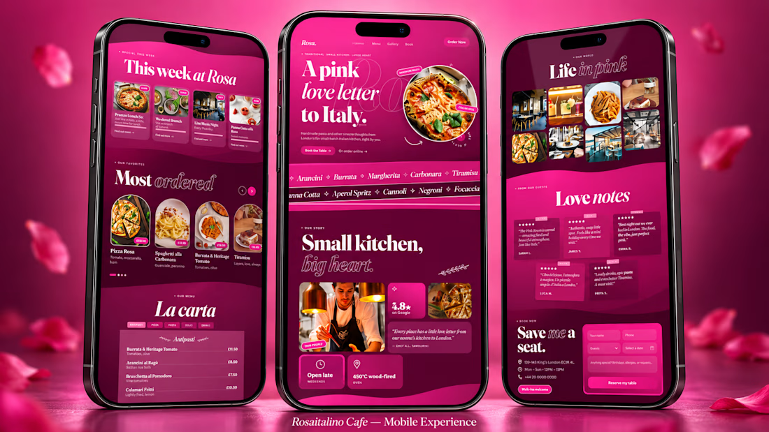
So I built a concept to show what that same restaurant could look like: Rosa italino Cafe, a rose-pink Italian restaurant website for London.
Here's what a website like this gives the owner:
🌹 A first impression that sells
People judge a restaurant in 3 seconds. A bold, beautiful design makes them hungry before they read a single word.
🍝 A menu that works like your best waiter
Dishes with photos, descriptions and prices, easy to scroll on a phone. Your signature dishes get the spotlight, so people order more of what you want to sell.
📱 Bookings from thumbs
Most people find a restaurant on their phone. A simple booking section means they reserve a table in a few taps instead of giving up.
⭐ Trust at a glance
Reviews, photos and your story in one place, so a stranger feels safe choosing you over the place next door.
📣 A place for your offers
Lunch sets, weekend specials, live music nights: update them and your regulars see them first.
🕛 A sales person that never sleeps
Your website is open at 2 AM, on Sundays and on holidays, showing your food to everyone who searches.
None of this needs a bigger budget. It needs a website designed like it cares about your food as much as you do.
That's what I do. I'm Swayam. I design and build websites for restaurants and small businesses, made to look stunning and turn visitors into customers.
Run a restaurant, cafe, salon or any small business?
Message me your business name and I'll send you a quick concept idea for your brand. No pressure, no boring sales pitch.
(Rosa italino Cafe is a concept project. Marco is a fictional character, but the problem is very real.)

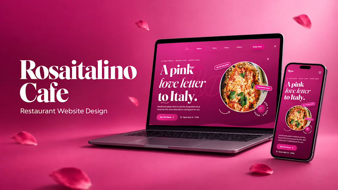
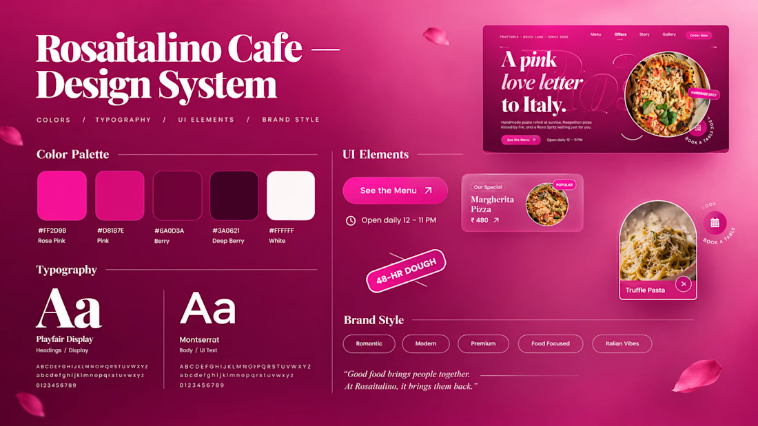

Thats real intuitive post!

I’m Rokas - a Framer Developer & Official Framer Expert.
I turn Figma designs into production-ready Framer websites, customize templates, and fix/troubleshoot existing Framer sites.
Have a Framer project, need a template customized, or something fixed? DM me.
Portfolio: https://contra.com/rokas_griskonis1
contra.com
Rokas Griškonis - Framer Designer | Contra
I fix & develop Framer websites. Official Framer Expert. . View Rokas Griškonis’s Profile on Contra. The Independent-first, commission-free freelance marketplace shaping the future of work.

Official Framer Expert status plus the production-ready angle is a strong combo. Positioning around fixing and troubleshooting existing sites is smart, that is usually where the urgent, paid work lives.

DevFolios — a developer portfolio template that helps you showcase your projects, highlight your skills, and turn your work into your next job or client.
Build it. Show it. Get noticed.
Template link: https://framer.link/BWyFxNT


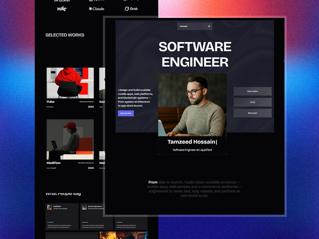

The hover effect of the buttons is so cool bro