The network for creativity
Join 1.25M professional creatives like you
Connect with clients, get discovered, and run your business 100% commission-free
Creatives on Contra have earned over $150M and we are just getting started

The network for creativity
Join 1.25M professional creatives like you
Connect with clients, get discovered, and run your business 100% commission-free
Creatives on Contra have earned over $150M and we are just getting started


Related posts

Holographic is back (again), and I couldn’t be happier.
I’m #TeamColor all the way. What about you, #TeamColor or #TeamMinimalism?
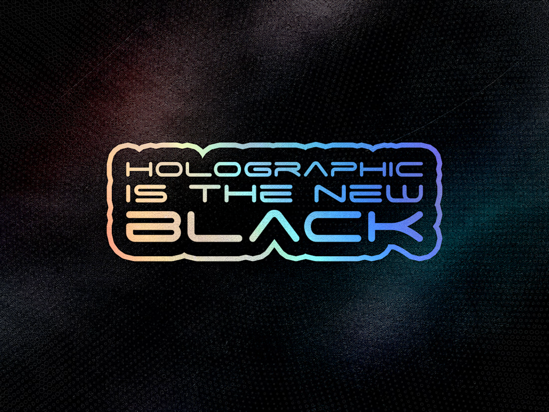
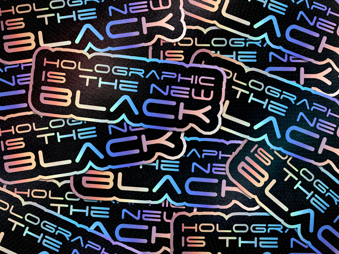


What if holographic design isn't really about adding colour, but about making colour behave like light?
I've always found iridescence fascinating. A surface that refuses to settle on a single colour, constantly shifting between shades depending on how light touches it. It's almost as if the design has a personality of its own.
I'd love to experiment with this beyond the usual shiny gradients: translucent typography, liquid-chrome textures, prismatic reflections and subtle holographic layers that reveal different visual dimensions as the perspective changes.
The challenge, though, is restraint. There's a fine line between something that looks futuristic and something that looks like a metallic gift wrapper.
The goal isn't to make everything shine. It's to give the viewer something new to discover every time they look.
#Holographic #VisualDesign #CreativeExploration


That's a great looking logo🔥