The network for creativity
Join 1.25M professional creatives like you
Connect with clients, get discovered, and run your business 100% commission-free
Creatives on Contra have earned over $150M and we are just getting started
Back to feedPost
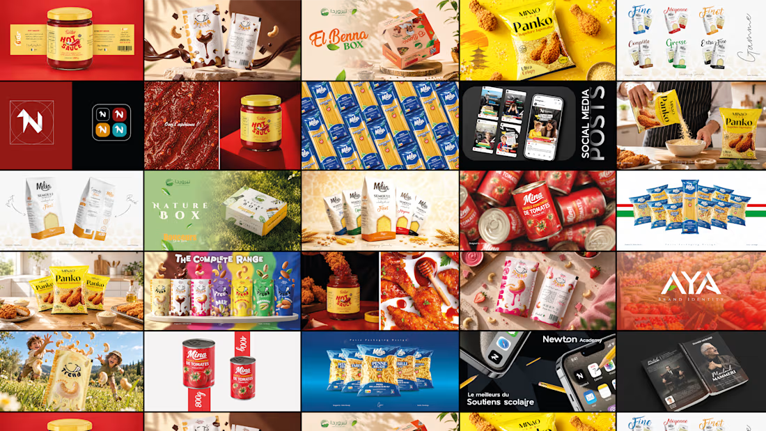
Finally making my way onto Contra 👋
After 5 years in graphic design, I’m really happy to be here and excited to start sharing my work on the platform.
I’ll be adding my projects gradually, from past work to new ones, so there’s more to come!
You can also take a look at my portfolio on Behance:
https://www.behance.net/theGmDesign
Excited to connect with other creatives and see what’s happening here. 🚀



Creative design 🤩

thank you Umar 🙏🏻
The network for creativity
Join 1.25M professional creatives like you
Connect with clients, get discovered, and run your business 100% commission-free
Creatives on Contra have earned over $150M and we are just getting started



Related posts


🎉 It’s live! I’ve finally updated my design portfolio:
👉
This space has been a long time coming, a reflection of the stories, systems, and identities I’ve been lucky to shape across wellness, healthcare, community & events!
It’s still evolving (aren’t we all?), and I’ll be adding more projects soon, but I’m excited to finally share a fresh look at my work and creative direction!

Congratulations on the new portfolio, Kajal! The grid of bold reds, magenta and cobalt mockups, with that confident serif G repeating throughout, makes the whole identity feel energetic yet cohesive. What guided the way you sequenced your wellness and healthcare projects?

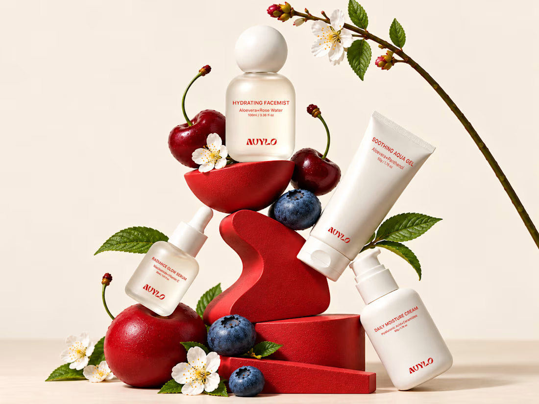
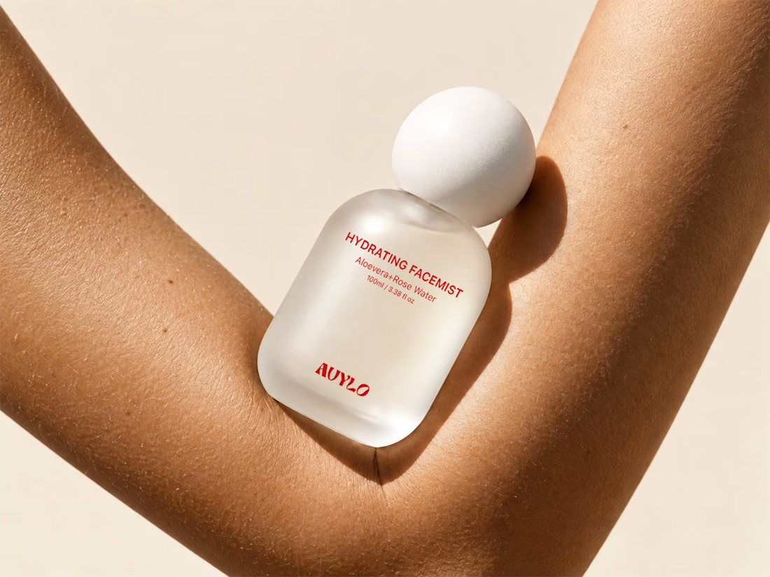
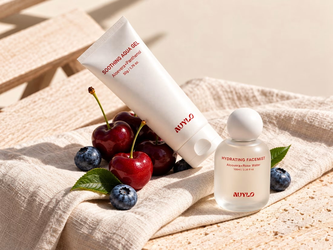
AVYLO Skin Care Packaging Design


Good job

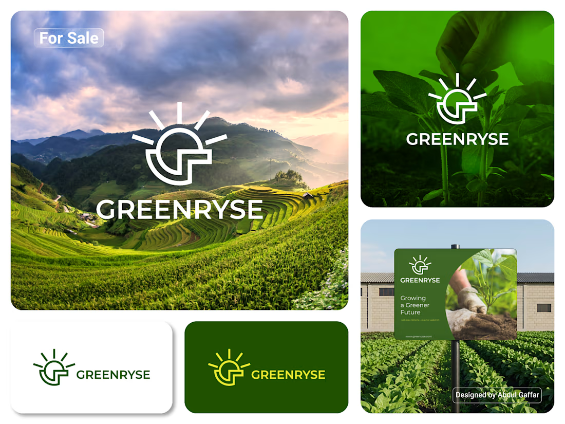
GREENRYSE – G Lettermark, Sun Logo Design, Sustainable Agriculture.
Introducing GREENRYSE, a modern logo concept inspired by nature, agriculture, and the power of growth. The symbol combines a geometric letter G with a rising sun, representing new beginnings, natural energy, and a brighter future for agriculture.
The presentation explores how the logo works across different backgrounds and applications, including agricultural landscapes, product imagery, and outdoor signage. Its clean geometric structure and fresh green color direction create a natural yet professional look.
Designed for agricultural companies, organic farming businesses, crop production, sustainable agriculture, and modern agritech ventures.
Stunning!