The network for creativity
Join 1.25M professional creatives like you
Connect with clients, get discovered, and run your business 100% commission-free
Creatives on Contra have earned over $150M and we are just getting started
Back to feedPost

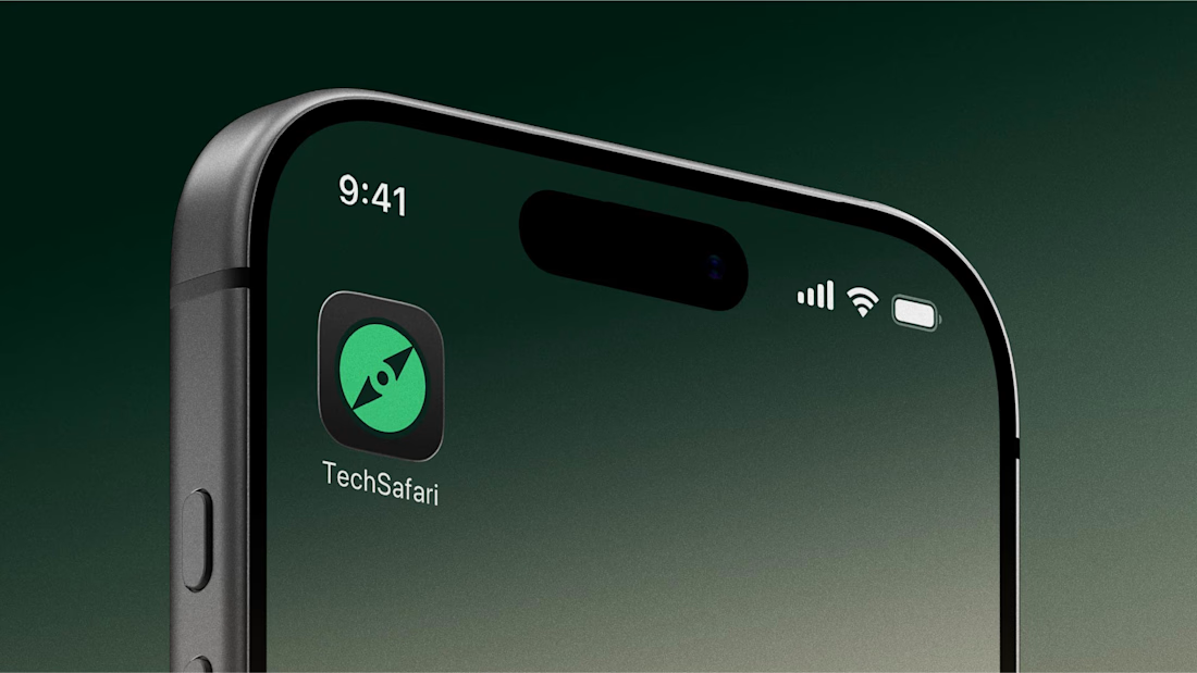
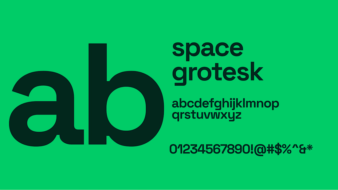
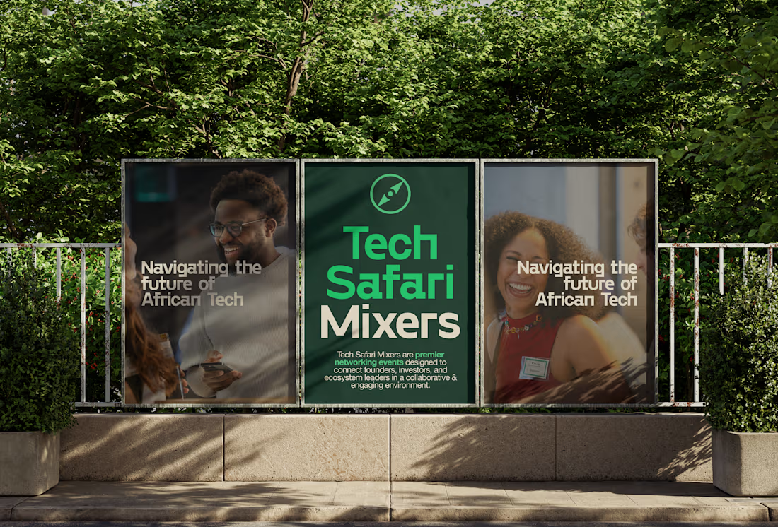
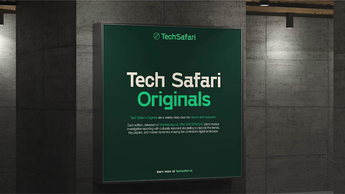
early concept design work from a brand sprint earlier this year 💚
The network for creativity
Join 1.25M professional creatives like you
Connect with clients, get discovered, and run your business 100% commission-free
Creatives on Contra have earned over $150M and we are just getting started



Related posts

"Is it too late to eat?"
"Not yet."
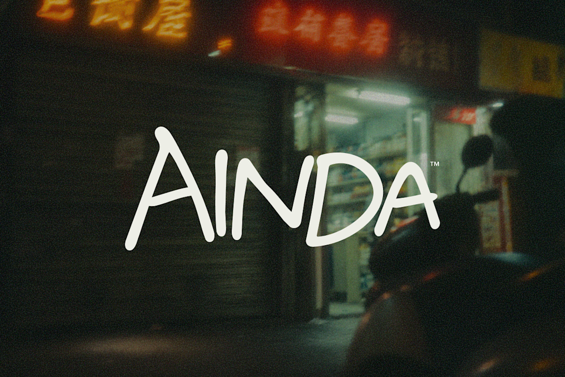
That's pretty much where AINDA started.
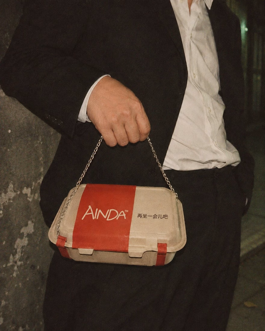
It's a fictional Chinese neighborhood restaurant I'm designing around the hours between today and tomorrow. Somewhere to have a proper meal, sit for a while, and maybe stay a little longer if the conversation isn't over.
I've been developing its identity around that everyday feeling, from the hand-drawn lettering and late-night atmosphere to the packaging and service objects, some of which have gotten a little out of hand.
Here are a few experiments from the project so far. Still a lot to explore.
The restaurant doesn't exist, but apparently its takeout already has places to be.

Love this! Turning a takeout box into a handbag is genius — strong brand storytelling. I do brand & packaging concepts like this too, my DMs are open for collabs. 🔥

New project! Me and @Mary Delaney helped out the folks at Balloon with a rebranding a redesign of their mascot! Check out the new appstore listing and stay tuned for much more!

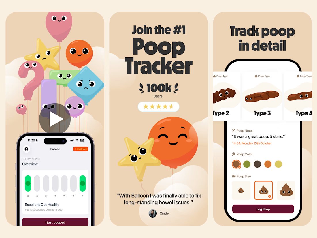

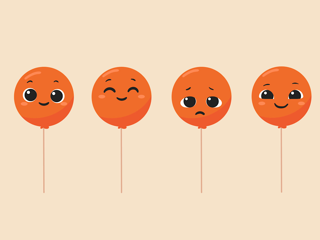

Everything has character! Good job. I like the little faces on the terds 🤣

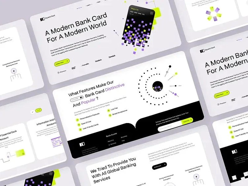
Card Banking Web Design Exploration
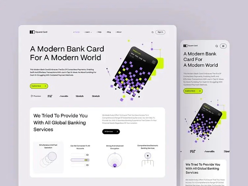
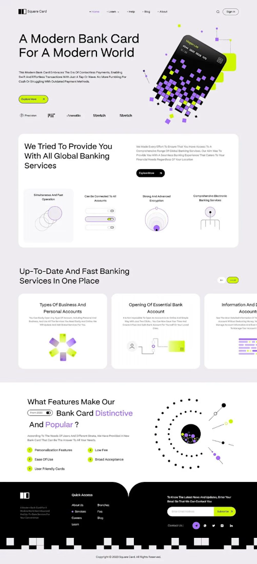
“A modern bank card for the modern world.” That line set the tone, and the layout follows it.
The hero is one pixelated card, built from small squares in lilac, lime and black. It breaks apart into the page, and the product still reads first.
The headline runs large across the left in clean type, so big the message lands before anything else. The card keeps its playful shape, and the words still lead.
Thin line icons and numbered points split the features into small, clear blocks. The busy information gets a strict structure to lean on.
A single lime button sits under the headline and marks where to go next.
Designed by Pixel & Form.
#WebDesign #BankingDesign #FintechDesign #UIDesign #LandingPage #ProductDesign #ResponsiveDesign #CardDesign #Typography #FigmaDesign



Nice work!