The network for creativity
Join 1.25M professional creatives like you
Connect with clients, get discovered, and run your business 100% commission-free
Creatives on Contra have earned over $150M and we are just getting started
Back to feedPost

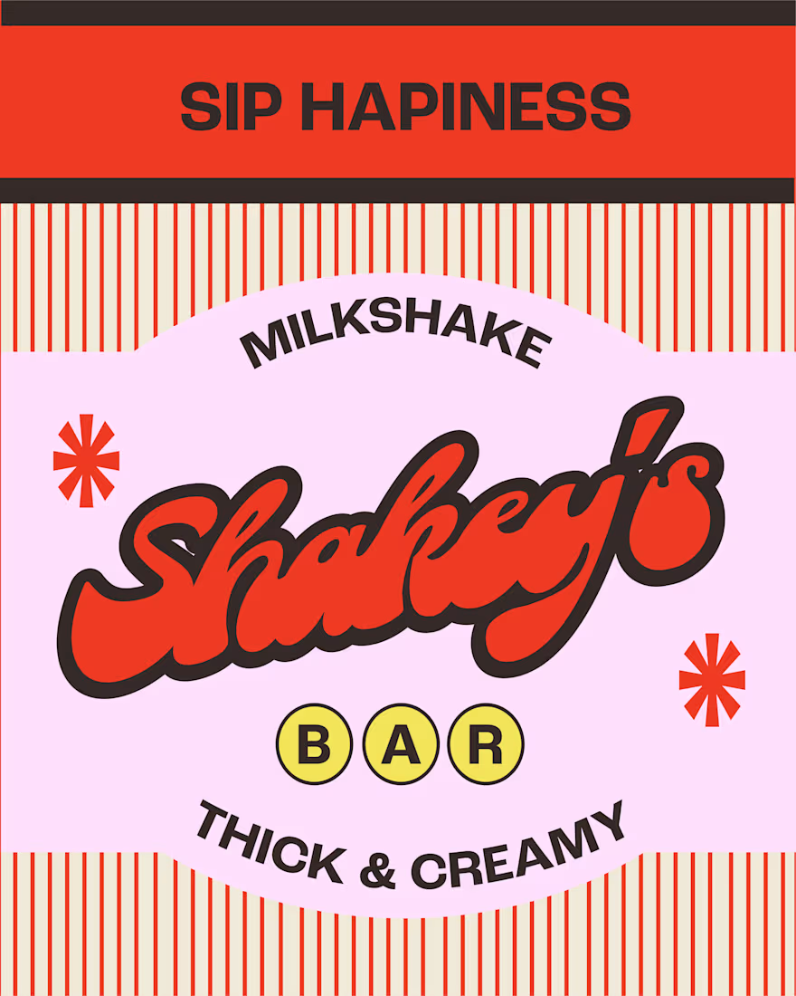
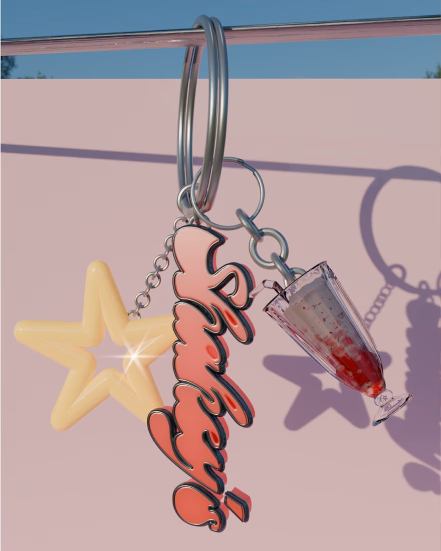
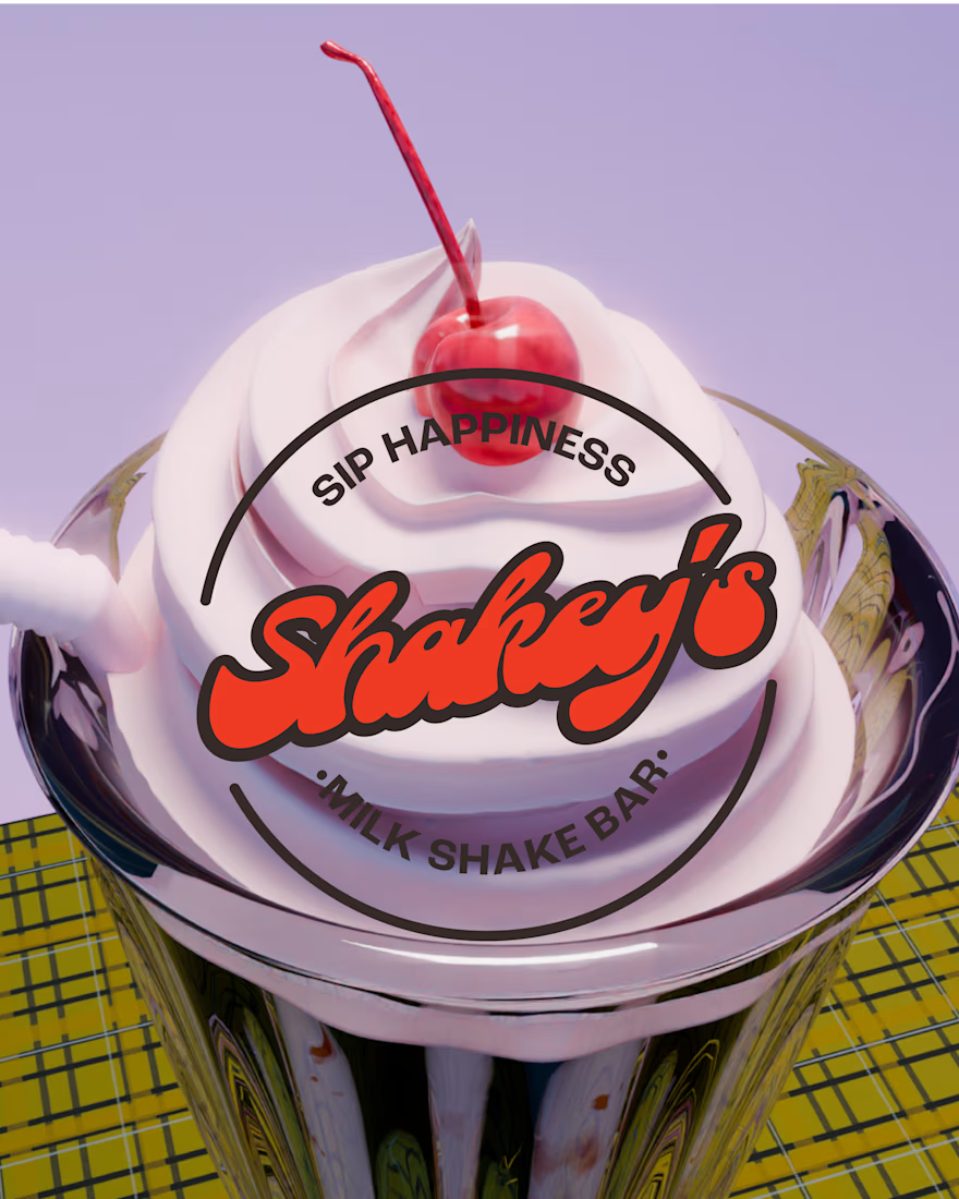
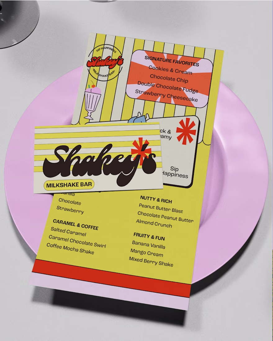
SHAKEY’S (part 2)
Retro-inspired milkshakes, hand-blended with real ice cream thick, creamy, and rooted in classic American flavor
Brief by: @designerbriefs @kittldesign
I had so much creating 3D art for shakey’s! Ive made lots of cute frog illustration cant wait to share in part 2
#milkshake #branding #milkshakebar #dbshakeys #flows

The network for creativity
Join 1.25M professional creatives like you
Connect with clients, get discovered, and run your business 100% commission-free
Creatives on Contra have earned over $150M and we are just getting started







Related posts

So, what is ROSI?
A few cans.
Five colours.
One very simple fish.
A ridiculously large wordmark.
And hopefully proof that everyday products don’t have to look everyday.


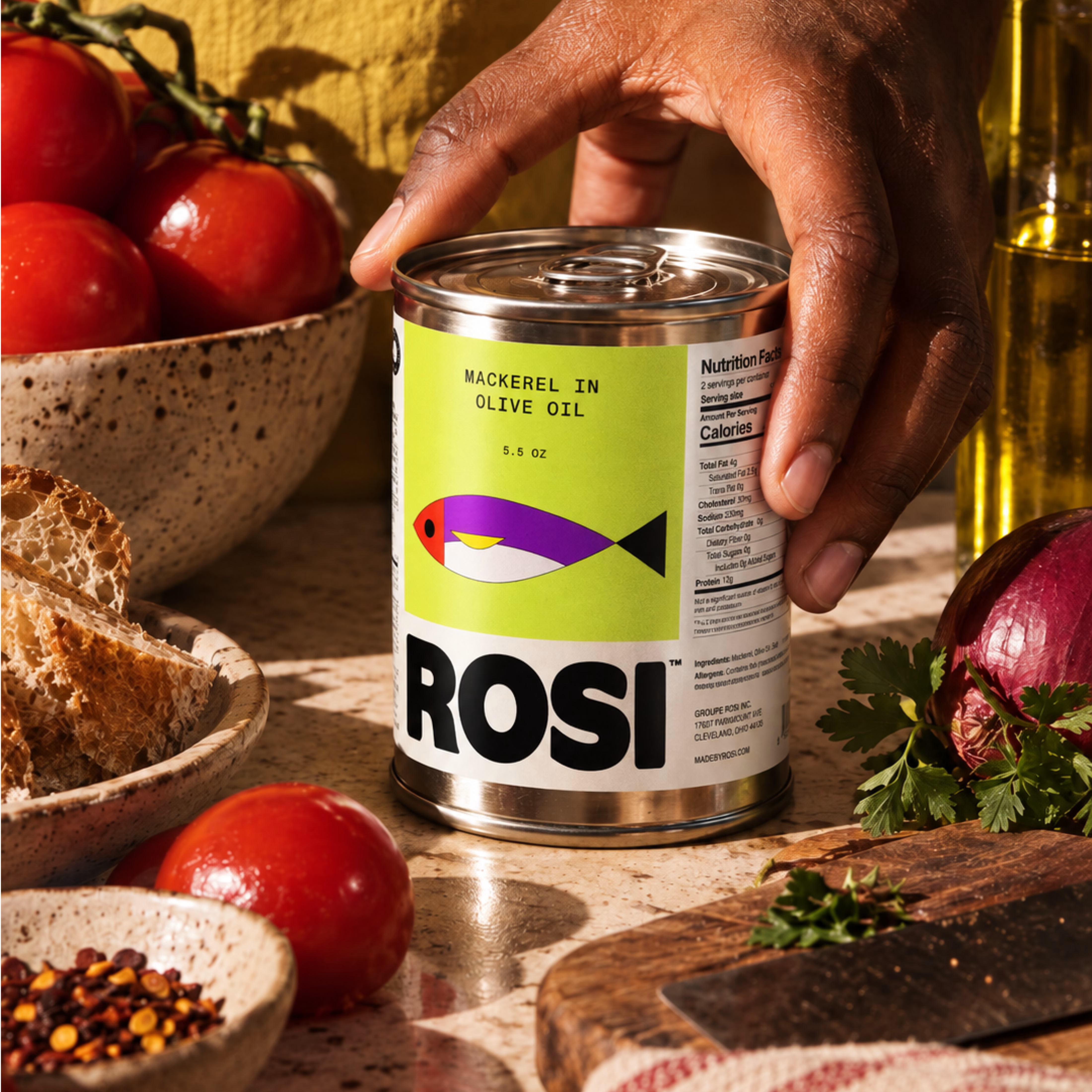
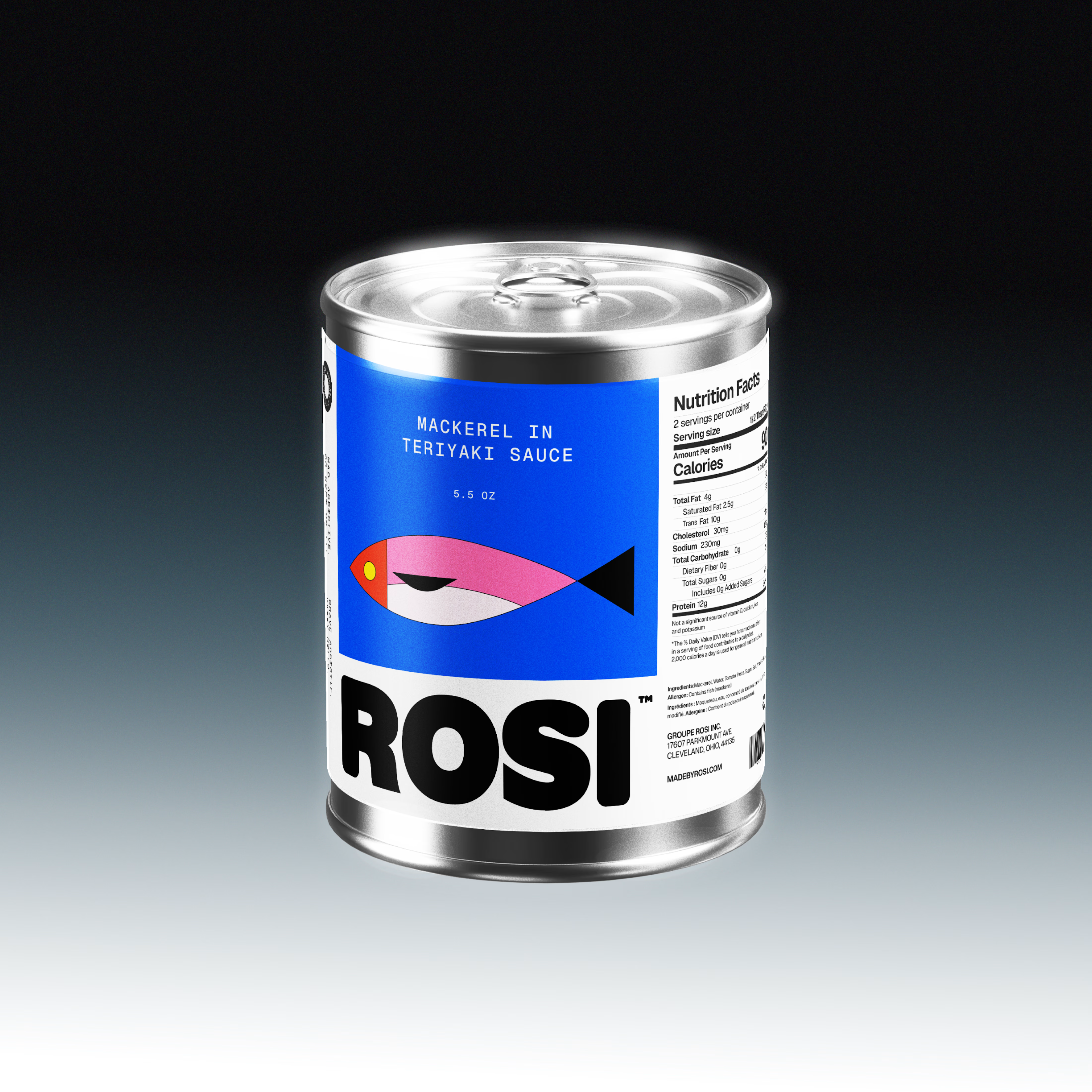
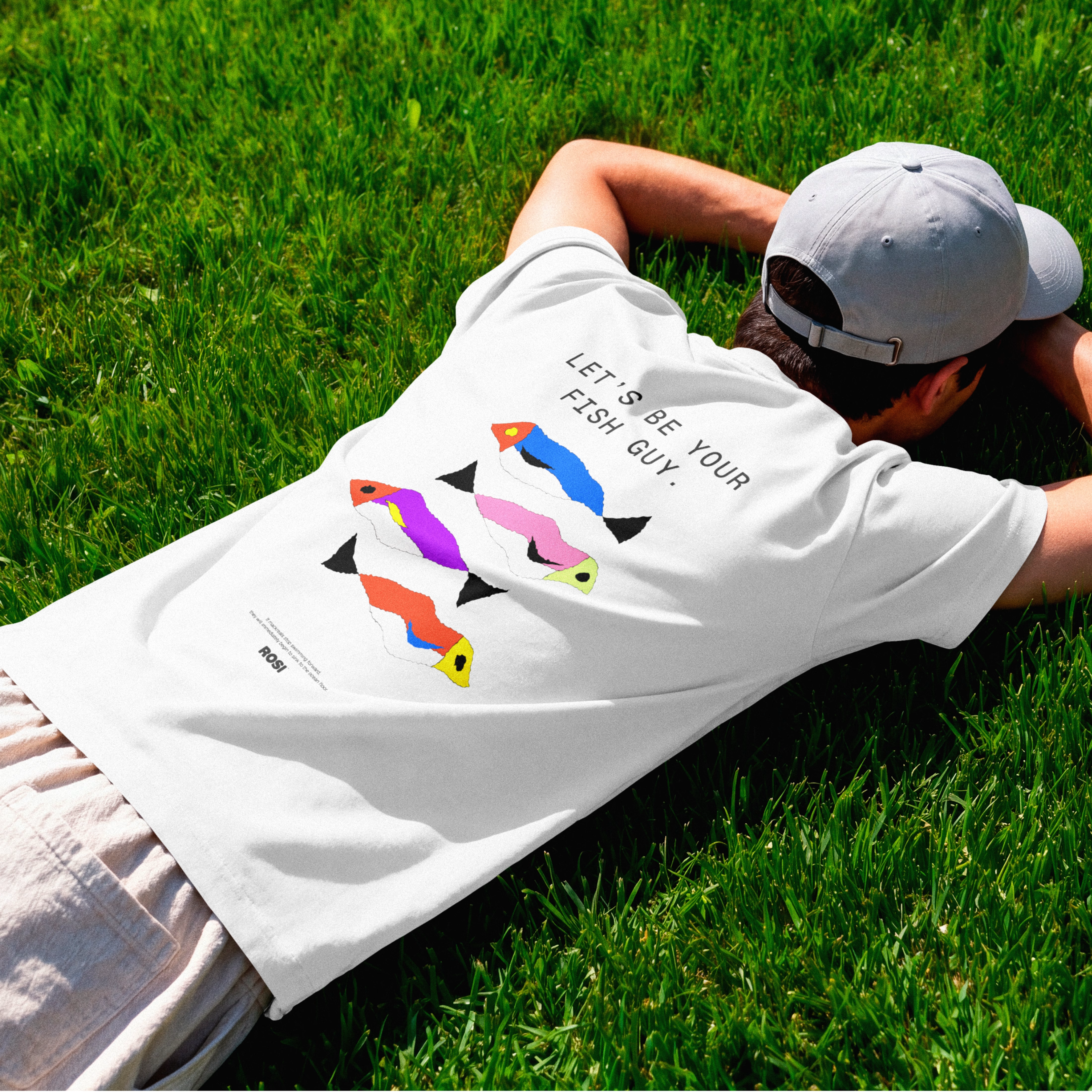

The ridiculously large wordmark is the entire personality, tinned fish has never strutted like this. Proof that confidence is a design decision, not a budget line.


Four logo concepts, one direction: calmness, warmth, mental health and professionalism.
Which one feels most aligned with the brief to you?


I think 3 or 4 work best. I really like the first one, but it moves away from the "calmness" concept

FARO OSTERIA just got featured on Contra! ✨
Really happy to see this one selected by the Contra team. I loved building the world around it, from the red pasta boxes and blue caps to the menu and street campaign.
Thank you, Contra, and everyone who has taken a look and supported the work.
Explore the project:
https://contra.com/community/eVKgBdEl-faro-osteria-italian-comfort-street
Independent concept. Creative direction, branding, packaging and AI assisted imagery by Mauricio Pontual / MP House Studio.

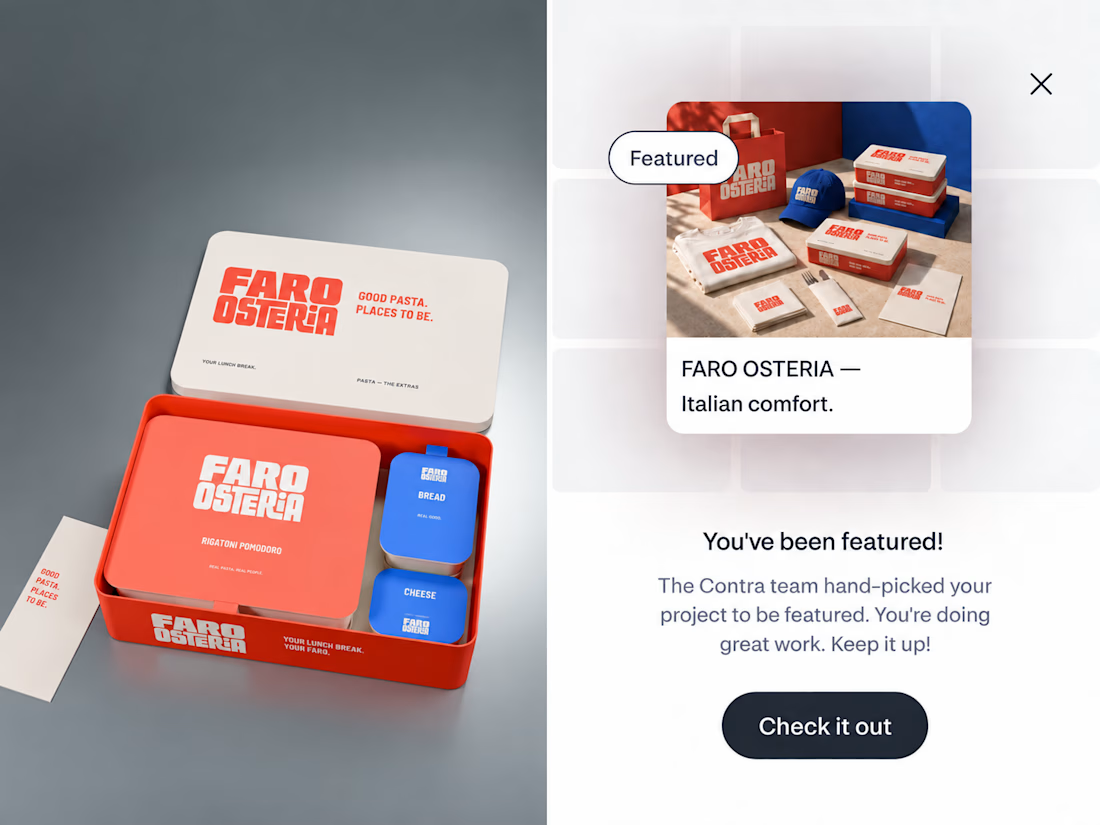

The red-and-blue packaging system feels wonderfully confident, and the tiny “featured” moment makes the presentation feel like part of the brand world. Great balance of restaurant warmth and editorial polish.