The network for creativity
Join 1.25M professional creatives like you
Connect with clients, get discovered, and run your business 100% commission-free
Creatives on Contra have earned over $150M and we are just getting started
Back to feedPost

I design products where the stakes are high and the users are experts. The kind of work where a bad design decision has real consequences.
I am now taking on a small number of projects and part-time engagements.
Product design. Design for AI. Designing with AI. Design systems. I work with founders and teams who care about how their product feels. If that sounds like you, let's start with a discovery call!
See the work: raunakjangid.com

The network for creativity
Join 1.25M professional creatives like you
Connect with clients, get discovered, and run your business 100% commission-free
Creatives on Contra have earned over $150M and we are just getting started







Related posts

Light or refined - which E-Bike product breakdown section design would you choose?
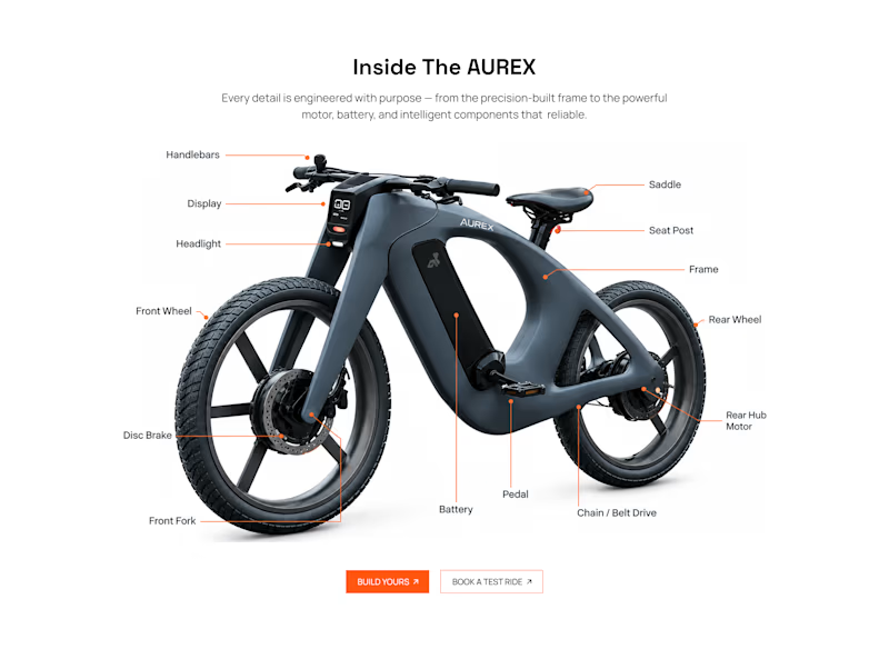
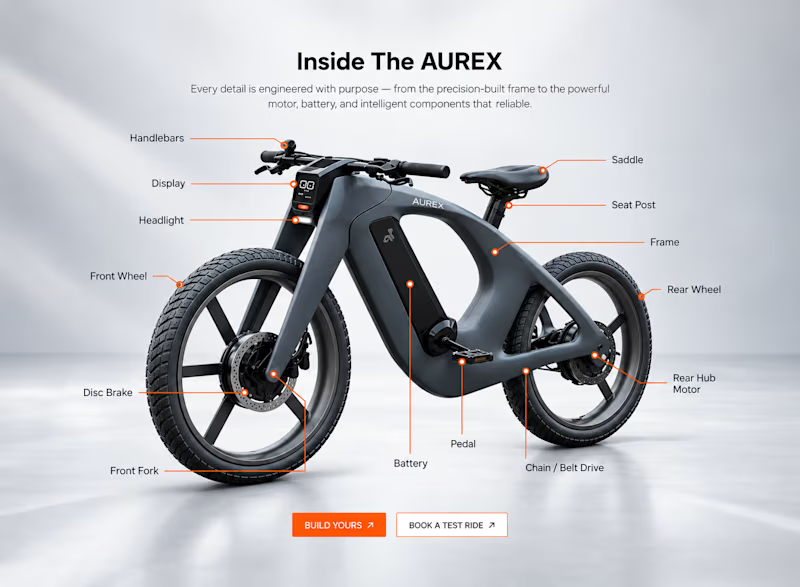
Two concepts for the same AUREX e-bike. Same product, same components, two different presentation styles:
A - Soft Studio: subtle gray depth, larger product focus, and a more premium visual feel.
B - Clean Minimal: bright white background, tighter spacing, and a more technical editorial layout.
Which direction feels stronger for a premium e-bike brand and why?


5 voted
31%
11 voted
69%
16 votes
Closed

A feels more premium to me. The soft gray depth and bigger product focus make the bike feel like something special. B is great for specs, but A sells the feeling

My Personal Portfolio
A digital portfolio showcasing my work across Product Management, Product Analysis, and UI/UX Design.
I built this portfolio to document how I approach digital products — from understanding problems and user needs to defining solutions and creating meaningful experiences.
Explore the full portfolio:
habsariamri.com
Product Management · Product Analysis · UI/UX Design · Web Development




Professional

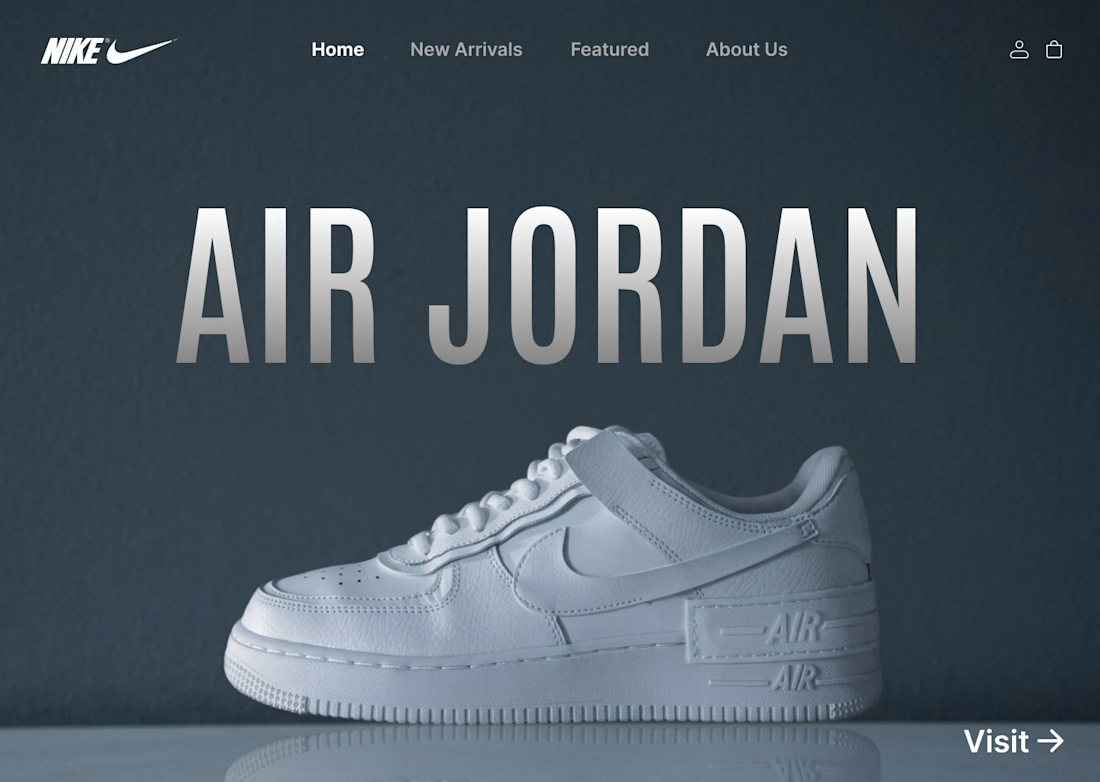
I designed a clean, minimalist e-commerce concept for Nike centered around the iconic Air Jordan series. The goal was to create a bold, modern hero section that instantly grabs attention while keeping the navigation effortless for shoppers.
Key Highlights:
Hero Visual: Featured high-resolution shoe imagery paired with bold display typography.
Minimal Layout: Dark, muted color scheme that makes the product pop without visual noise.
Streamlined UI: Essential navigation tabs paired with a direct CTA for seamless user flow.
#UIDesign #UXDesign #Figma #WebDesign #NikeConcept #LandingPage #DesignShowcase #UXUI #ECommerceDesign