The network for creativity
Join 1.25M professional creatives like you
Connect with clients, get discovered, and run your business 100% commission-free
Creatives on Contra have earned over $150M and we are just getting started
Back to feedPost

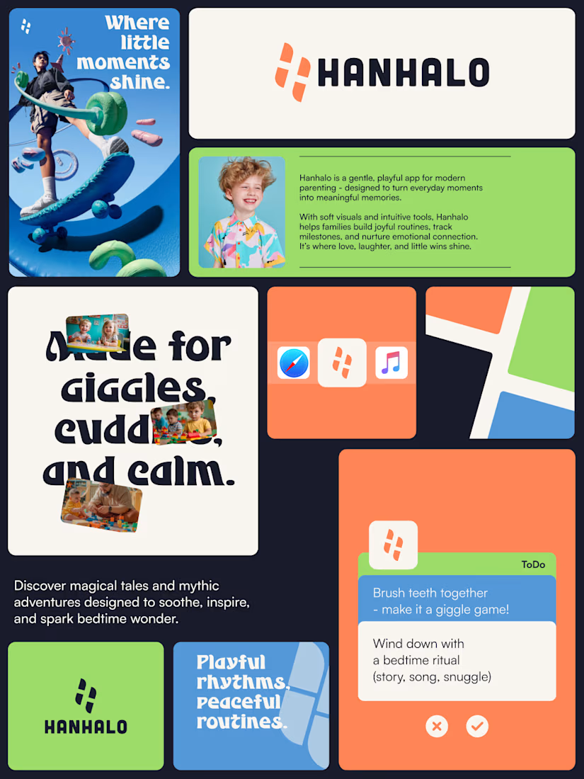
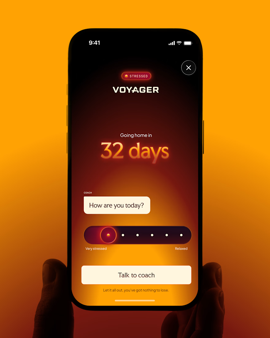
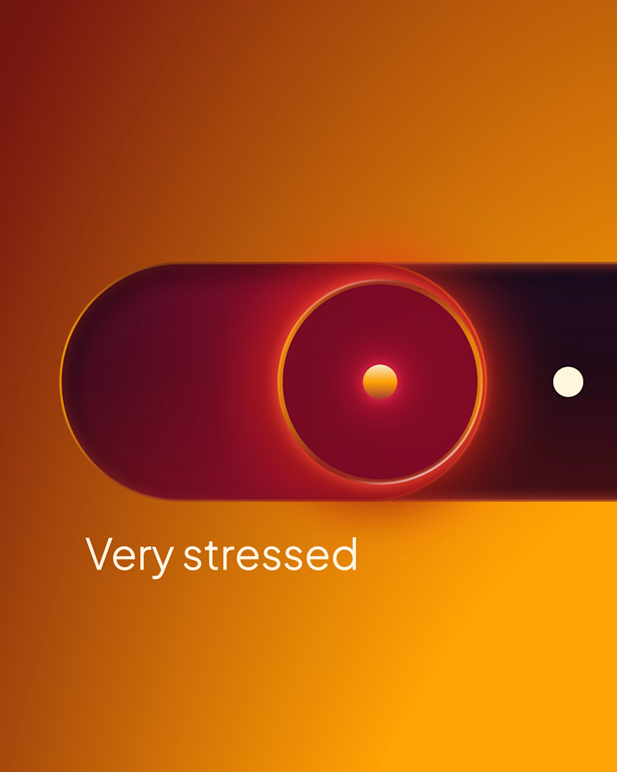
A look at the brand identity and app system for Hanhalo, a playful platform designed for modern parenting, joyful routines, and meaningful family memories.
💼 Building a consumer app or lifestyle brand? We are accepting new project inquiries. DM us or check the link in bio to connect! 🚀
The network for creativity
Join 1.25M professional creatives like you
Connect with clients, get discovered, and run your business 100% commission-free
Creatives on Contra have earned over $150M and we are just getting started











Related posts

How do you design a kids brand that parents trust and children get excited about?
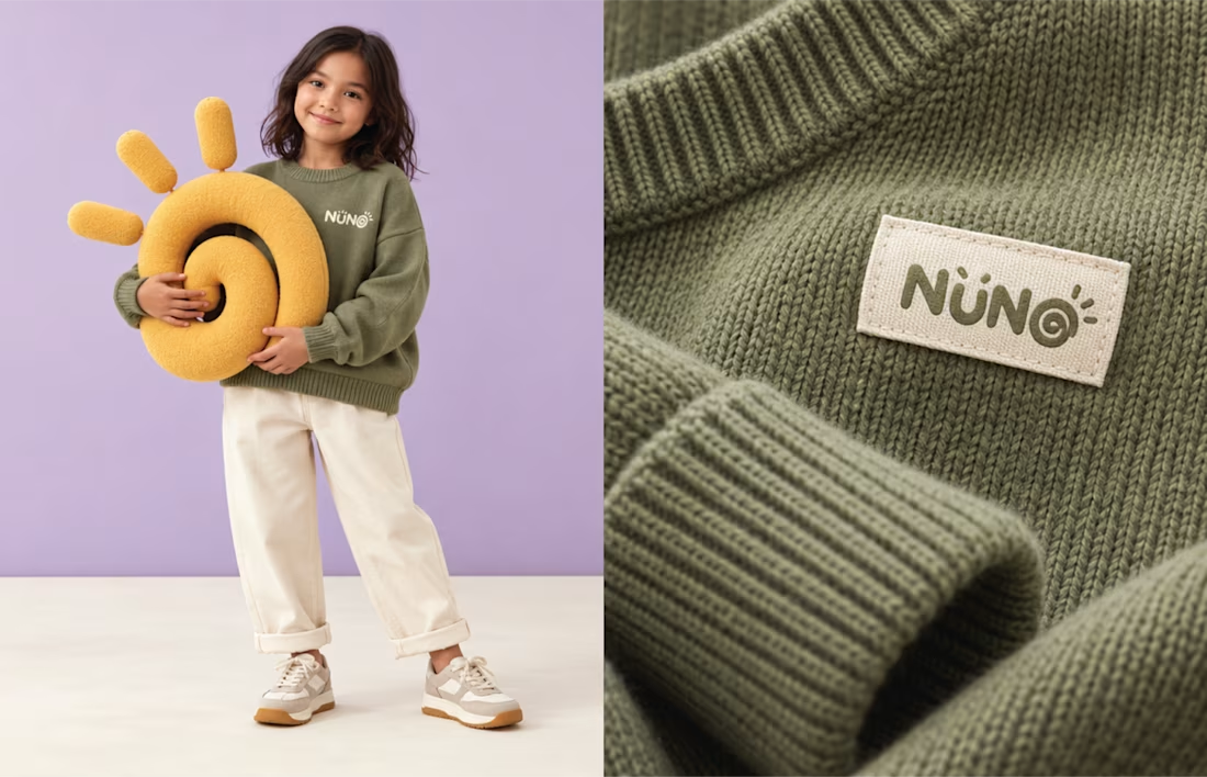
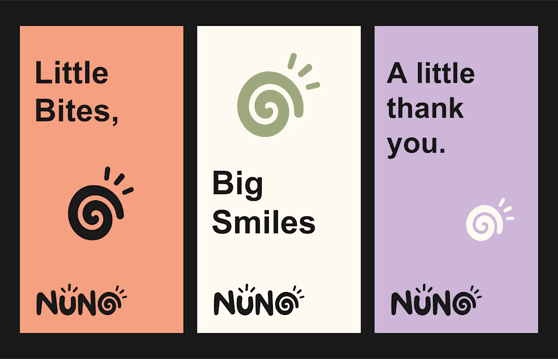
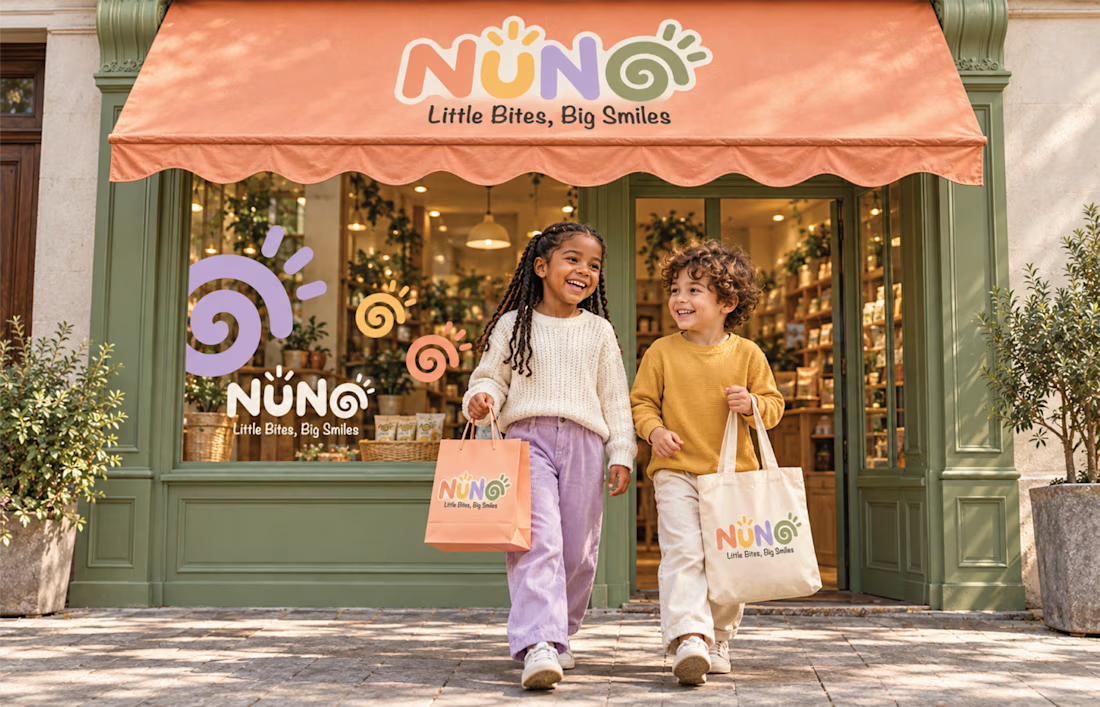
That was the challenge behind NUNO, a playful kids brand identity built on one line: Little Bites, Big Smiles.
The decisions that shaped it:
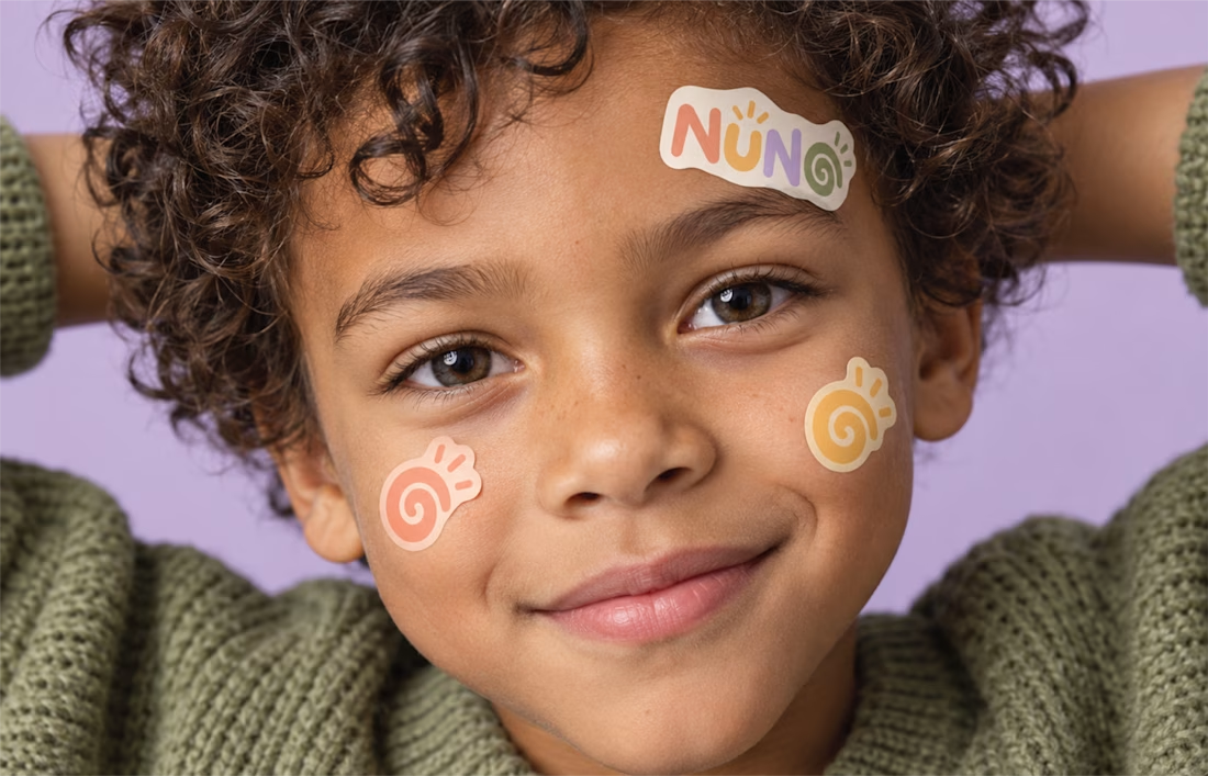
The wordmark carries a spiral inside the final O. That spiral became the hardest working element in the system, repeating across stickers, patterns, labels and packaging.
The palette is warm pastels: peach, mustard, lilac and olive. Soft enough to feel safe to parents, bright enough to hold a child's attention on a crowded shelf.
And it was built as a system, not a logo. The same identity runs across snack packaging, shopping bags, stationery and the storefront, so the brand reads as one everywhere a family meets it.
Designers, when you build a kids brand, what do you protect first: the playfulness, or the consistency? Genuinely curious how others balance the two.
#KidsBranding #BrandIdentity #PackagingDesign #LogoDesign #BrandDesigner



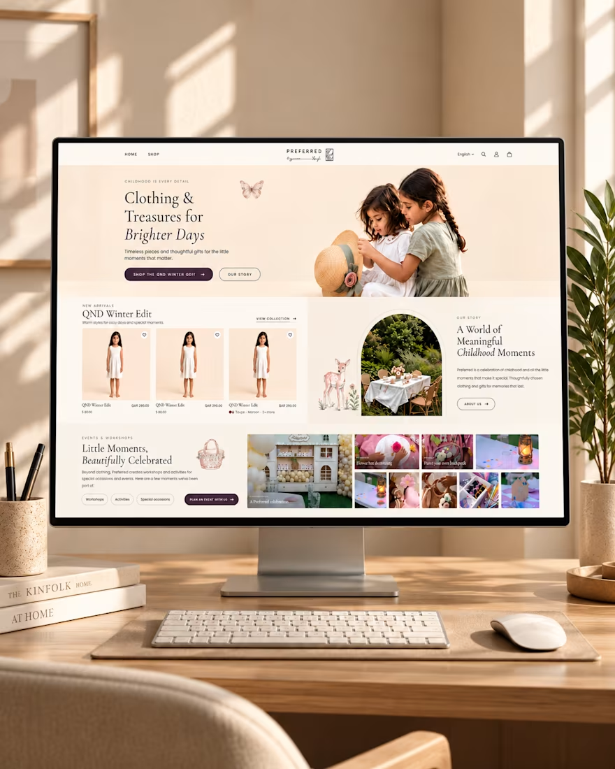
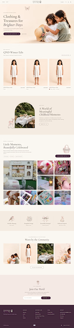
✨ Designing Digital Experiences That Feel Like Childhood.
Introducing my homepage design concept for Preferred — a children's clothing and lifestyle brand built around meaningful moments, thoughtful gifts, and timeless style.
From the warm color palette and elegant typography to the seasonal product collections and childhood event showcases, every section is designed to create a welcoming shopping experience that connects with parents and celebrates childhood.
The goal? Combine beautiful design with intuitive navigation to make discovering products feel effortless.
💻 What do you think of this design?
#WebDesign #UIDesign #UXDesign #EcommerceDesign #ShopifyDesign #WebDesigner

THIS IS LOOKING STUNNING