The network for creativity
Join 1.25M professional creatives like you
Connect with clients, get discovered, and run your business 100% commission-free
Creatives on Contra have earned over $150M and we are just getting started
Back to feedPost

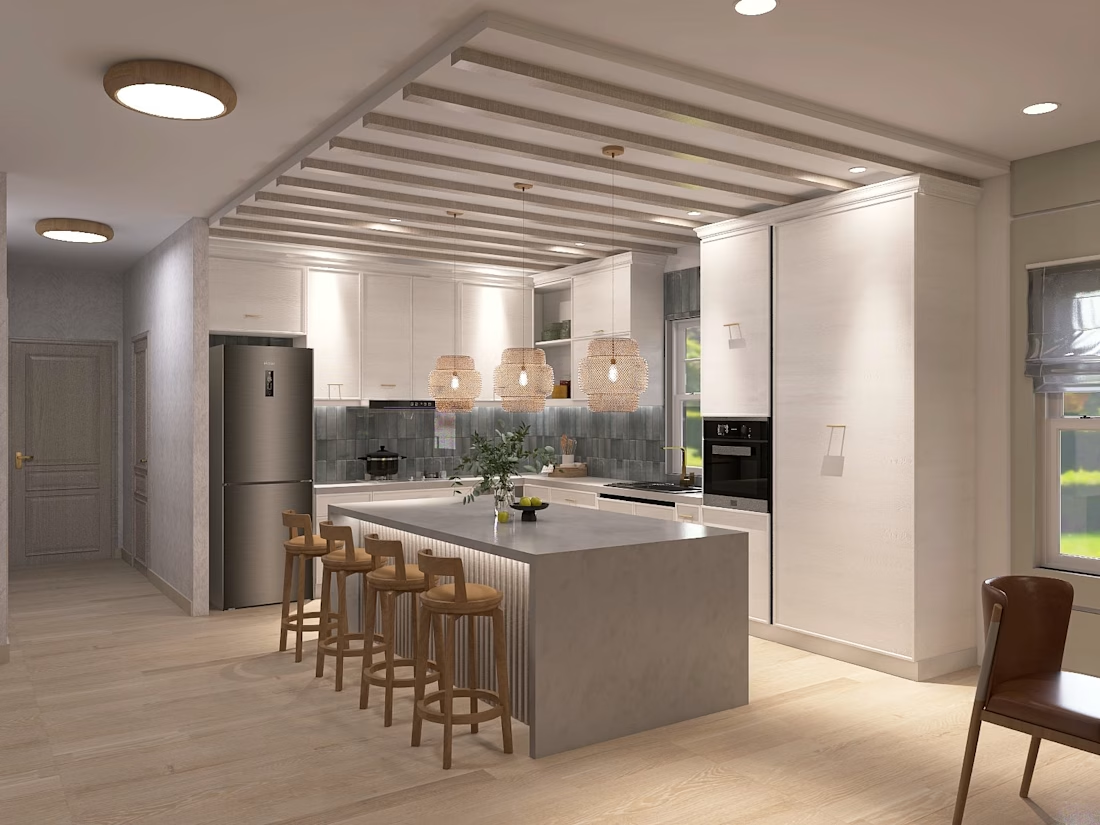
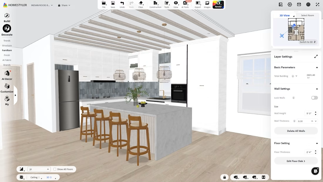
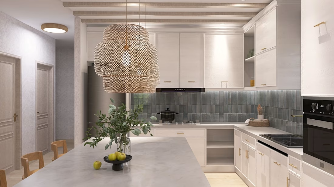
Part of the project I'm working on for an Airbnb hotel in Florida. Very happy with the results, although there are still many things to refine and improve. 👩🏽💻

The network for creativity
Join 1.25M professional creatives like you
Connect with clients, get discovered, and run your business 100% commission-free
Creatives on Contra have earned over $150M and we are just getting started





Related posts


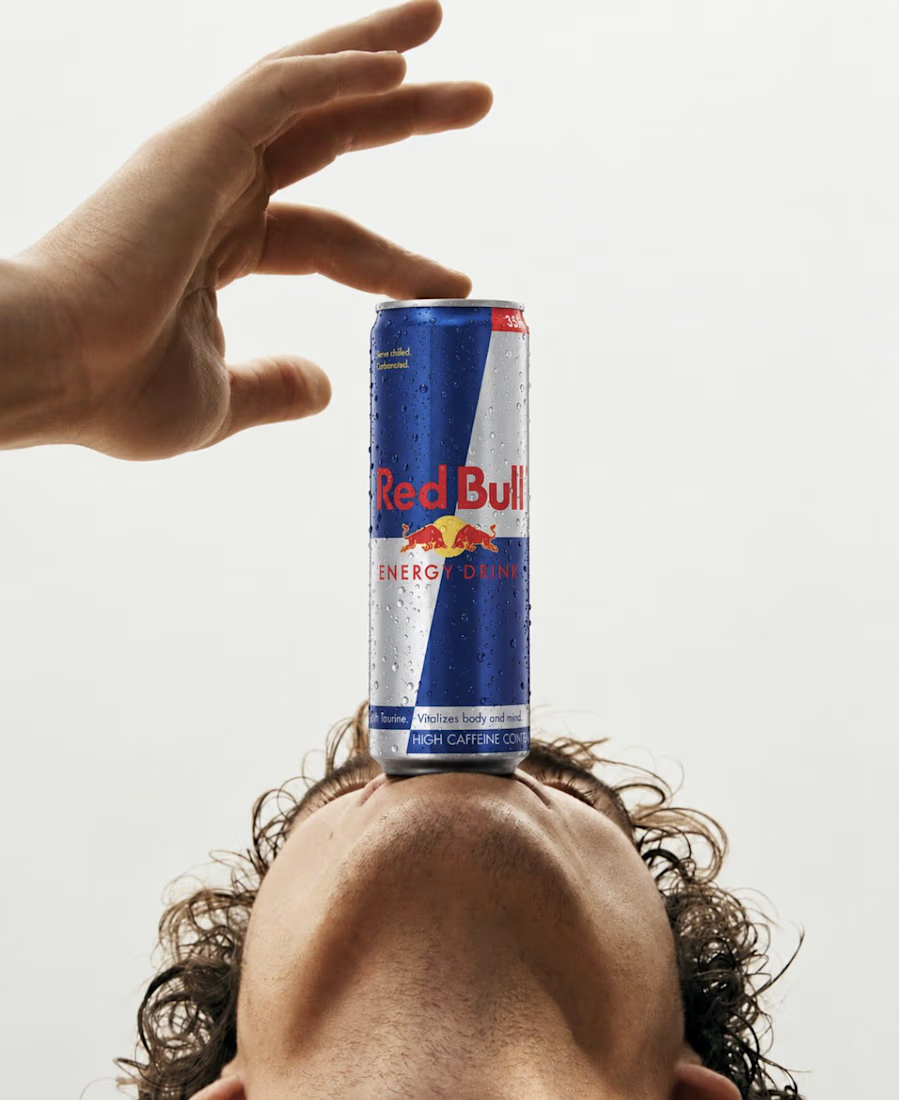
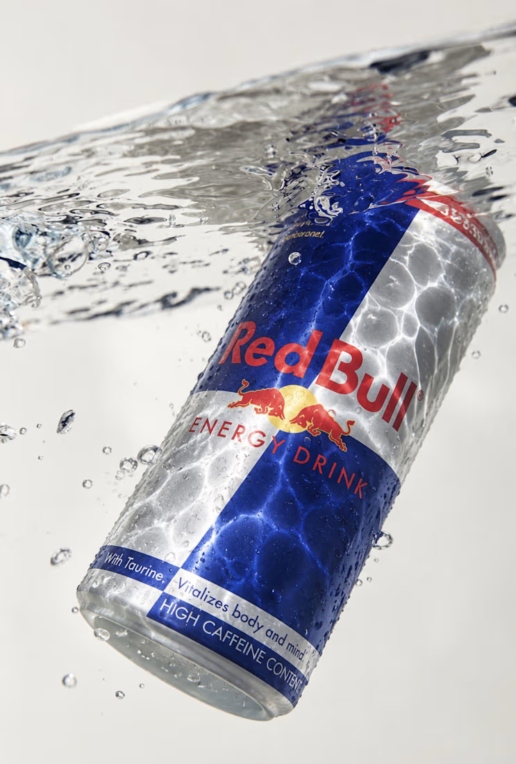

Good concept it I like how water reflected on redbull can right image is better from my opinion ❤️❤️

I wanted to make a photography website that felt more like an experience than a portfolio.
So I built CINÉRA — a cinematic photography studio website with a 3D gallery, interactive archive, real availability, and a complete booking flow.
You can explore the work, pick a date and time, add your shoot details, and get booked without the usual back-and-forth.
On the studio side, there’s a dashboard to manage bookings and inquiries, plus automatic booking confirmations to take a bit of the repetitive work off the photographer’s plate.
This was built for an appointment-based business challenge, and honestly, I had way too much fun making it.


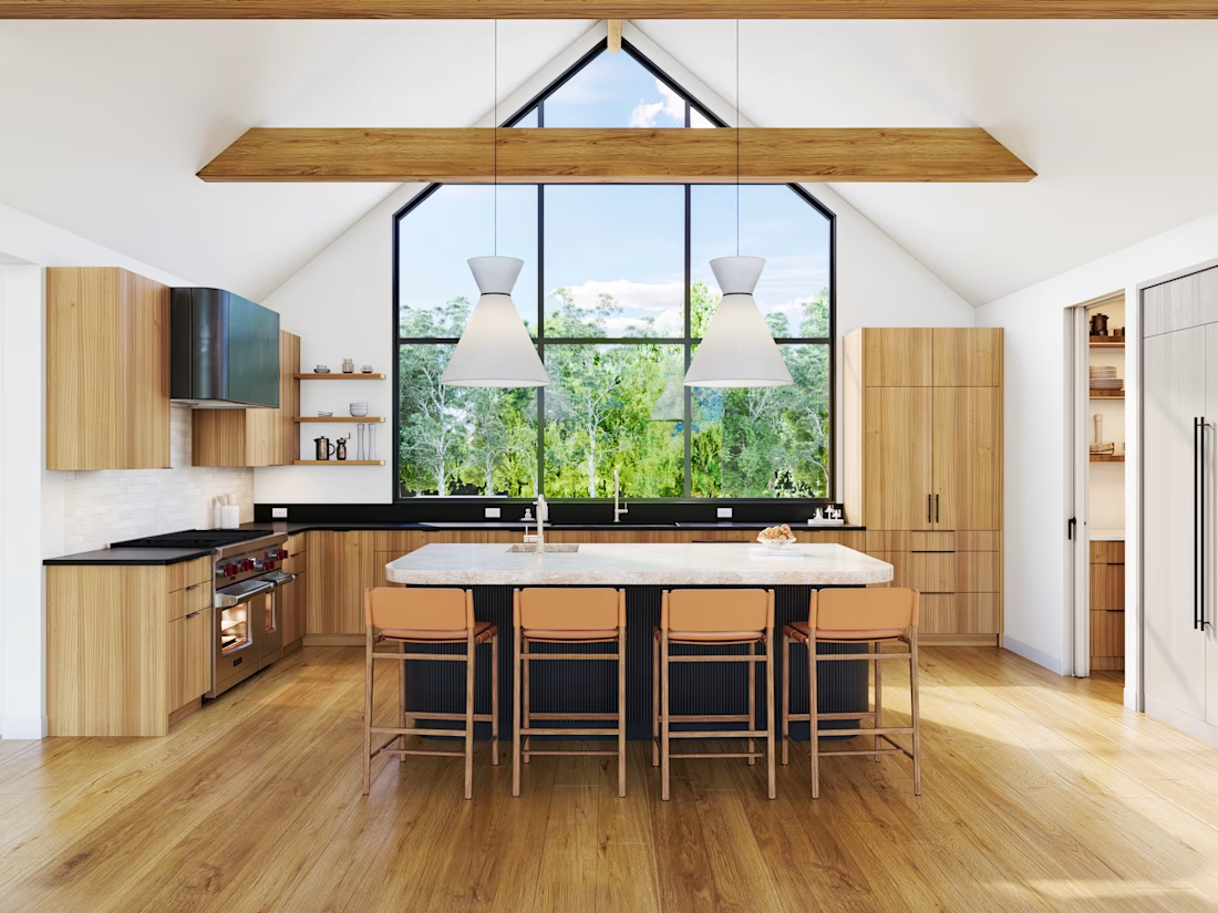
New kitchen render set is live 🏡
This one's built around a single architectural move - a soaring gable window that anchors the entire vaulted ceiling. Everything else (the island, the cabinetry, even the bar wall next door) had to support that one gesture instead of competing with it.
Full case study is in my portfolio. Which space would you spend more time in - the island or the bar wall?


Wow😍