The network for creativity
Join 1.25M professional creatives like you
Connect with clients, get discovered, and run your business 100% commission-free
Creatives on Contra have earned over $150M and we are just getting started
Back to feedPost
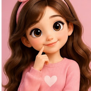
Say hi to my new style 👋💖
This is my first AI character reel!
If you want to see more videos like this,
check out my YouTube channel 💕 Link in bio!
#AICharacter #NewSeries #PinkVibes #YouTubeChannel #FirstReel #Subscribe
youtube.com
PIXELSTORIES.Ai🌼
Welcome to my AI World 🌸 Cute AI Girl | Daily Shorts | Aesthetic Vibes Watch her eat, celebrate, and be adorable 😍 New video daily! Subscribe & turn on 🔔

Really loving the direction here!

Thank you so much Sevki✨
I’m really glad you liked it. Working hard to improve with each reel ❤️
The network for creativity
Join 1.25M professional creatives like you
Connect with clients, get discovered, and run your business 100% commission-free
Creatives on Contra have earned over $150M and we are just getting started








Related posts

My Ai avatar and video demo. I am loving my Ai skills . Ai makes my work faster and seamless.
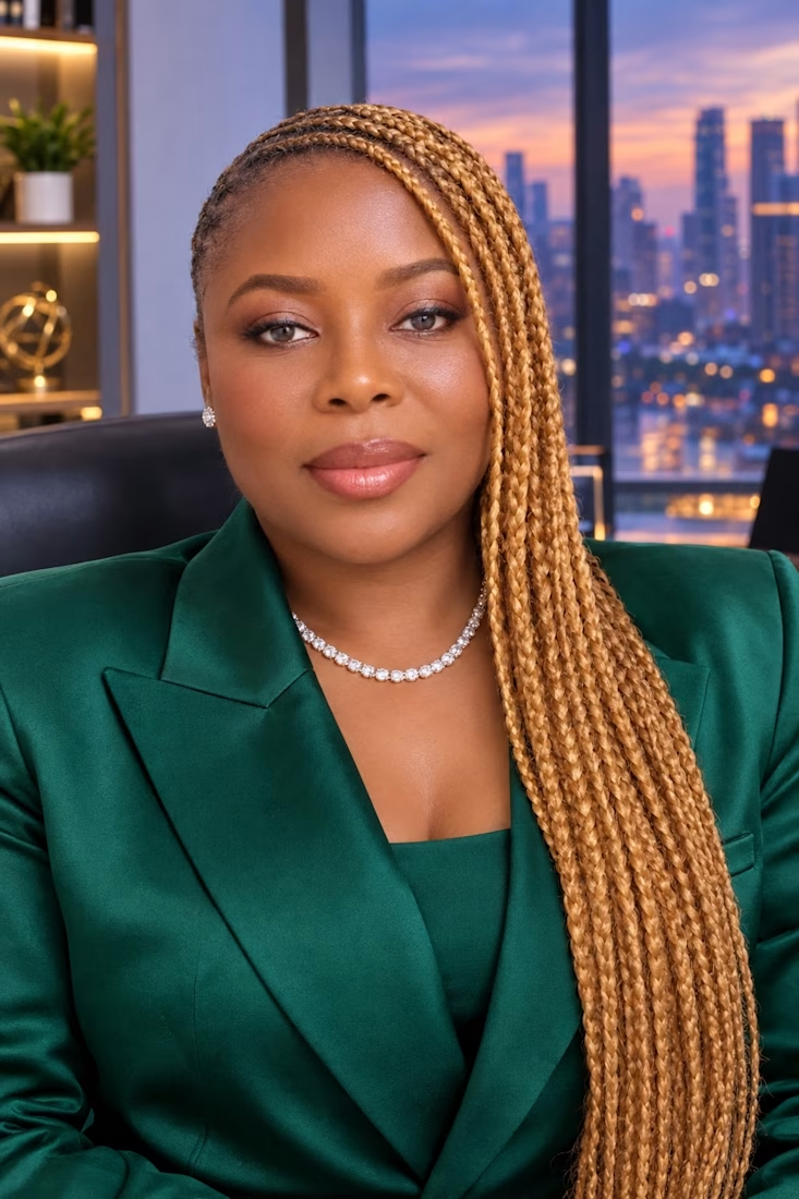

We've been having a lot of fun testing AI recently in a brand and web projects.
I'm a big believer in everything we produce is human first and AI assisted to help spin up ideas of enhance our digital presence. Behind the scenes there isn't anything we can't achieve in digital now.
With Claude 5.5, An initial brief and just a few prompts later on a logo animation and I can visualise what I want for my animators and not just have to talk them through a few slides.
Most will say do we even need to improve what claude spits out, but I notice the little things and the little things are why we are always busy.
But this unlock has huge potential for us and our clients.


Love the little petals shifting like they're saying hi. Lovely work, Alex!

AI creatives — but on-brand and true to the product ✨
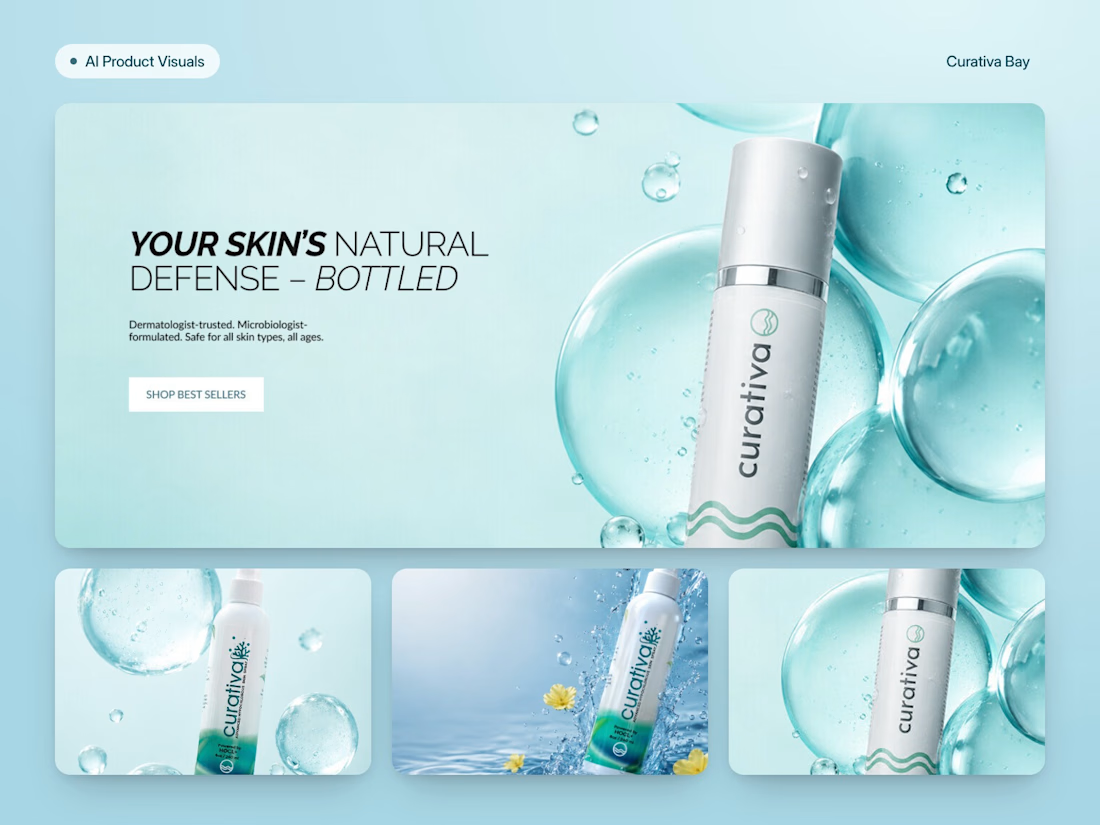
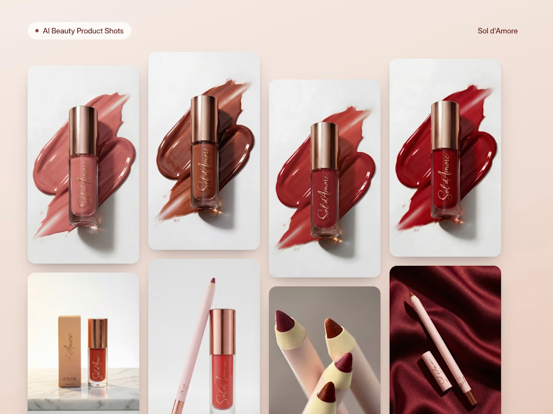
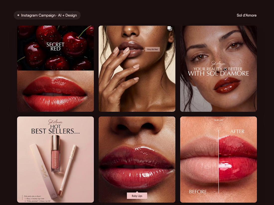
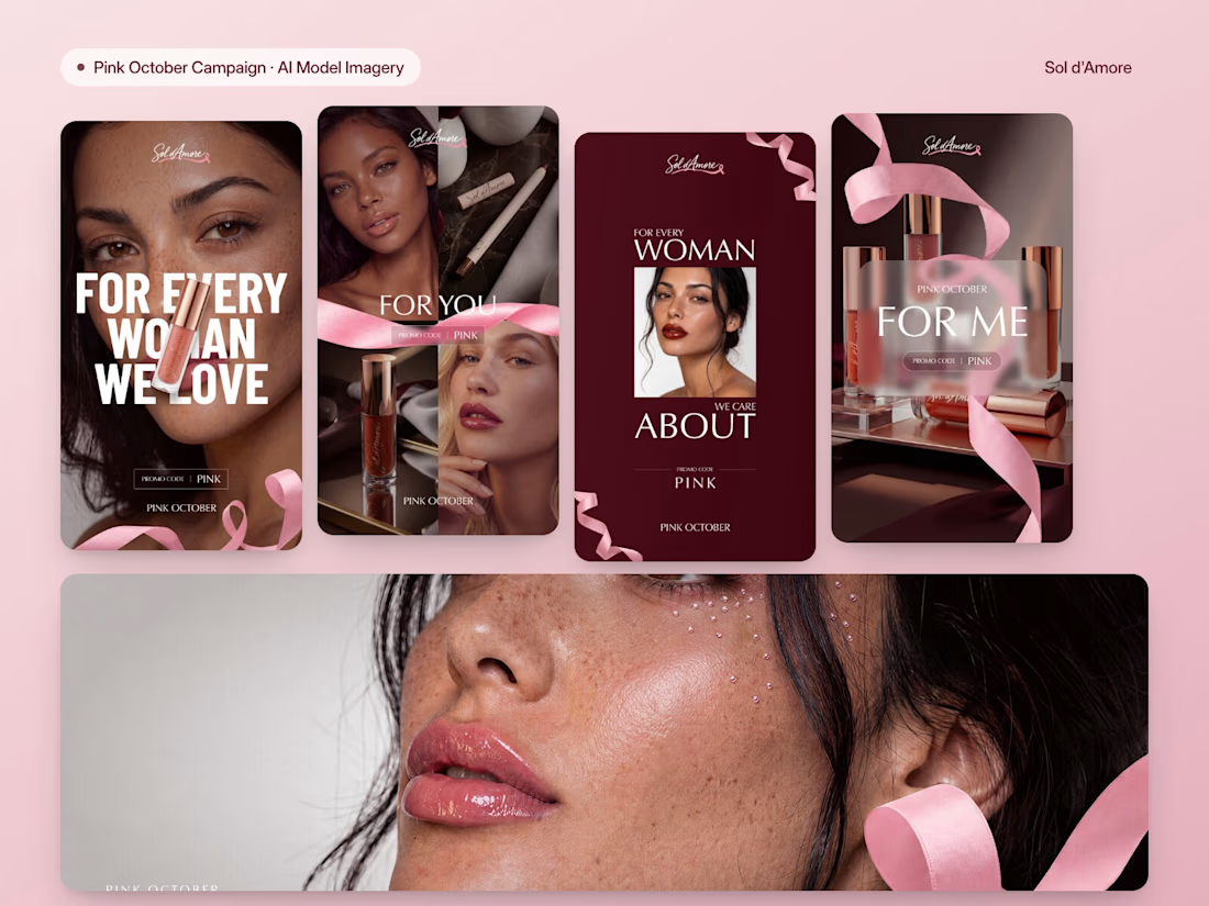
A big part of our work at The Ash Design this year: AI visuals for e-commerce brands. Not "prompt → post", but generated scenes that are art-directed, retouched and designed into real campaigns.
A few recent ones:
→ Curativa Bay (HOCl skincare): splash & bubble product scenes turned into website heroes
→ Sol d'Amore (lip cosmetics): product shots, an 8-post Instagram campaign and a Pink October campaign with AI model imagery
→ Wafaa (contracts platform): an educational IG series where AI was used only where it actually helped
Biggest lesson: the product has to stay 100% real — shades, caps, textures. AI builds the scene, design does the selling.
Open for new projects: AI product photos, models with your product, social & ad creatives. DM me 👋


Super crisp visuals and brand alignment! The lighting and textures are spot on.