The network for creativity
Join 1.25M professional creatives like you
Connect with clients, get discovered, and run your business 100% commission-free
Creatives on Contra have earned over $150M and we are just getting started
Back to feedPost

This is a simple, modern landing page for Sunnyside, a design agency.
The landing page features the work of the agency, their services and some testimonials from their clients.


The network for creativity
Join 1.25M professional creatives like you
Connect with clients, get discovered, and run your business 100% commission-free
Creatives on Contra have earned over $150M and we are just getting started



Related posts


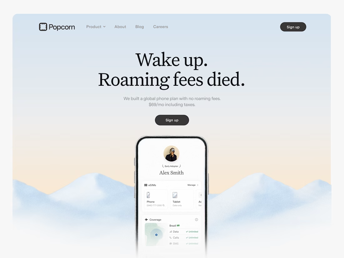

Looks great! What about readability though?
Text seems low contrast to me. Although I have a poor vision and most things seem too small and low contrast to me.


A calculator that runs by itself is a clever way to show the product without asking anyone to read. Watching a price turn into an invoice explains the value instantly.


The black diagonal stripes behind the wordmark give a coming soon page an instant gallery feel. Is there an email capture on it, or is it brand-only for now?


