The network for creativity
Join 1.25M professional creatives like you
Connect with clients, get discovered, and run your business 100% commission-free
Creatives on Contra have earned over $150M and we are just getting started
Back to feedPost

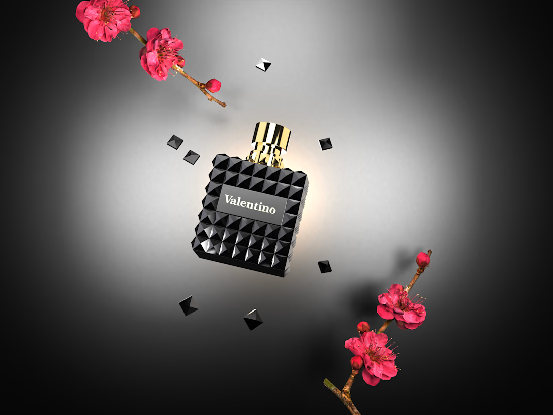
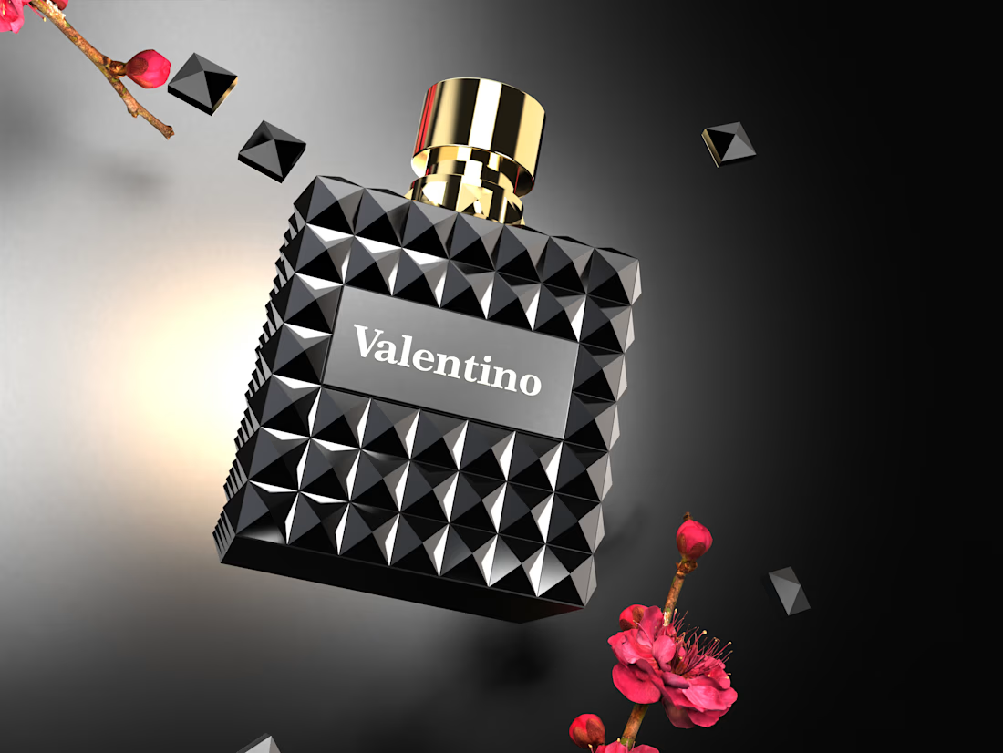
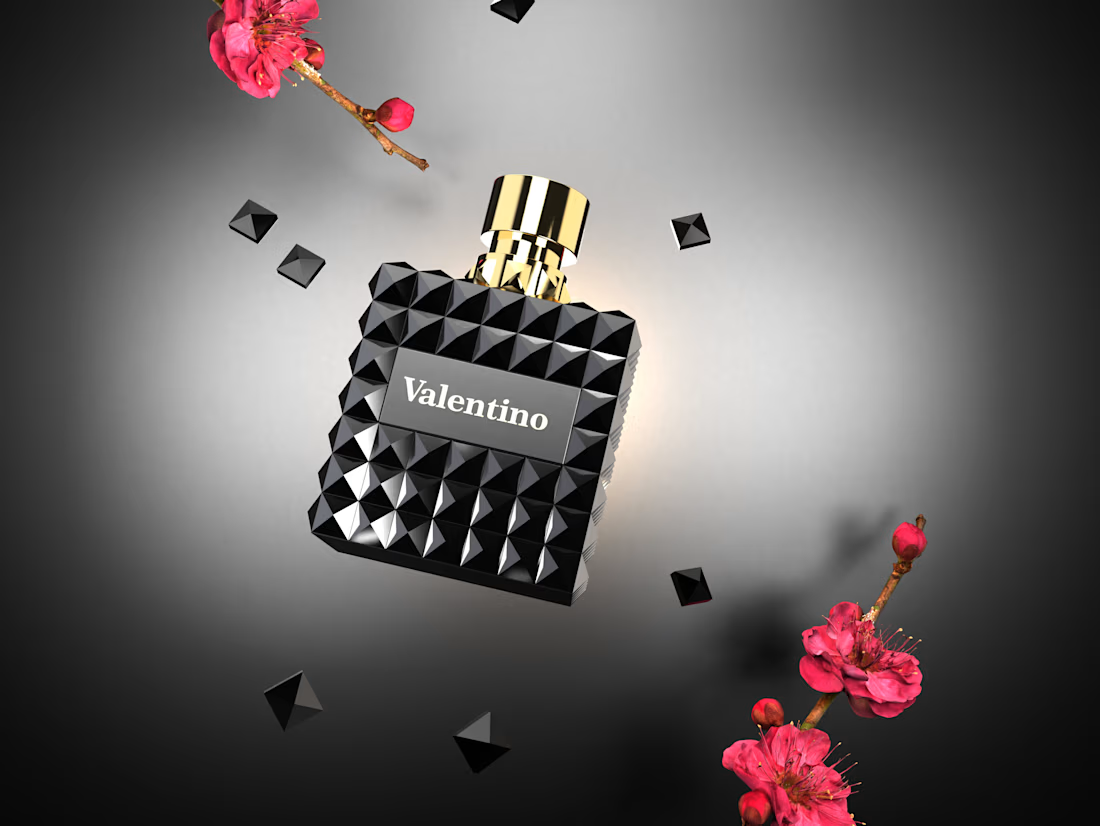
Valentino-Inspired Luxury Fragrance | 3D Product Visualization


The network for creativity
Join 1.25M professional creatives like you
Connect with clients, get discovered, and run your business 100% commission-free
Creatives on Contra have earned over $150M and we are just getting started

Challenges
View all


Related posts

Most luxury eyewear brands sell frames. Very few sell the feeling of putting them on.
Orelux was designed to close that gap. Not just with product shots but with a world. Editorial campaign photography of real people wearing real confidence. A hero that says "See the World in Style" and means it before you scroll once.
The home screen sets the tone full-bleed lifestyle imagery, an in-app try-on preview, and an "Explore Collection" CTA that earns the click.
Three sections. Every reason to buy answered before the question is asked.
This is what luxury e-commerce looks like when the design respects the product as much as the person wearing it.
Does this feel like an eyewear website that converts browsers into buyers? 👇
Designed by Orbix Studio.
Tools: Figma
#WebDesign #LuxuryDesign #EcommerceUI #UIDesign #ContraFreelance #ProductDesign #FashionDesign #LandingPage


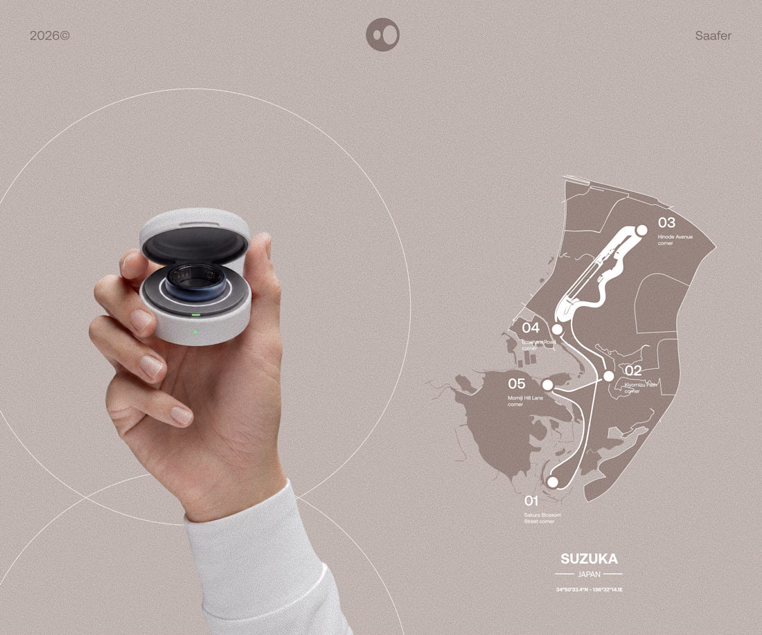
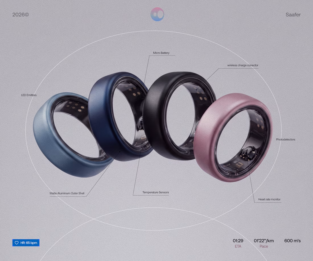
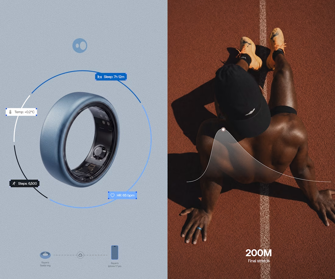
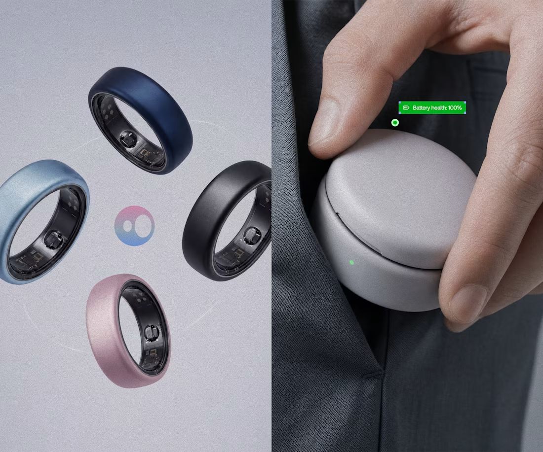
Model rendering and branding done for Saafer's smart ring (Health tech)



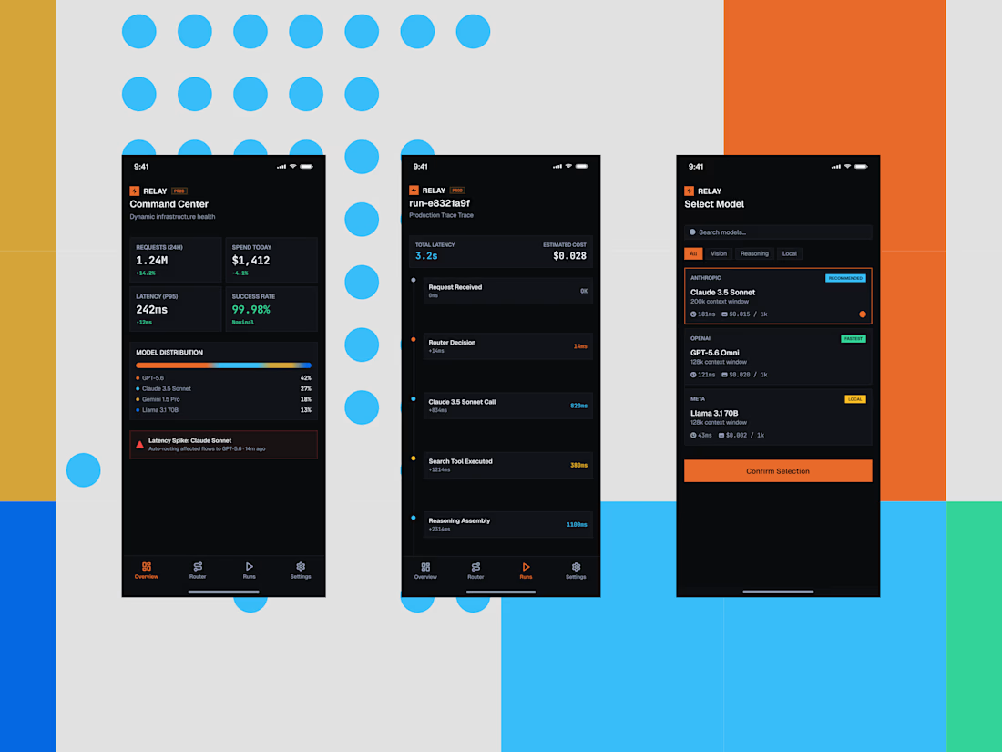
Some quick mockups for Relay, an AI infrastructure platform concept built around model routing, observability, and performance.
Exploring what a mobile command center could look like for teams managing multiple AI models, with a focus on clear data, fast decisions, and a developer-first UX.
Product design, mobile UI, AI tools, and a little systems thinking all in one.




the blue dots and orange blocks pop. did you build this in Framer?