The network for creativity
Join 1.25M professional creatives like you
Connect with clients, get discovered, and run your business 100% commission-free
Creatives on Contra have earned over $150M and we are just getting started
Back to feedPost
A fitness brand needed a bold and energetic identity that could stand out and motivate its audience. Their previous branding felt weak and didn’t match the high-energy nature of the business.

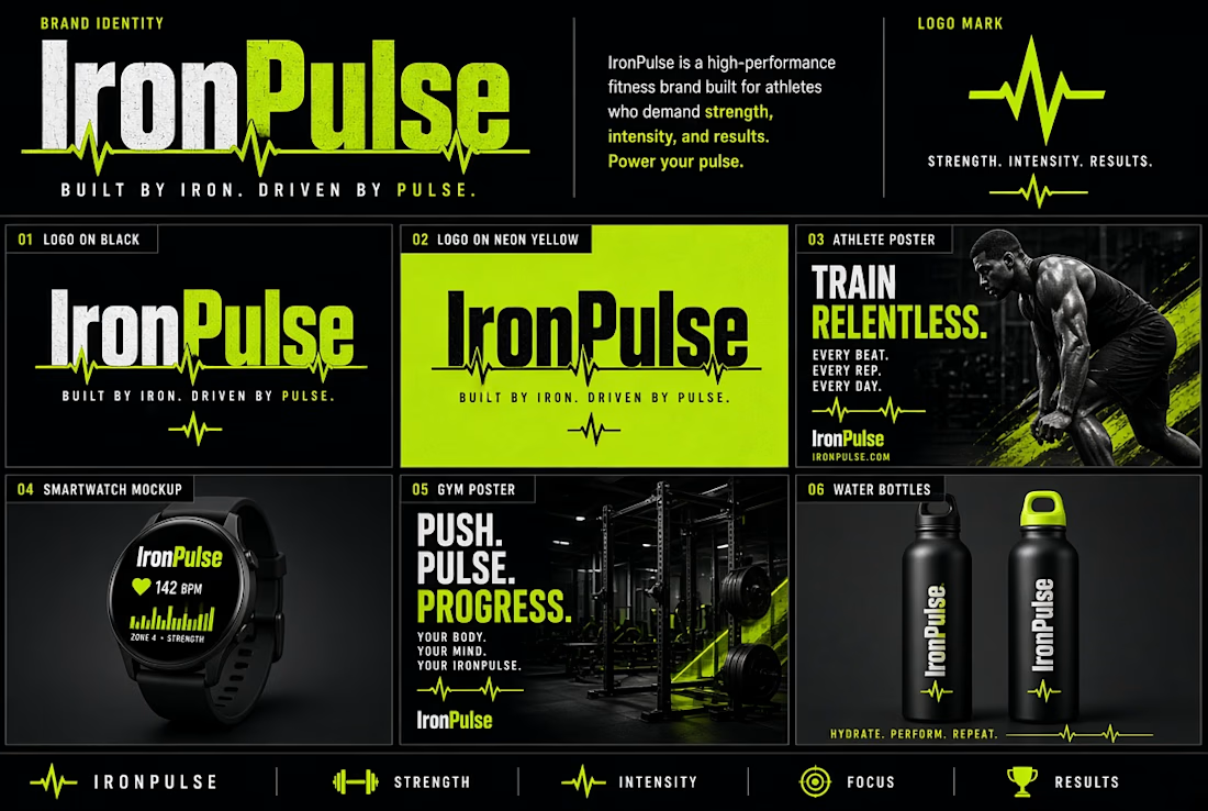
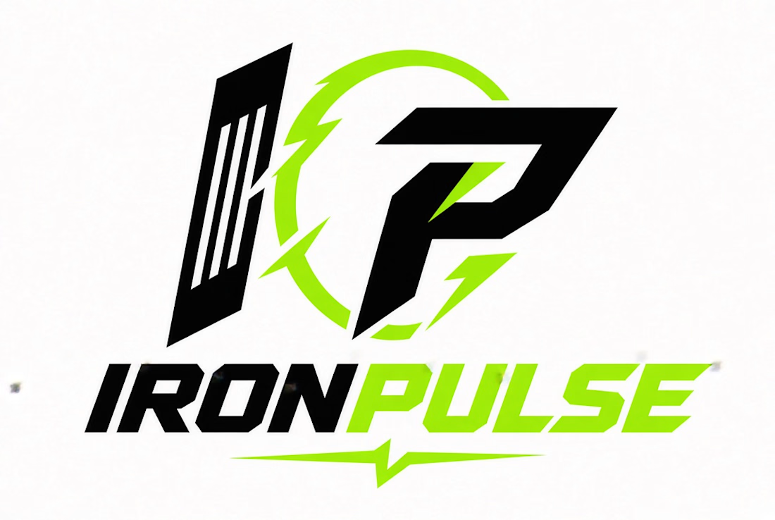

"Weak" in fitness branding usually turns out to be a contrast problem more than a typeface problem. What ended up carrying the energy for you here - the type weight, the palette, or the photography?

Thanks for the insight. You’re right — contrast plays a big role in fitness branding.
The network for creativity
Join 1.25M professional creatives like you
Connect with clients, get discovered, and run your business 100% commission-free
Creatives on Contra have earned over $150M and we are just getting started
Trending
retrofuturism
Share your favorite designs from the past exploring the distant future. Or your own take on the aesthetic 🚀
halftone
Dots. Texture. Grain. Let's see your designs using the halftone technique.

Midjourney
Creatives are showing off what they're making with Midjourney.
colorgrade
Video editors sound off: How do you enhance the mood of your video in color grading?


Related posts

The mark behind ASTRAL.
Probably one of our favorite details from the whole project.


This is underrated, looks very cool!

Hi,
This project was one of my favorites!
It's an experimental cuisine based on hydroponic plants.
A combination of science and technology! 🙌
Throughout the brand image, I make sure everything stays organized and clean.
Let me know what you think!


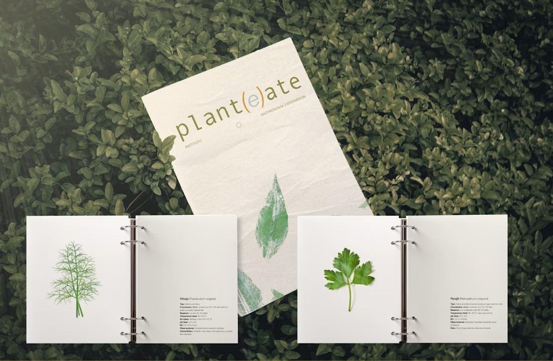
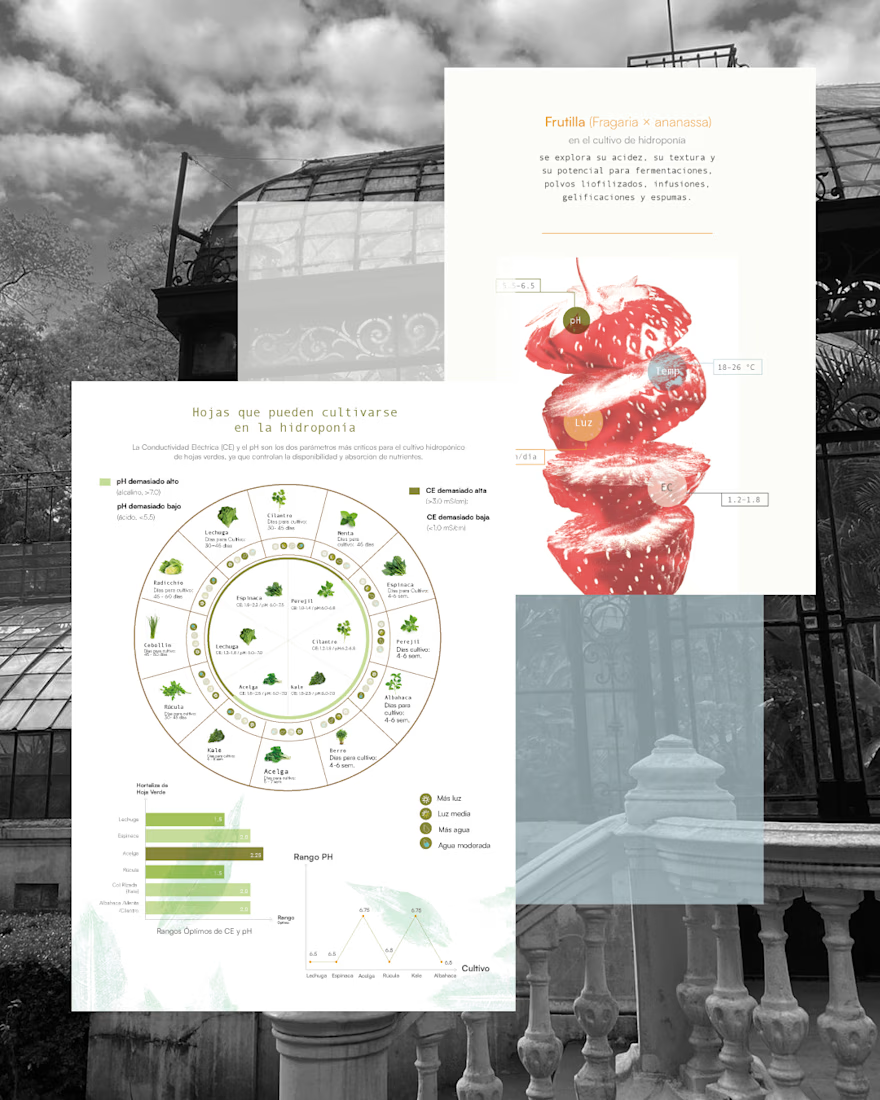
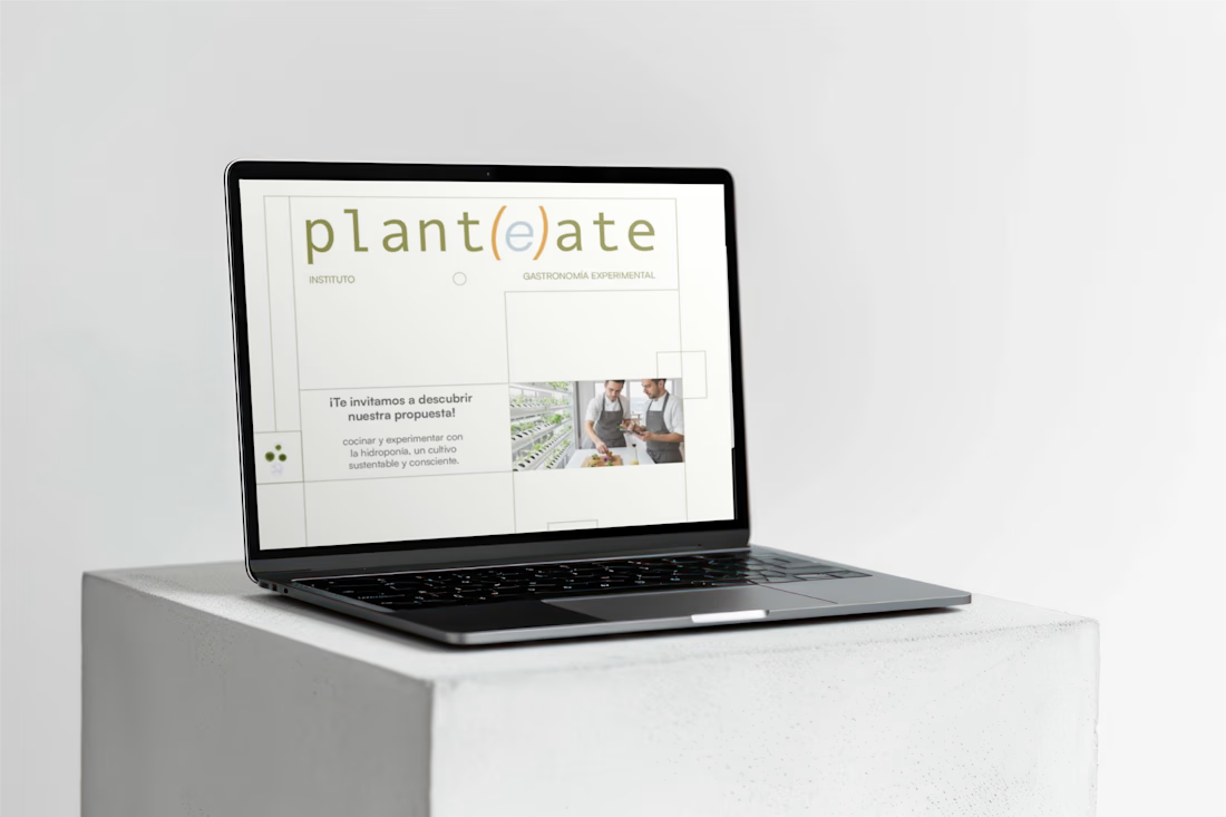
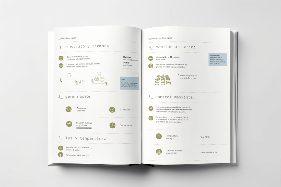

Experimental cuisine built around hydroponics is such a specific and compelling concept. Science meets food culture. The clean organized brand approach fits it perfectly.

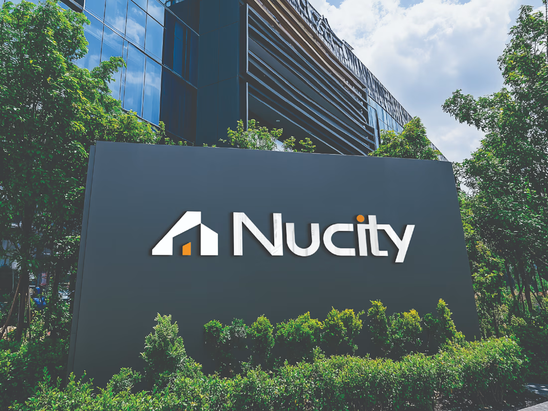
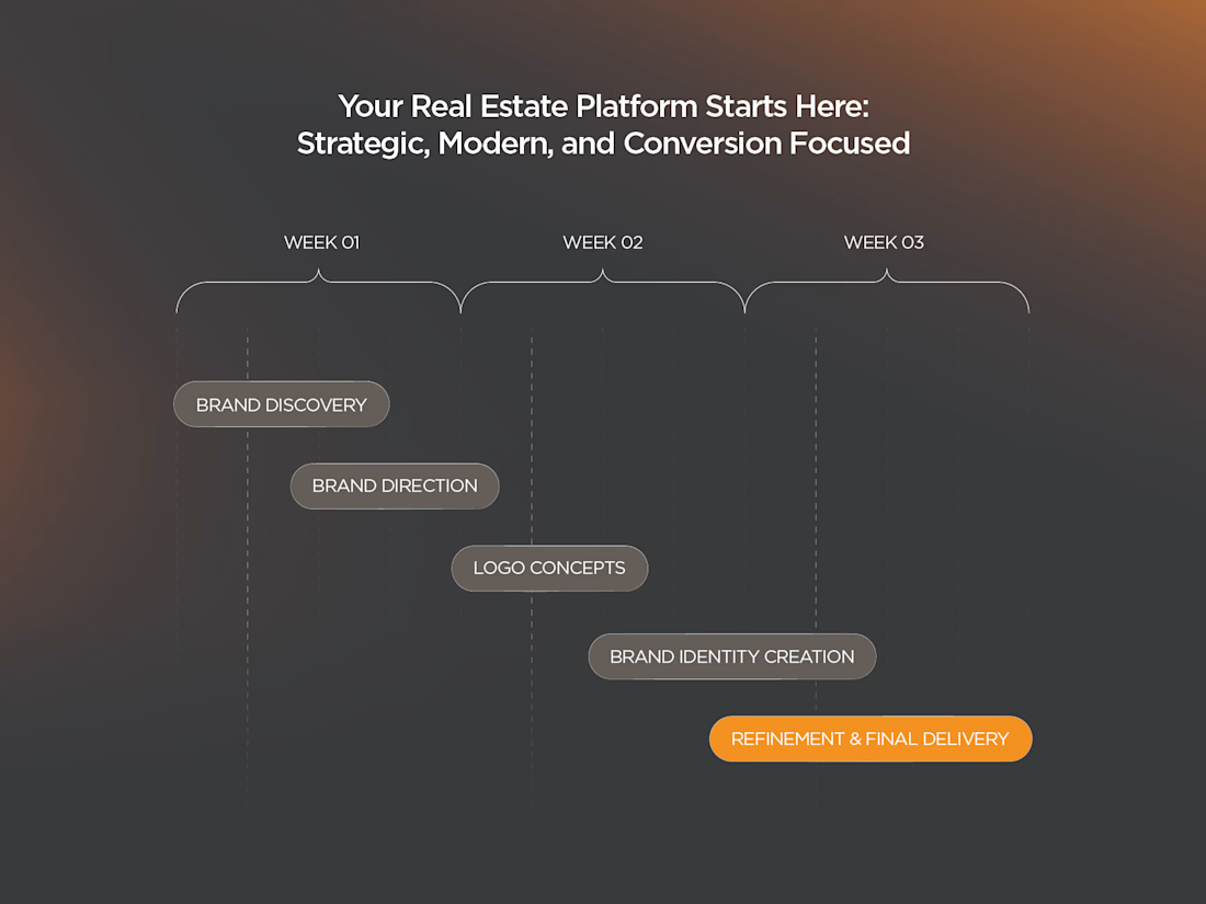
Nucity is a modern real estate brand built around urban living, trust, and long-term investment value. The goal was to create a premium, recognizable, and scalable identity for both digital and physical touchpoints.
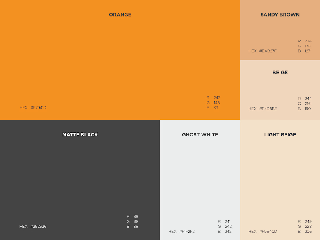
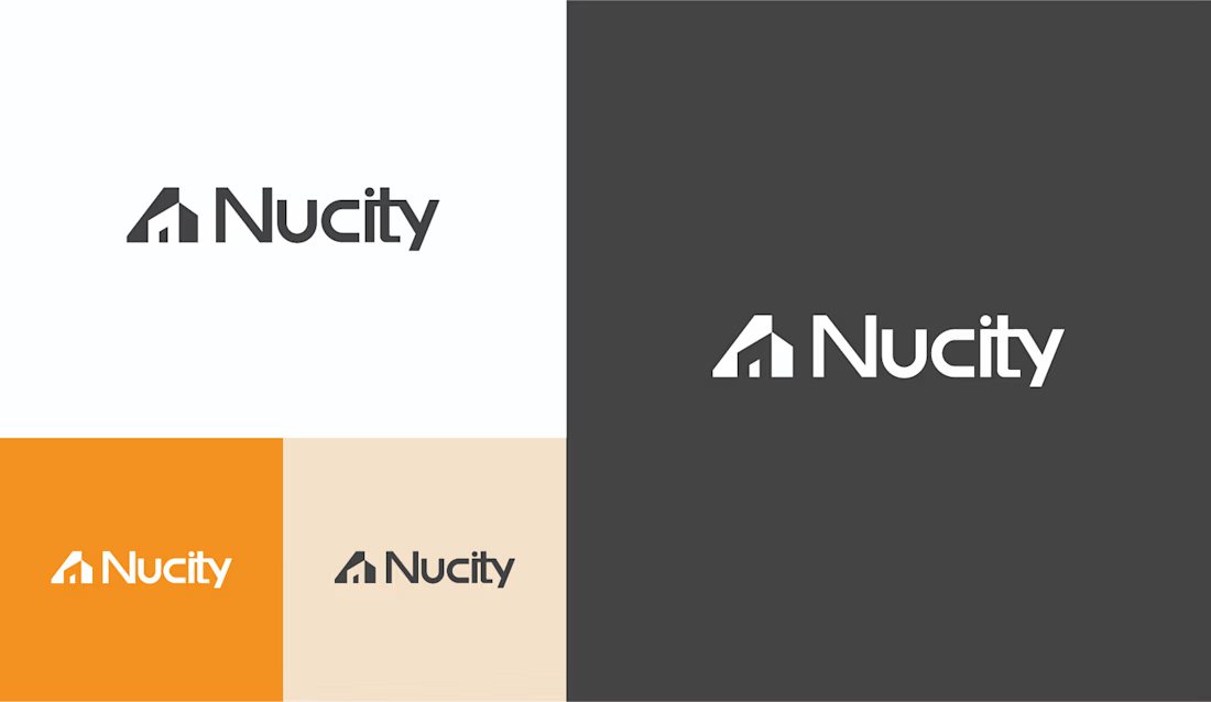
I designed a clean, architecture-inspired logo system with a refined visual direction, using warm orange and neutral tones to balance confidence with approachability. Paired with modern typography, the final identity works seamlessly across presentations, marketing materials, signage, social media, and real estate communications.