The network for creativity
Join 1.25M professional creatives like you
Connect with clients, get discovered, and run your business 100% commission-free
Creatives on Contra have earned over $150M and we are just getting started
Back to feedPost

"Can you just speed up our website?"
That's how my recent audit started.
What I found: A site held together with duct tape.
Ahrefs health score: 12%
❌ 𝗧𝗵𝗲 𝗣𝗿𝗼𝗯𝗹𝗲𝗺𝘀:
#𝟭 HTML Chaos
Dozens of H1s per page. Everything was tagged wrong.
#𝟮 Style Bloat
50+ duplicate classes. "H2", "H2 New", "H2 New Copy"...
#𝟯 No Components
The client couldn't duplicate pages. IX2 broke. Zapier failed.
#𝟰 Image Nightmare
Unoptimized PNGs. No alt text. The same images are uploaded repeatedly.
✅ 𝗧𝗵𝗲 𝗙𝗶𝘅:
→ Proper HTML structure
→ Design system
→ Component library
→ Image optimization
✅ 𝗥𝗲𝘀𝘂𝗹𝘁 (𝗮𝗻𝗱 𝘄𝗲'𝗿𝗲 𝘀𝘁𝗶𝗹𝗹 𝗴𝗼𝗶𝗻𝗴):
12% → 70% health score
Pages duplicate in minutes
Load time cut in half
Fix the foundation. Everything else follows.
[continued in comments 👇]
#webflow #seo #webdevelopment

This wasn't about speed. It was about architecture.
A few important notes:
Ahrefs/PageSpeed context:
I show these scores because they're easy to visualize progress, but they're not my main metric. Real audits evaluate performance, accessibility, UX, conversions, and business...

Obviously, such actions lead to a significant slowdown in page loading.
The network for creativity
Join 1.25M professional creatives like you
Connect with clients, get discovered, and run your business 100% commission-free
Creatives on Contra have earned over $150M and we are just getting started



Related posts


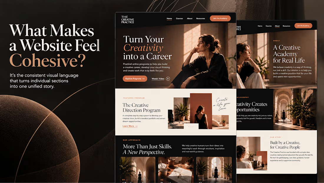
What makes a website feel cohesive?
It’s not just the colors.
It’s not just the typography.
And it’s definitely not about making every section look the same.
A cohesive website is built when every visual decision feels like part of the same story, from typography and imagery to spacing, buttons, cards, and even the smallest details.
The goal isn’t repetition.
It’s creating a visual language that people recognize and remember.
That’s when a website starts to feel like a brand, not just a collection of sections.

Well put, Serge. Consistent spacing, buttons and cards do more for that feeling than making sections match, and they are usually the first things to drift as a site grows.

Halden - Landing Page Concepts
Halden sells to grid operators, and there were two good ways to pitch it: tell them what's coming, or show them everything happening now. Rather than pick one on instinct, I designed the landing page as an A/B test so real traffic decides.
The two pages share one 12-column grid, the same section order, type system and components. Each variant changes only its message, its hero visual and its light color, so any difference in demo requests comes from the pitch and not the layout.
The work was building a system flexible enough to carry two different stories without either one feeling like the backup version.
Forecasting (act before demand spikes) vs metering (see and bill every kilowatt)
Primary metric: Demo requests from the hero CTA
4 voted
57%
3 voted
43%
7 votes
Closed

I'd pick Forecasting. "From meter reading to early action" tells a grid operator what they get in one line. Did you write both hero lines before designing the visuals?

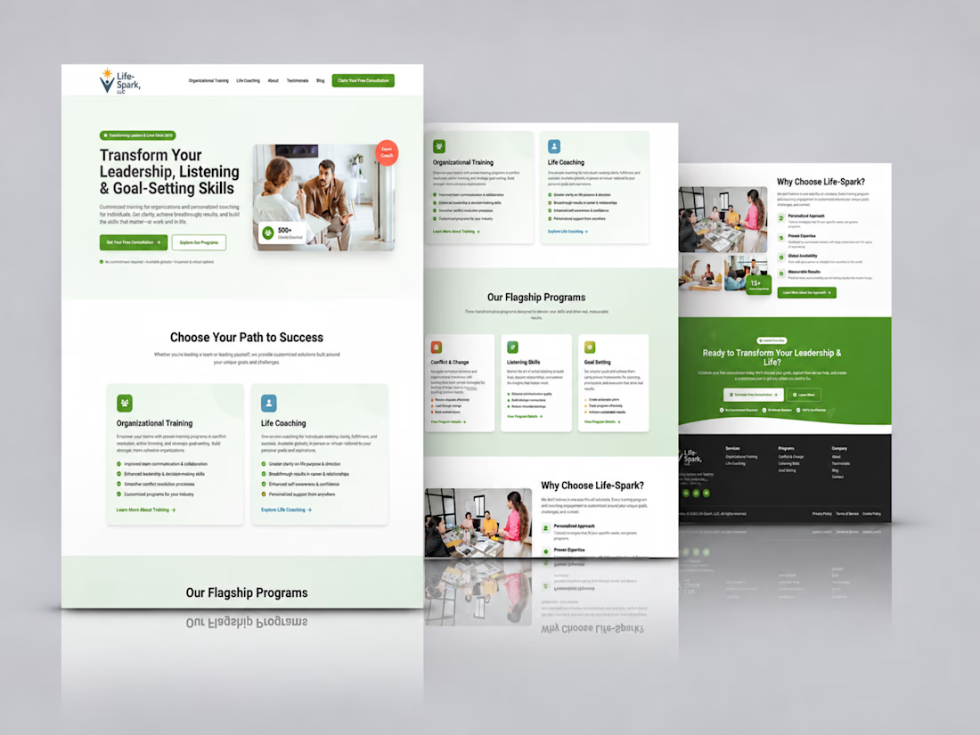
Kajabi Life Coach Website Design & Development
The client needed a professional website that would communicate their life coaching services more effectively, build trust with potential clients, and make it easier for visitors to understand their coaching approach and take the next step.
I helped bring this vision to life by designing and developing a Kajabi website with a welcoming visual direction, clear content structure, and intuitive navigation. The focus was on presenting the coaching services in a more engaging way, creating a smoother visitor experience, and making it easier for prospective clients to connect with the coach and explore available opportunities for personal growth.
#Kajabi #KajabiWebsiteDesign #KajabiExpert #LifeCoach #LifeCoaching #LifeCoachWebsite #CoachingWebsite #PersonalDevelopment #PersonalGrowth #CoachingBusiness #WebsiteDesign #WebsiteDevelopment #WebDesign #ResponsiveWebDesign #OnlineCoaching #BusinessWebsite #UXDesign #UIUXDesign


Love how clean and intentional everything feels.