The network for creativity
Join 1.25M professional creatives like you
Connect with clients, get discovered, and run your business 100% commission-free
Creatives on Contra have earned over $150M and we are just getting started
Back to feedPost
FrameOrbit — Config Makeathon Submission 📸🌀
Sharing second project for the Config Makeathon: FrameOrbit.
https://cedar-thaw-04755246.figma.site/
Project published to the community.
FrameOrbit is a playful camera canvas experience where taking photos feels more spatial, visual, and alive.
The idea started from a simple question:
What if captured photos didn’t disappear into a hidden gallery, but stayed around your camera as part of the experience?
In FrameOrbit, the camera view sits in the center of a soft canvas. Every time the user captures a photo, it instantly appears as a framed image around the camera. As more photos are taken, the canvas starts to build a visual orbit of moments around the live camera view.
Users can:
Capture photos directly from the center camera frame
See each image appear instantly around the canvas
Apply different photo styles like Normal, Noir, Warm, Cool, Vivid, Fade, Retro, and Neon
Drag photos around the canvas
Tap any photo to open it in a cinematic full-screen viewer
Move between images using previous/next navigation
Save all captured images or reset the canvas
The goal was to make photo capturing feel less like a utility and more like a small creative ritual, a live memory board that grows with every shot.
Built with Figma Make, I focused on creating a polished interactive prototype with a soft visual system, floating photo cards, smooth viewer experience, and a simple flow that can be understood in seconds:
Capture → frame appears → build your orbit → explore your moments.
FrameOrbit turns the camera into a canvas. ✨
#ConfigMakeathon #FigmaMake #FrameOrbit #ProductDesign #UXDesign #UIDesign #CreativeTools #CameraApp #Prototype #Makeathon


The color palette strip right there on the capture screen is a sharp move. Keeps the creative decision in the moment instead of sending people to an edit screen after. What inspired the spatial framing concept?

The spatial framing concept was inspired by the idea that photos usually disappear right after we capture them , they go into a hidden gallery or camera roll.
I wanted to make capturing feel more visible and emotional, almost like building a live memory board. So instead of...


This is super fun
Thanks man! 🙌

Make sense
have fun! 🎉

Love the visual direction here. The attention to detail really stands out.
Glad you liked it!

Amazing
have fun! 🙌


That’s a cool idea! Nice way to take some photos with friends and capture fun moments 💫
yeppppppp ... also some crazy moments with colleagues in the office lol
The network for creativity
Join 1.25M professional creatives like you
Connect with clients, get discovered, and run your business 100% commission-free
Creatives on Contra have earned over $150M and we are just getting started










Related posts

Built this in Framer as a concept project. Goal was to make it feel run by ex-journalists. Choices: editorial serif (Libre Baskerville), a dark photo with one color accent, and copy that positions against blast-style PR.
Where I’m unsure: text legibility over the photo and whether the two CTAs compete. What would you change?



That's great design it feels professional I like how the background mixed with interface ❤️❤️
Great job Cheree🎉🎉

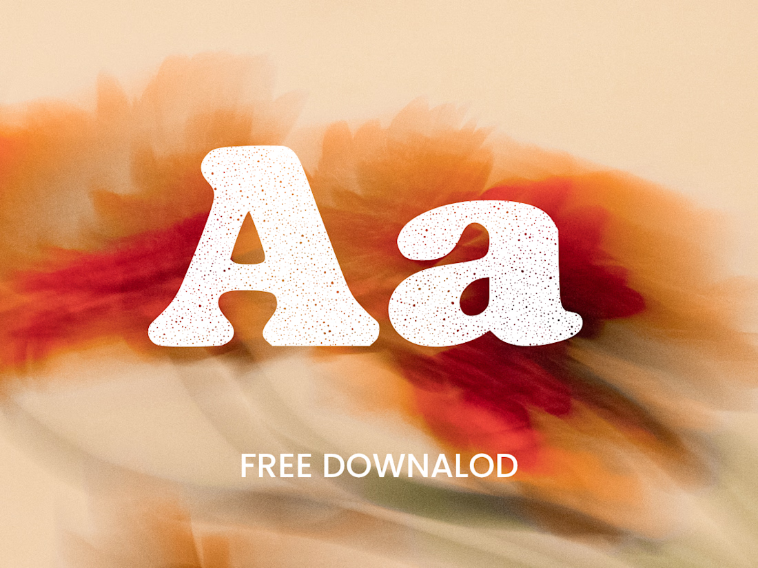
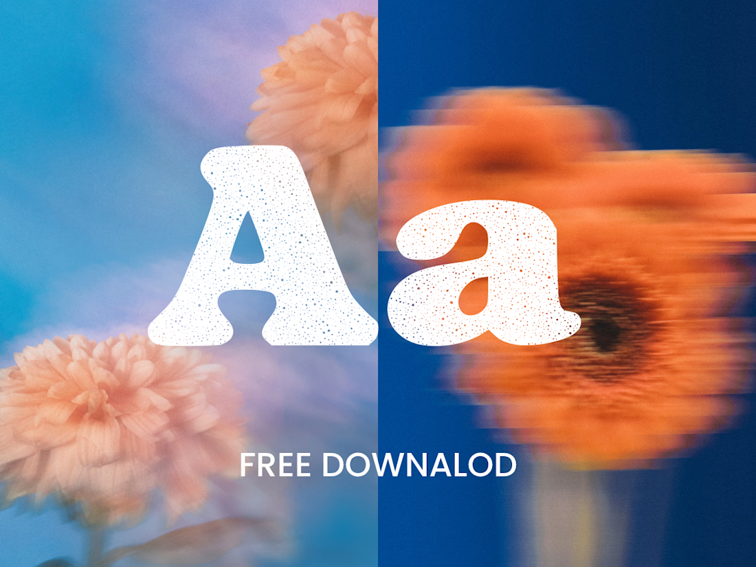
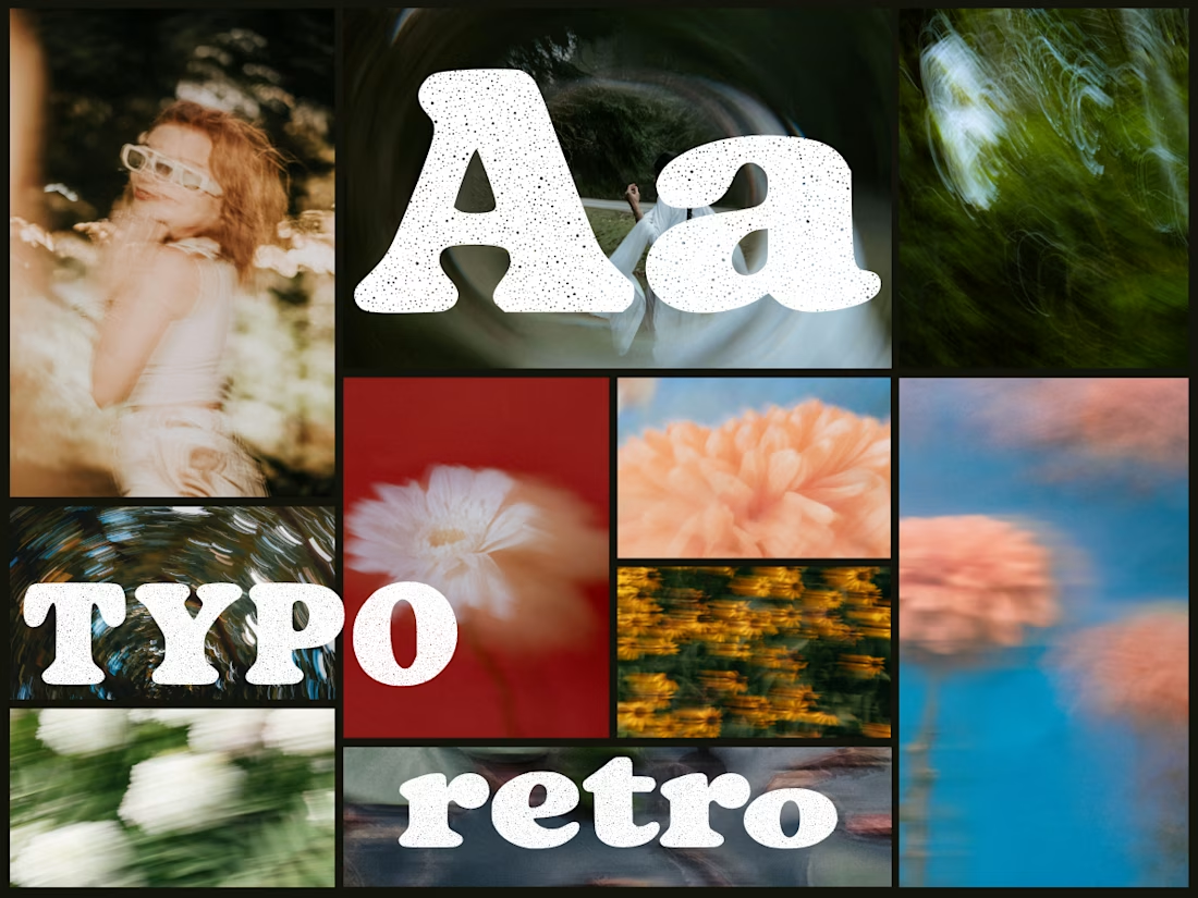
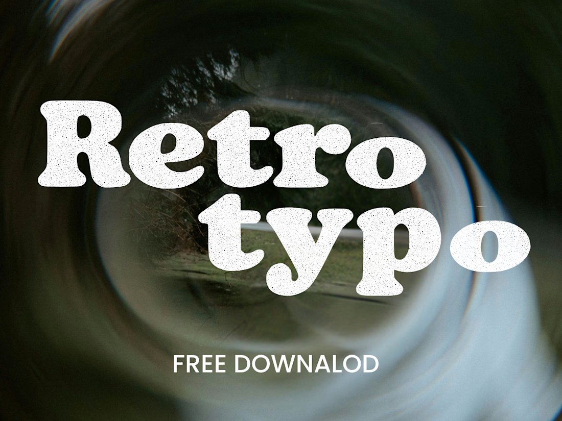
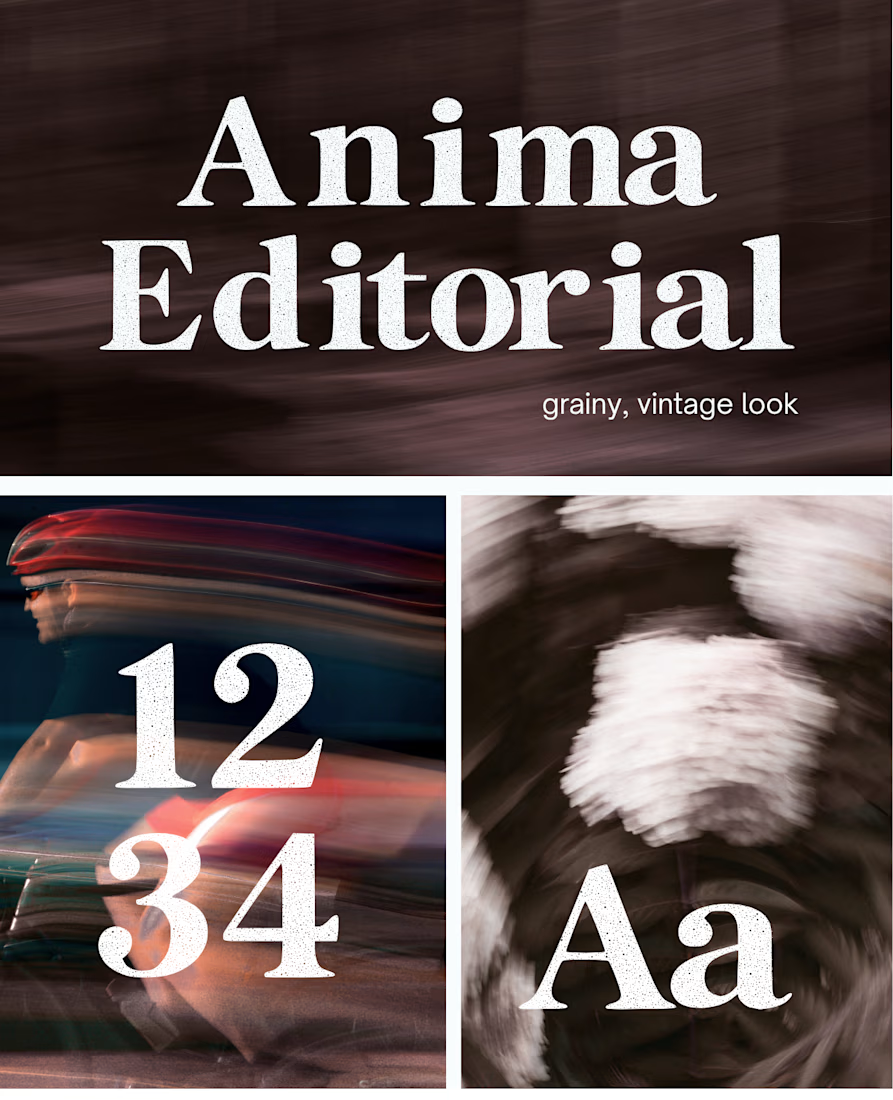
Anima is a self-initiated type design project inspired by vintage print, worn ink and analog photography.
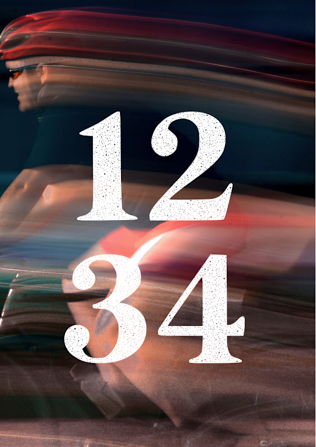
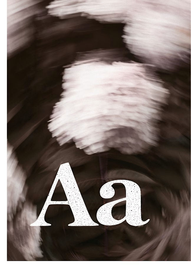
The collection includes two experimental serif typefaces: Anima Editorial, with elegant proportions and contrasting strokes, and Anima Retro, with softer, bolder shapes. Both feature grain built into the letterforms.
I developed the creative direction, custom fonts and promotional artwork, combining AI-assisted exploration with font development. The campaign pairs textured typography with motion-blurred photography to capture a warm, nostalgic mood. FREE DOWNLOAD AT https://twaperdigital.com/anima-retro


Great job Denisa the font style background and it's effects are great 🎉🎉🎉🎉
keep going Denisa🔥🔥🔥🔥
I created this font & it is free to download and use in your free or paid projects. Enjoy 🚀 find it at https://twaperdigital.com/anima-editorial


I like this font