The network for creativity
Join 1.25M professional creatives like you
Connect with clients, get discovered, and run your business 100% commission-free
Creatives on Contra have earned over $150M and we are just getting started
Back to feedPost

Club Sola - One of my favourite (and tastiest) projects I've had the pleasure of working on! 🍍🌶️


Looks amazing, Dan!
The network for creativity
Join 1.25M professional creatives like you
Connect with clients, get discovered, and run your business 100% commission-free
Creatives on Contra have earned over $150M and we are just getting started



Related posts

Behind the wall: a homepage concept for Studio Cesare
I’m testing a new landing page for my studio, made with Brik.
A pixel-brick grid covers the screen. Move through it and the bricks fall away to reveal the person behind the work, mid-coffee, slightly off balance. Then the wall closes again.
It’s a small metaphor for how I approach next-generation branding: a strong system on the surface, with a real person and a real point of view underneath.
Exploring this for the studio site launch. Open to feedback, and to new projects 🤝🏼

This is amazing!!

A modern, elegant website concept designed for J. Michaels Salon, showcasing a premium beauty and wellness experience.
The design combines sophisticated typography, warm neutral tones, golden accents, and beautiful interior imagery to create a luxurious and welcoming digital experience.
The homepage features a clean navigation system, an immersive hero section, elegant visual presentation, and a clear call-to-action that guides visitors towards exploring the salon's products and services.



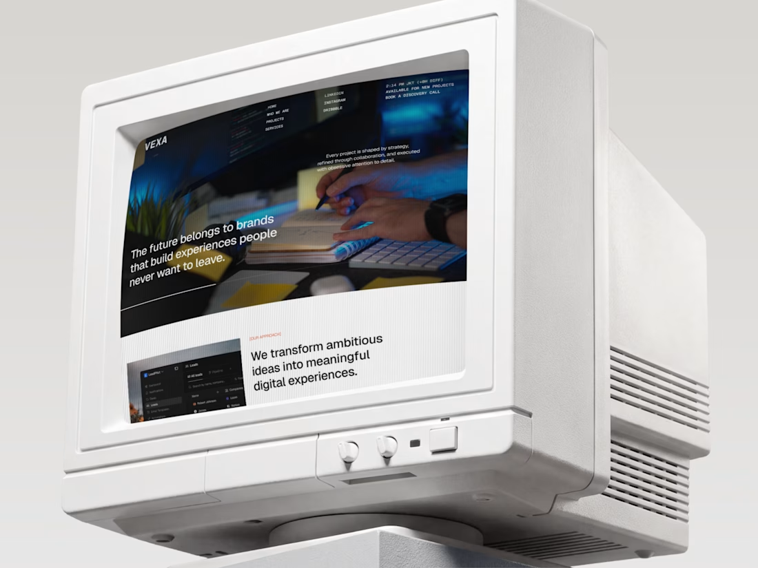
The future belongs to brands people never want to leave. 🖥️✨
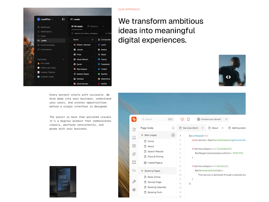
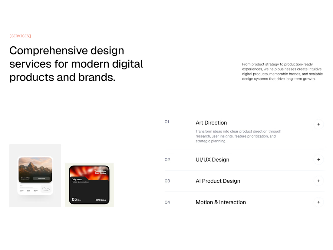
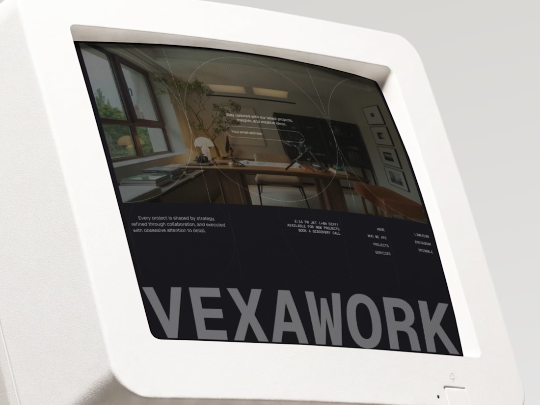
Meet Vexa, a landing page for a design studio that mixes modern UI with a nostalgic twist. Think crisp white layouts, typewriter-style details, and bold type, all shown on vintage CRT monitors that make the studio’s story feel unforgettable.
Swipe through the 4 frames to see the hero, the approach, the services, and the closing VEXAWORK screen. 👀
Retro monitors or modern devices: which would you use to show your work? Tell us in the comments! 💬👇
#UIDesign #UXDesign #WebDesign #LandingPage #DesignStudio #RetroDesign #BrandIdentity #PortfolioDesign