The network for creativity
Join 1.25M professional creatives like you
Connect with clients, get discovered, and run your business 100% commission-free
Creatives on Contra have earned over $150M and we are just getting started
Back to feedPost
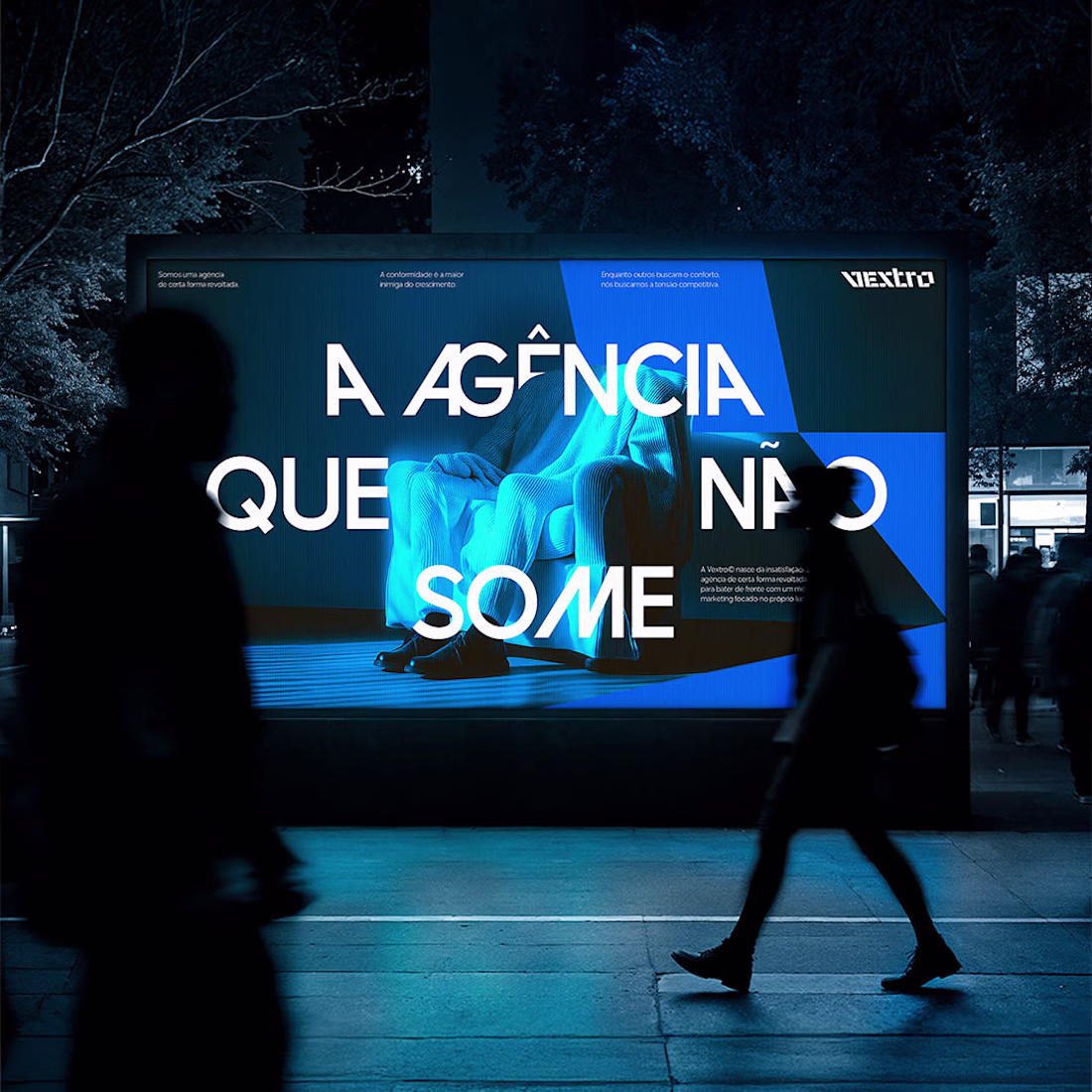
Vextro was born from dissatisfaction. Its mission: to challenge mediocrity and declare war on the comfort zone. The challenge was translating "rupture" into a brand. We constructed the identity using two core elements:
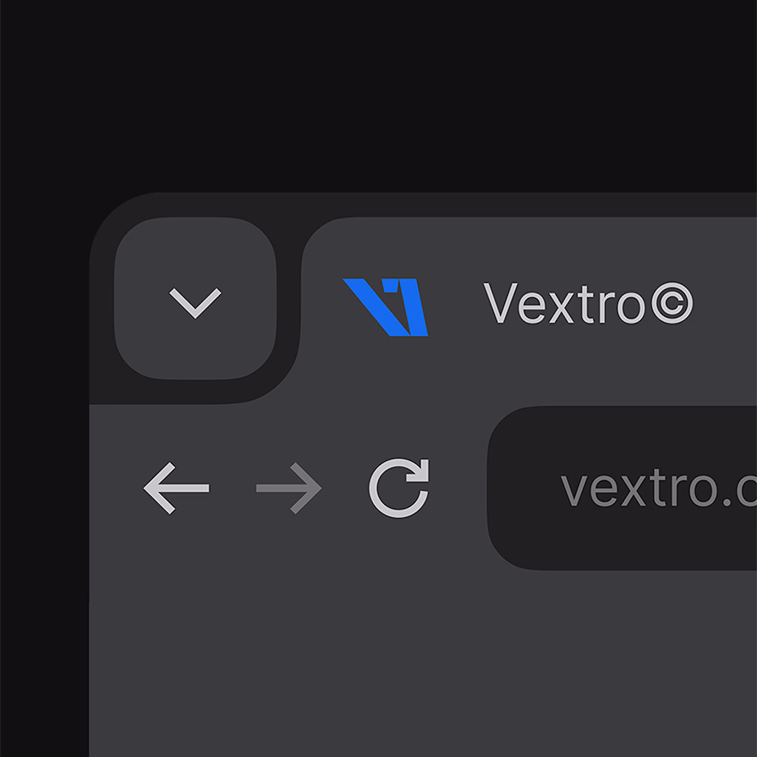
1. The Anti-Standard Symbol: The logo uses an inverted italic. This represents a deliberate movement against the current to unlock growth.
2. The Palette of Rivalry: Electric Blue stands in opposition to safe choices, while Black adds authority.
The result is a visual manifesto. Through deconstructed assets and motion blur, Vextro positions itself as a force that rejects the "good enough."

the screen board design is lit, well done
Thanks a lot, Zaoui! Stoked you like the screen board design
Beautiful branding project. Great work
Thank you, Shubham! Really appreciate the support
Anti-standard symbol.. love that!
Glad that caught your eye, Daniel! It was essential to visualize the "movement against the current"
Thanks, Catherine & Vlad! Really appreciate the support
Thanks, Chintan! We felt the static version couldn't capture the full energy, so motion was a must
The network for creativity
Join 1.25M professional creatives like you
Connect with clients, get discovered, and run your business 100% commission-free
Creatives on Contra have earned over $150M and we are just getting started
Challenges
View allTrending
Claude
Claude has entered the design space. How are you using Claude Design?
Contra University
Learn from expert creatives how to earn more using next-gen AI tools.
fifaworldcup2026
The World Cup is here and the whole world's watching. How are you designing for the world stage?
creativeaiflow
Creative AI workflows are evolving. What tools do you use, and what are their strengths and weaknesses?
freelancerlife
Freelancer life is wins, pivots, and everything in between. What’s yours right now?