The network for creativity
Join 1.25M professional creatives like you
Connect with clients, get discovered, and run your business 100% commission-free
Creatives on Contra have earned over $150M and we are just getting started
Back to feedPost
Taste Test

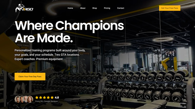
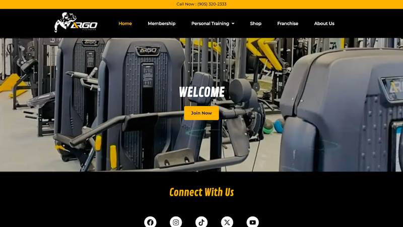
Two gym hero sections.
Version A
• Clear offer
• Sticky CTA
• Social proof
• Focused hierarchy
Version B
• Generic headline
• Small CTA
• Nav dominates
• No trust signals
Which one would you bet converts more?
A or B?
4 voted
80%
1 voted
20%
5 votes
Closed


Amazing work
Thank you Subash!

Good work
Thank you!!
The network for creativity
Join 1.25M professional creatives like you
Connect with clients, get discovered, and run your business 100% commission-free
Creatives on Contra have earned over $150M and we are just getting started





Related posts

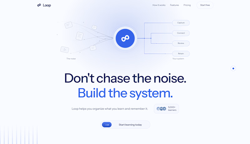
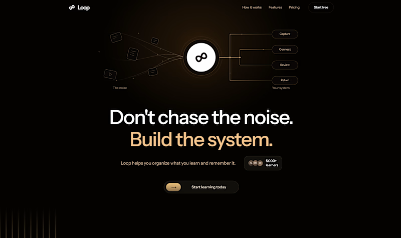
Which one would you go for and why? 🚀
Rate this hero section? 👇
5 voted
83%
1 voted
17%
6 votes
Closed

Light mood is working better here than the dark one

Building hero sections that don't just look cool, but actually convert. 🚀
Just finalized the new hero layout for my portfolio. Blending dark aesthetics, interactive 3D elements, and real performance metrics:
⚡ 98/100 Performance Score
⚡ 1.8s Page Load Time
⚡ 0.2s AI Chatbot Latency
High-performance Web & AI engineering is all about combining immersive visuals with zero-compromise speed.
What do you think of this layout?
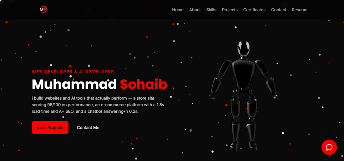

The robot on the right balances the dark hero nicely. Is the 3D model lazy loaded?

Hero section exproration: Glacier, a compliance platform for SaaS teams.
The brief: security should feel calm, not stressful.
A still lake and one peak carry the calm. Technical type carries the precision. A halftone texture ties them together.

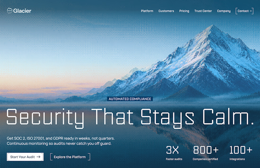
The hero is too calm. like the direction