The network for creativity
Join 1.25M professional creatives like you
Connect with clients, get discovered, and run your business 100% commission-free
Creatives on Contra have earned over $150M and we are just getting started
Back to feedPost
I used Google Stitch to design Folia, a local-first document builder desktop app that lets anyone create professional CVs, invoices, and portfolio websites without subscriptions or internet access.
Stitch helped me rapidly prototype the full UI flow: the document type picker home screen, multi-step form builder with live preview panel, template picker with visual thumbnails, and the build success screen.
What makes this design special:
Split-panel layout: form on left, live preview on right Clean minimal aesthetic that feels premium not generic
Three distinct template styles per document type
Dark mode throughout
Progress step navigation
The exported HTML/CSS from Stitch became the foundation
I refined for a Tauri v2 desktop app built with Rust + Svelte. Privacy-first.
No cloud. One-time payment.
Your documents stay on your computer forever.

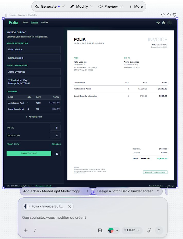
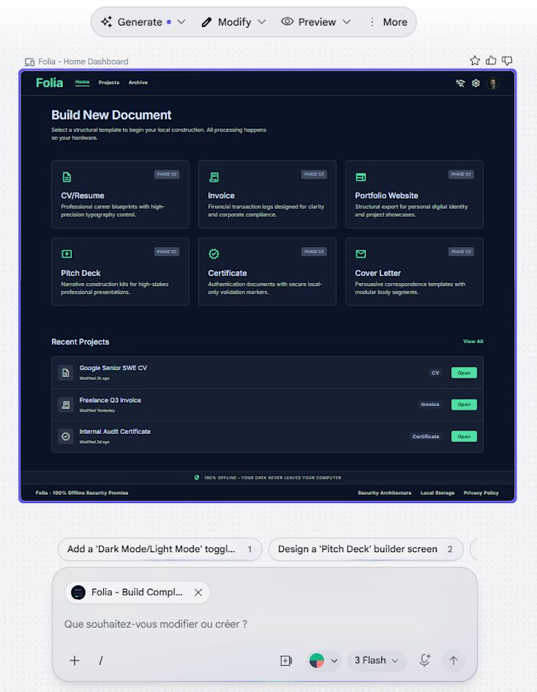
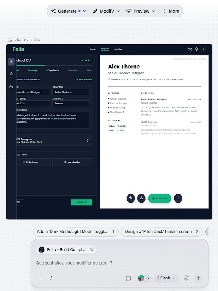

Everything flows together so naturally here, it’s beautiful.

Thank you Denis! that means a lot coming from someone with your eye for design. I'm building this for freelancers who are tired of subscriptions eating into their margins. If you ever want to try it on a real project I'd love to hear what a pro thinks of it in actual use🙏
I took a look at your profile after your comment 😉 Framer developer building conversion-focused sites. I think you might find what I'm building next interesting.
It's called Animus, an offline 2D character animation studio. You draw, rig, animate, and export a self-contained...

Really like this, the local-first direction + document builder flow feels very practical and well thought out. The split preview layout works nicely.
View my entry for this challenge
https://on.contra.com/pnfJBQ
Curious what you think about it.

on.contra.com
Introducing Voya: Revolutionize Your Travel Planning Experience
Connect with next-gen talent and tools to get work underway. Hire more independents. Start more projects. Get more creative.
Thank you Rishi!👏 just went through Voya properly, the insight is sharp. Most travel apps solve booking, yours solves the reason people never book. That framing is strong.
Interesting contrast between our two entries, yours is cloud-connected by necessity, mine went fully...
The network for creativity
Join 1.25M professional creatives like you
Connect with clients, get discovered, and run your business 100% commission-free
Creatives on Contra have earned over $150M and we are just getting started





Related posts

An old client project: a full redesign of a crypto app.
Created the video with Opus 5.5

Top-notch design.


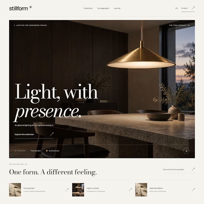
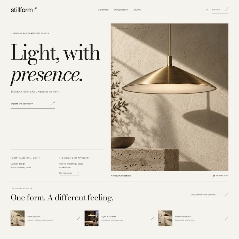

Atmospheric, and it was the photography that decided it. A lamp is a product you buy for what it does to a room, so seeing the warm glow pooling across a dark surface sells the feeling before the layout even registers. Sculptural is gorgeous but shows the object, Atmospheric shows the outcome.

A modern, visually focused website designed around clean layouts, bold typography, immersive visuals, and smooth interactions. The design combines a strong visual identity with an intuitive user experience, creating a polished and premium digital presence.
I focused on UI/UX design, responsive layouts, visual hierarchy, animations, transitions, and interactive elements to make the website feel dynamic rather than static. The experience was designed with attention to spacing, typography, composition, and consistent interaction patterns across different sections.
The project showcases my approach to creating modern, creative, and conversion-focused websites that balance aesthetics with usability and responsive frontend implementation.

