The network for creativity
Join 1.25M professional creatives like you
Connect with clients, get discovered, and run your business 100% commission-free
Creatives on Contra have earned over $150M and we are just getting started
Back to feedPost


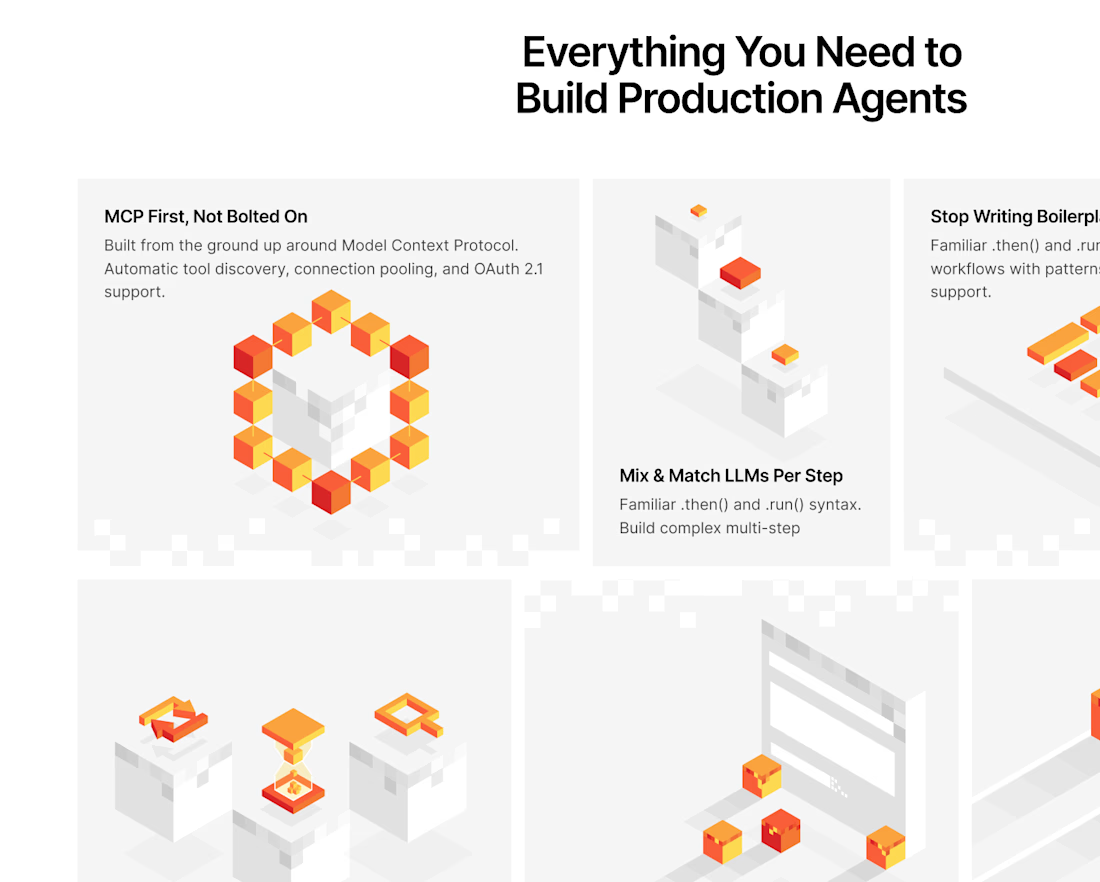
Minecraft-inspired website visuals


Cool!

What made you land on the blocky isometric style for this? It makes a topic as dry as agent infrastructure feel a lot more approachable, the little icons tucked into each block are a nice touch.

The low-poly cubes make what could've been a dry infrastructure diagram genuinely fun to look at. When you're translating something this technical, how much time goes into just understanding what the product actually does before you start sketching?
Balancing playful blocky visuals with a genuinely technical product can't be easy without it tipping into gimmicky. How do you know when the style is landing right for the audience versus going too cute?


Nice work

The design looks awesome. Great project!


minecraft site, ok that's fun

This is amazing

Such a clean design! 🧡

The voxel blocks make an MCP/agent-orchestration pitch actually approachable instead of another abstract node diagram. The soft shadows keep it from feeling too gamey too, good balance.
The network for creativity
Join 1.25M professional creatives like you
Connect with clients, get discovered, and run your business 100% commission-free
Creatives on Contra have earned over $150M and we are just getting started











Related posts

WHAT I HAVE BUILT:
PIXEL MEADOW (https://pixel-weadow.base44.app) is an interactive 2D pixel art website. This website shows my work and creativity in an interactive way. That's it.
A little side talk:
Sigh...
After trying so many ideas, I finally landed on this website: https://pixel-weadow.base44.app
Yeah, it might not fulfill all the criteria of the guidelines (I didn't read them carefully before making the website, which was kind of my fault).
I might not win the competition, but I'm satisfied with what I made after just 3 weeks of learning AI website development.
And, make sure to check out my website: https://pixel-weadow.base44.app
Built it in @Base44 for the #Base44Challenge


Bro same thing happened to me as well, i made a completely different website for the lovable challenge only to after realise that it did not fit the theme. Yeah....... the theme was Appointment setting and i made a 8-bit productivity Website 😭😭😭

I rebuilt the website for Malham Smithy, a traditional blacksmith forge in the Yorkshire Dales, using Base44.
What I built:
Booking on the site: customers pick a forging course, see the dates still open and book in a few steps, with no phone calls needed.
Personalised gift cards: buyers choose a colour, add their own message and preview the card before they buy.
A working shop and commissions: handmade pieces with a bag and checkout, plus a simple form for custom commissions.
Owner alerts: the forge is notified every time a booking, order or enquiry comes in.
Premium design: a clean, minimal look that matches the craft.
Mobile-first: smooth scrolling, easy tapping and a fully responsive layout on every screen.
I built it all by prompting in Base44, refining every detail until it felt hand-made.

Too smooth as always

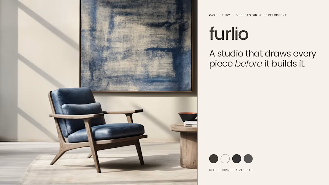
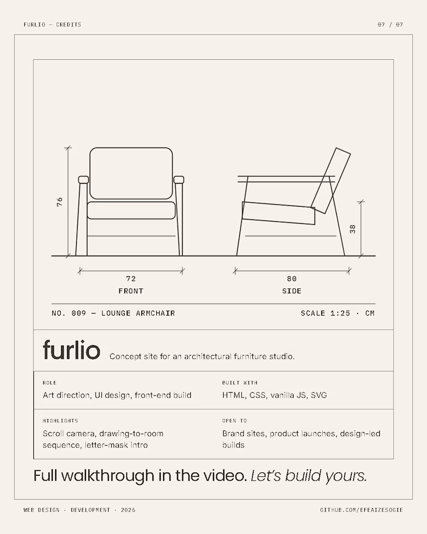
Was going through some old pictures on my PC and somehow ended up building a furniture website.
Had to make the drawings part of the experience.
Here’s Furni. 👀