The network for creativity
Join 1.25M professional creatives like you
Connect with clients, get discovered, and run your business 100% commission-free
Creatives on Contra have earned over $150M and we are just getting started
Back to feedPost

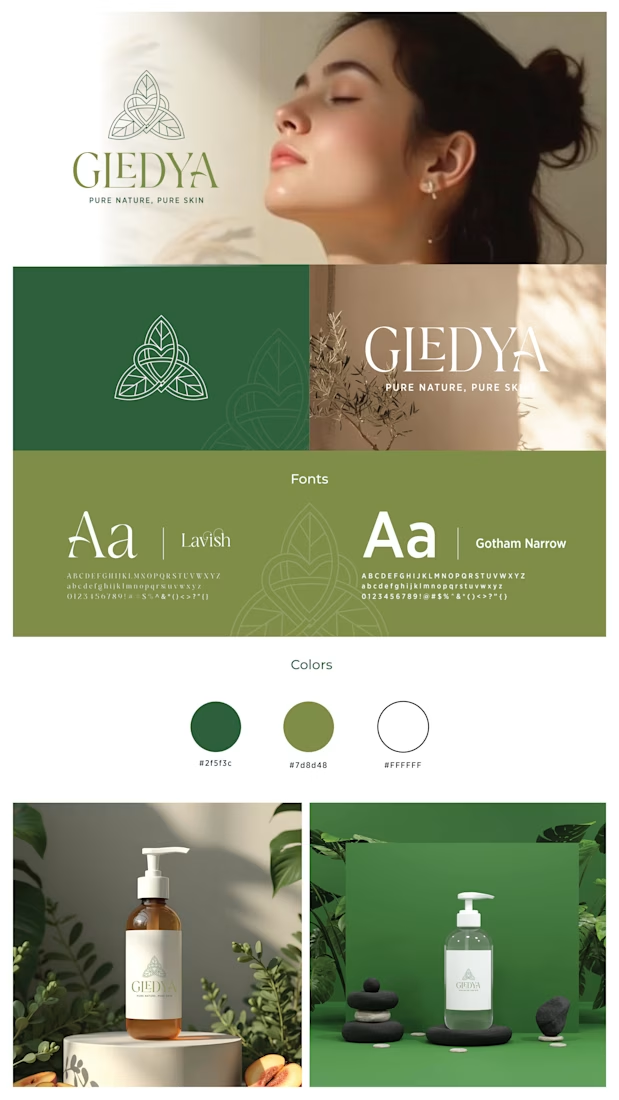
I recently wrapped up the visual identity for GLEDYA, a brand built on the philosophy of "Pure Nature, Pure Skin."
The challenge was to create something that felt raw and earth-connected, yet sophisticated enough for a premium skincare shelf.
The Symbol: I designed a geometric trinity of leaves, blending soft curves with structured lines to represent balance and growth.
The Palette: We moved away from sterile "clinical" whites and opted for deep forest greens (#2f5f3c) and earthy olives (#7d8d48) to ground the brand in the natural world.
The Type: Pairing the elegant, serif 'Lavish' with the clean, modern 'Gotham Narrow' creates a perfect tension between heritage and innovation.
The network for creativity
Join 1.25M professional creatives like you
Connect with clients, get discovered, and run your business 100% commission-free
Creatives on Contra have earned over $150M and we are just getting started
Related posts


February Recap as a Brand Designer :
💜 Officially an Adobe Ambassador (WHAT)
💜 3x Brand collab deals
💜 2x Passion projects posted
💜 1x Client project posted:
💜 452 followers gained
💜 4x Client projects completed
💜 15 New enquiries
💜 6x Discovery calls
💜 2x Calls with designers
💜 3x Clients booked
March is Fully Booked!! 🥳
(literally a dream client)


Great achievements 🎉 how's your strategy to gain so many followers? It would be really helpful to know. Thank you!


SaaS = Software as a Self-soothing
Instacalm -- because there's always things we cannot control in life. Within just a few hours using Figma Make I was able to spin up an app to instantly create a calming meditation practice through the one thing we can control: our breath.
I wanted to create something that was immediately usable and had zero learning curve so anyone could pick it up and chill-the-F-out in a matter of seconds.
Features:
- animated color theme and particles
- animated breath pacer for inhale & exhale cycles
- ambient background music
- optional affirmations
60 versions, 5 breath modes, 5 dark & light color themes, 5 soundscapes, and 80 affirmations later, there's a v1.0 Instacalm app. 😌 Enjoy.


Software as self-soothing’ is a powerful framing. Designing for nervous system regulation instead of productivity feels like a meaningful shift. The breath pacing + ambient layering makes it feel intentional rather than ornamental.


Trending
maxearnings
The next frontier of payments is live on Contra. How are you maximizing revenue?
freelancerlife
Freelancer life is wins, pivots, and everything in between. What’s yours right now?
aidesignflow
AI tools are redefining how designer work. What does your workflow look like?
micrographics
Micrographics started as utility - barcodes, packaging, instruction labels. How would you use them?
aivideo
AI video tools are moving at warp speed. What tools are you using?