The network for creativity
Join 1.25M professional creatives like you
Connect with clients, get discovered, and run your business 100% commission-free
Creatives on Contra have earned over $150M and we are just getting started
Back to feedPost
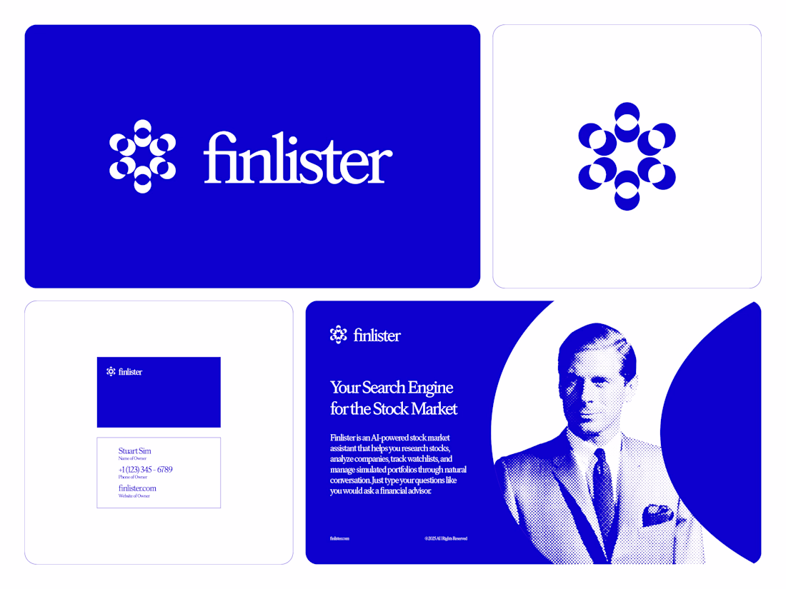
Art Direction for Finlister
Simple. Monochromatic. Focused. These are all terms I would use to describe the art direction you see here in front of you. From the shapes to the colors and from the typeface to the photography, this brand direction is very cohesive and ready to be adapted to a greater visual system. This is also one of my favorite logo marks I have ever made for any of the brands I have worked with.
What do you think about this direction?
@Patrick Tuell love it
The network for creativity
Join 1.25M professional creatives like you
Connect with clients, get discovered, and run your business 100% commission-free
Creatives on Contra have earned over $150M and we are just getting started
Trending
Claude
Claude has entered the design space. How are you using Claude Design?
Contra University
Learn from expert creatives how to earn more using next-gen AI tools.
MagicPath
The canvas is infinite, and exploration is becoming the workflow. How are you using MagicPath?
creativeaiflow
Creative AI workflows are evolving. What tools do you use, and what are their strengths and weaknesses?
freelancerlife
Freelancer life is wins, pivots, and everything in between. What’s yours right now?