The network for creativity
Join 1.25M professional creatives like you
Connect with clients, get discovered, and run your business 100% commission-free
Creatives on Contra have earned over $150M and we are just getting started
Back to feedPost
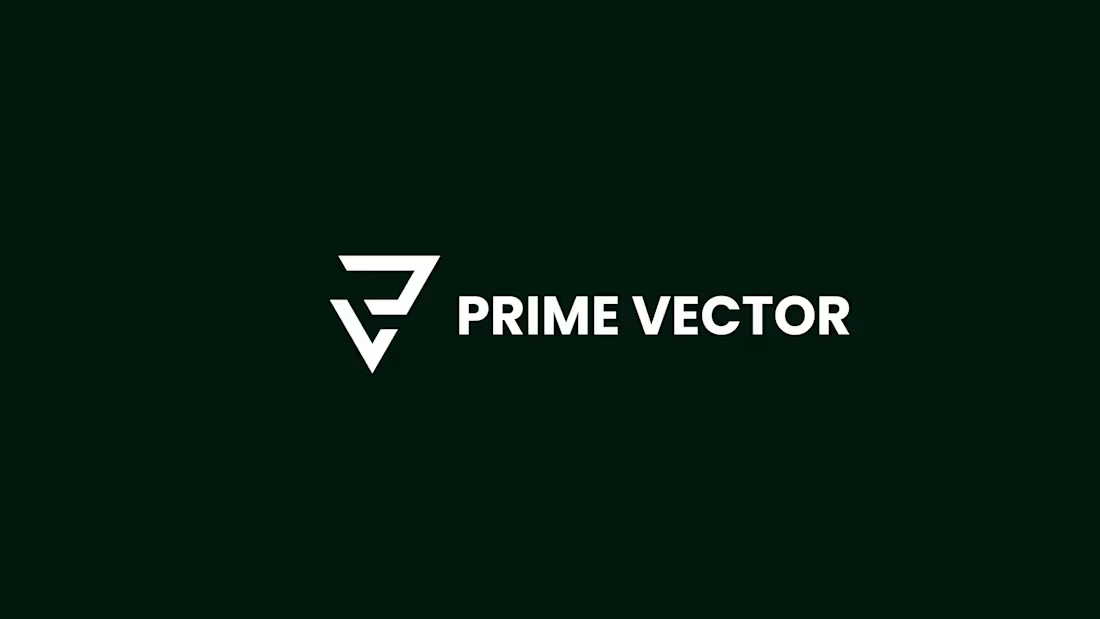
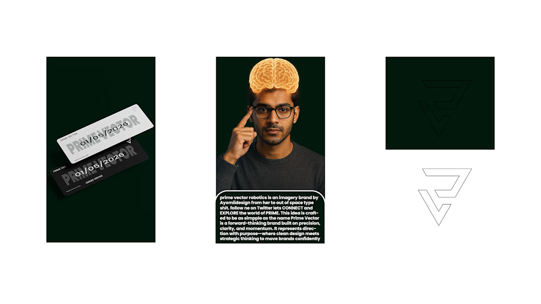
Just wrapped up this logo for Prime Vector.
The idea was simple: direction, clarity, and forward motion.
Clean lines, sharp angles, and a symbol that feels strong without trying too hard.
Still refining my process and exploring different identity styles, but I’m really happy with how this one turned out.
Would love to hear your thoughts.
#LogoDesin
#Branding
#GraphicDesigner
#VisualIdentity
#MinimalDesign
#CreativeWork
#DesignJourney
Brand DesignVisual DesignlogomarkAdobe IllustratorAdobe PhotoshoplogodesignervisualidentityLogo Design


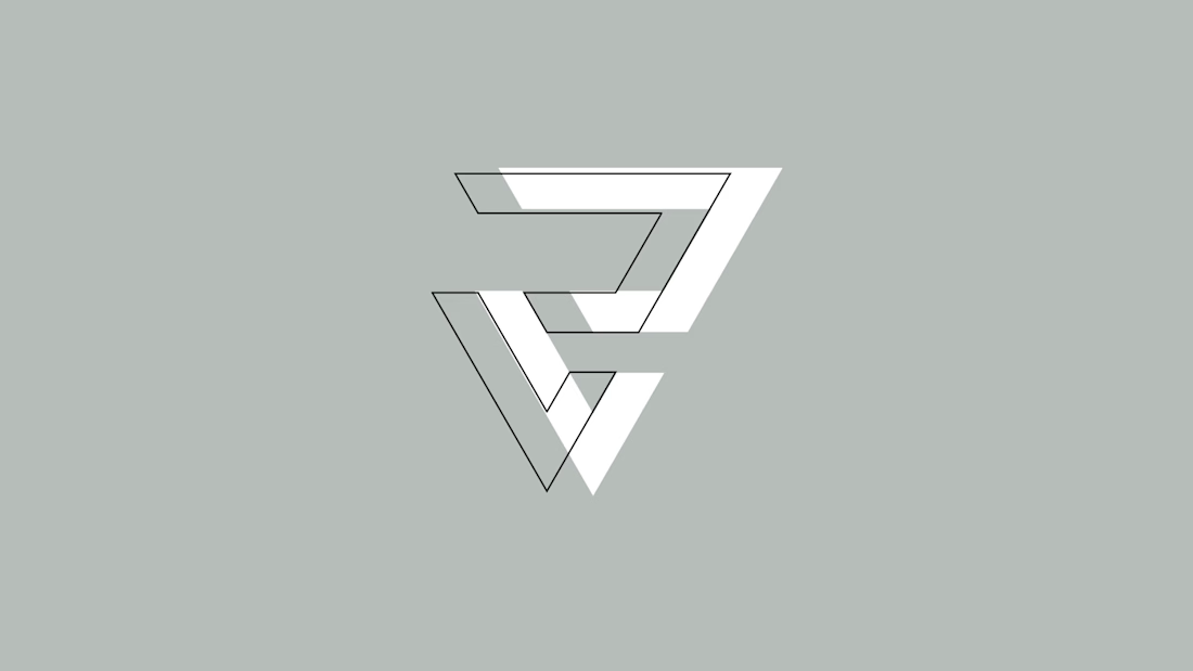

for the first impressions 2 to 3 seconds its appeared to me like a letter (e)

Thank you for the observation. i have spent so much time fixed on it that i did not realised it could also symbolize as the small letter 'e'
I know, sometimes you see what you designed differently than others, that's why it's always helpfull to shar the work with 2 to 3 Friends and ask for firts impression what they see or what they understand from the mark. It would be very helpfull.
Thank you man. i'd put that into consideration
The network for creativity
Join 1.25M professional creatives like you
Connect with clients, get discovered, and run your business 100% commission-free
Creatives on Contra have earned over $150M and we are just getting started







