The network for creativity
Join 1.25M professional creatives like you
Connect with clients, get discovered, and run your business 100% commission-free
Creatives on Contra have earned over $150M and we are just getting started
Back to feedPost
Dark-themed real estate mobile app .
This appfocuses on creating a seamless property discovery experience through a clean layout, strong visual hierarchy, and carefully crafted details. Property images take center stage, while pricing, location, and key information remain easy to scan at a glance.
The dark interface helps highlight content, improves visual contrast, and gives the product a modern, premium feel.
Designed in Figma.
Need help bringing your product ideas to life? Let's connect.
Dark Real Estate Mobile App, Luxury Property App UI, Real Estate App Case Study, Property Listing Mobile UI, Modern Real Estate Dashboard, Premium Real Estate UX Design, Real Estate App Interaction Design,Mobile App Design Inspiration 2025/2026


Very polished, love it! 😍

This dark UI looks incredibly premium! The way the property images pop against that deep background is perfect for a luxury real estate app. The layout is exceptionally clean and scannable! 🖤🏡


That's awesome!

Having worked together, I know how much thought and effort goes into your work. The attention to detail really shows here. Keep going — you're doing great things 💙

Thank you so much😍


Awesome UI!

This is so good 🔥🔥🔥

Great job🔥

Dark mode perfectly highlights the photos, nothing distracts from the main focus. Really turned out great!😍

cool animation

Love the dark theme choice here – it really lets the property photography breathe and gives the whole thing a premium, editorial feel. The visual hierarchy is spot on too: image first, price prominent, specs scannable. The yellow CTA against the dark background is a nice contrast punch. Clean work!

Looks sophisticated and lux 😍

so clean and polished design! like the colours 🖤💛

Dark mode is a power move for luxury real estate! 🖤 It instantly makes properties look like high-end art pieces rather than just random listings. Great job!
The network for creativity
Join 1.25M professional creatives like you
Connect with clients, get discovered, and run your business 100% commission-free
Creatives on Contra have earned over $150M and we are just getting started







Related posts

A luxury property deserves a presentation that does it justice.
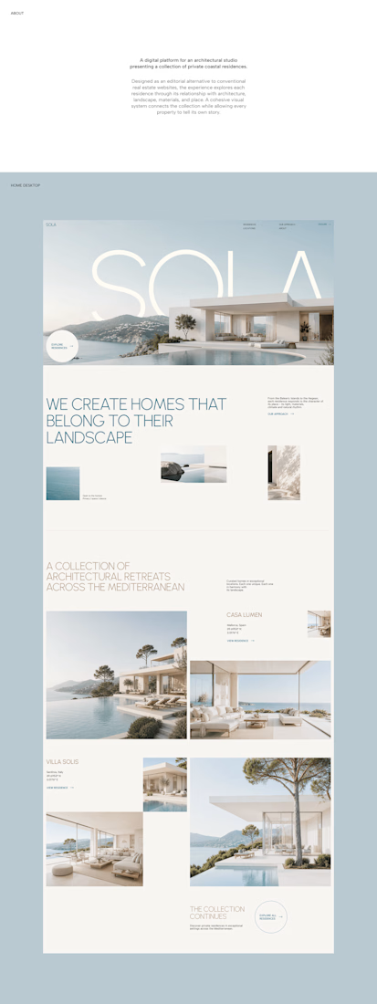
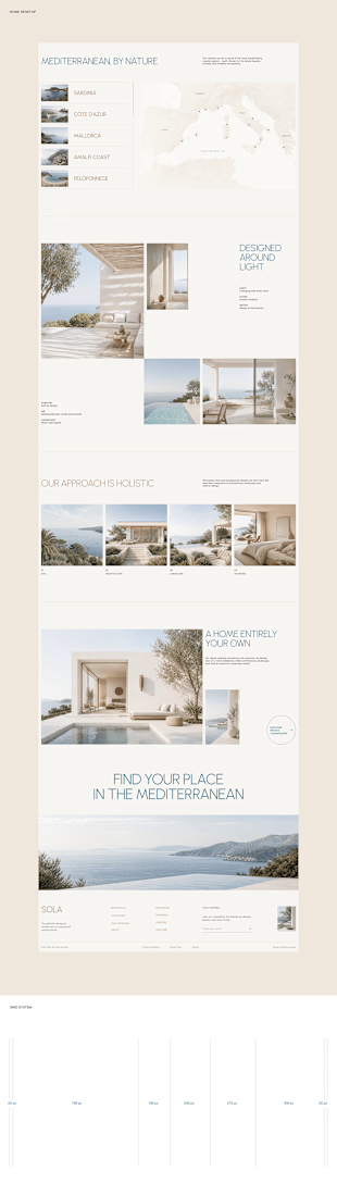
With SOLA – Architecture Studio & Luxury Real Estate, I wanted to bring the beauty of modern coastal architecture into the website itself.
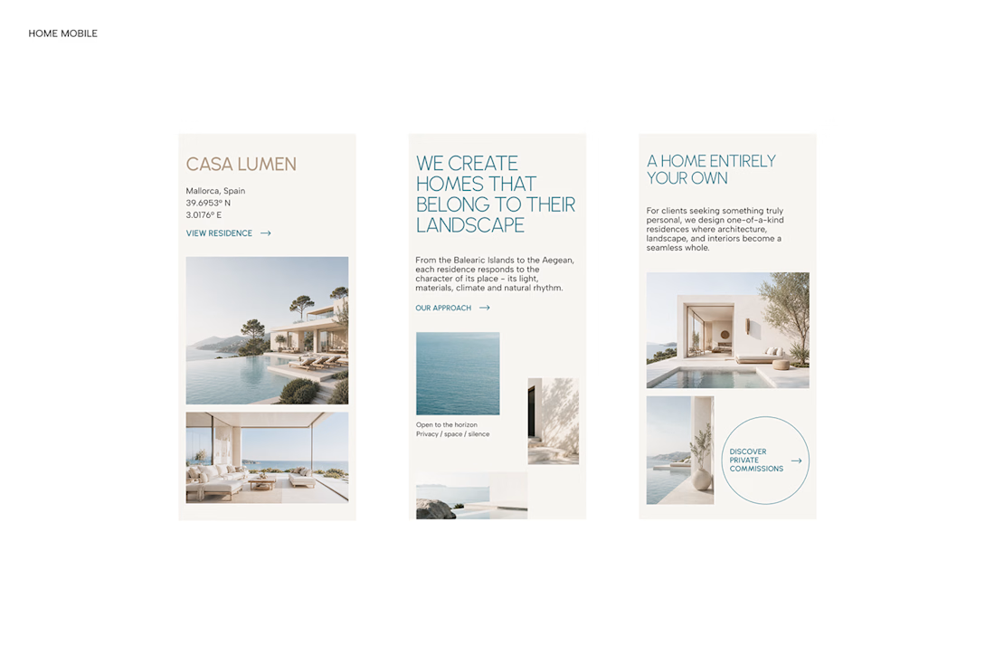

From the large property images and soft blue tones to the clean layout across desktop and mobile, every part of the design helps create a calm, premium feel while making the homes the centre of attention.
I like how the website brings architecture and digital design together, giving visitors a chance to explore the properties before making an enquiry.
If you were looking for a luxury home, would a website like this make you more interested in the property?
#WebDesign #Architecture #LuxuryRealEstate

Incredible work, you transformed SOLA into a premium property brand.


Every element feels perfectly placed! 👏

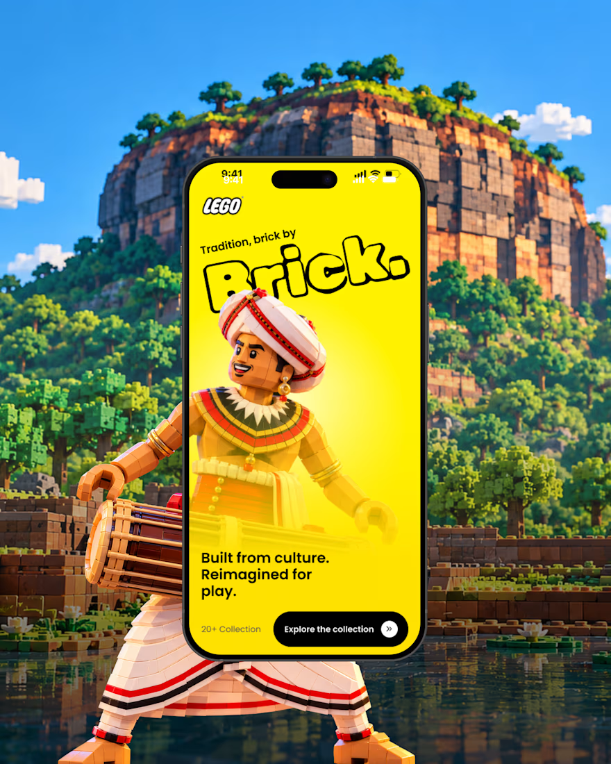
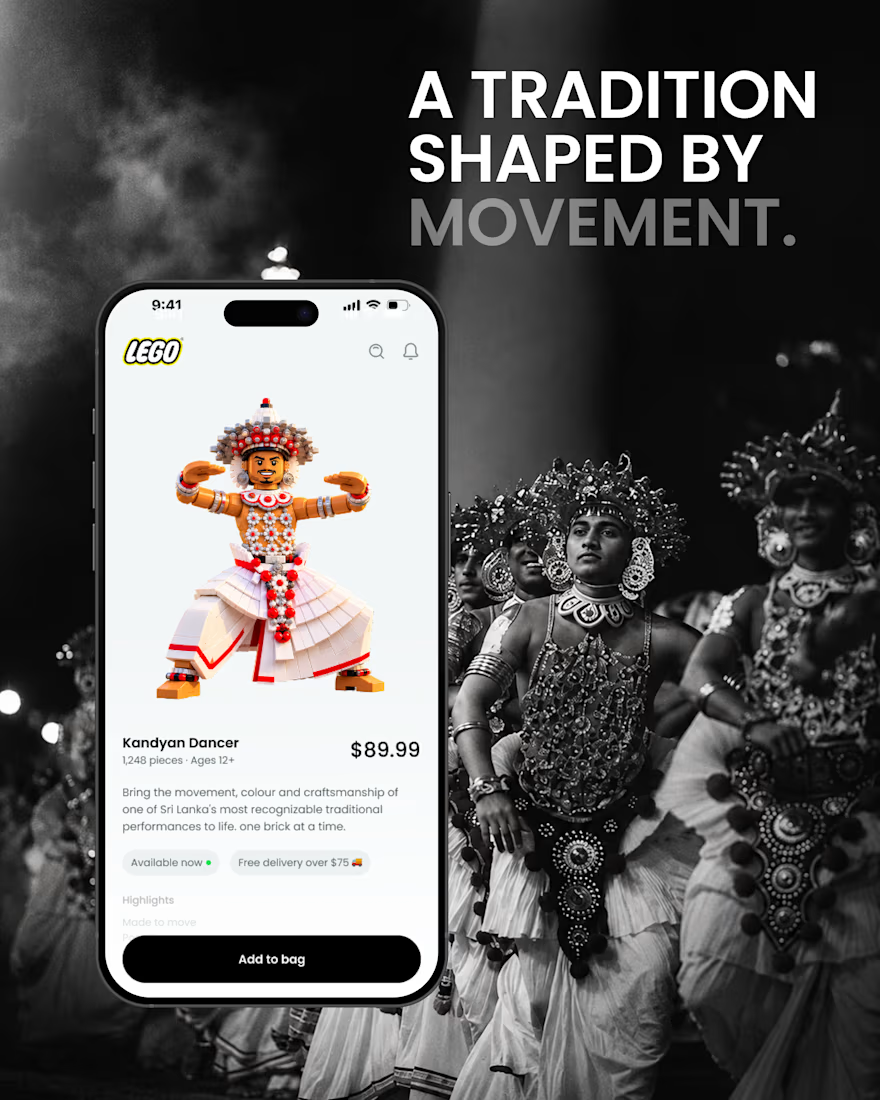
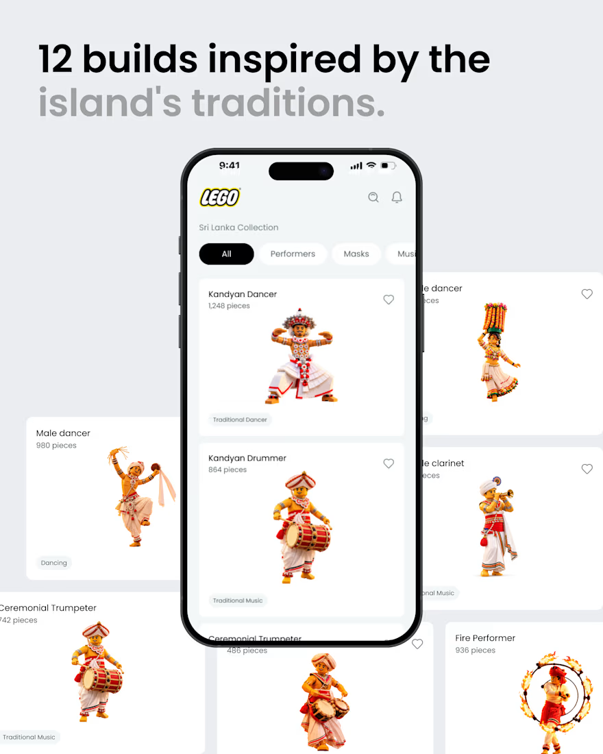
What if Sri Lankan tradition found its way into the LEGO app? 🇱🇰🧱
A small product design exploration.
Had a small idea and decided to visualize it. ✌️
I reimagined a few elements of Sri Lankan culture traditional dancers, masks, musicians, and instruments as brick built characters, then explored how they might live inside a LEGO style mobile experience.
Just a hypothetical design experiment combining culture, product design, and a little AI-assisted exploration.
Not affiliated with or endorsed by LEGO.
#ProductDesign #UIDesign #DesignConcept #DesignExploration #CreativeAI #SriLanka #SriLankanCulture #LEGO

That's awesome great job 🎉🎉