The network for creativity
Join 1.25M professional creatives like you
Connect with clients, get discovered, and run your business 100% commission-free
Creatives on Contra have earned over $150M and we are just getting started
Back to feedPost

Crypto needed a guardian. So we built one.
Here's a sneak peek at the social media system we built for it. Three moods, one color, one identity.

The network for creativity
Join 1.25M professional creatives like you
Connect with clients, get discovered, and run your business 100% commission-free
Creatives on Contra have earned over $150M and we are just getting started



Related posts

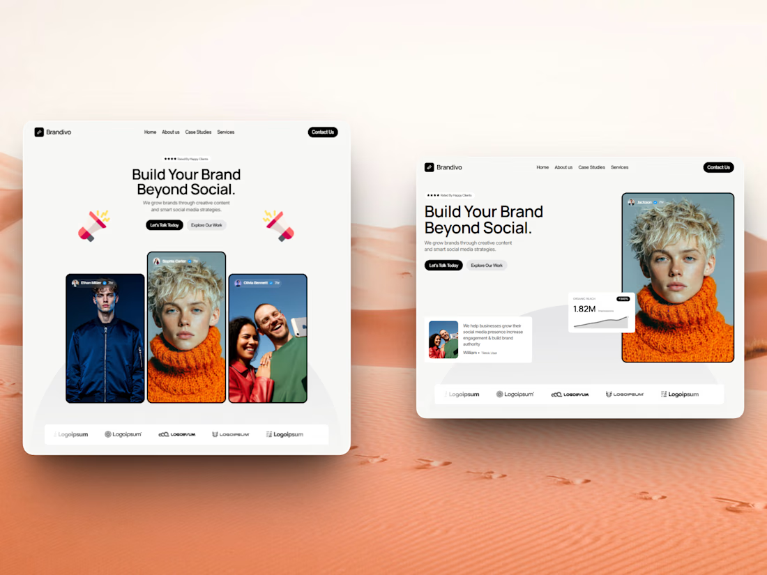

I'd pick the right one. The headline and image split is cleaner and the stats card gives proof right away, the left feels busier with three portraits. Is this template for Webflow?

A modern and professional social media design created with a focus on clean layout, attractive typography, and visual balance.
Services: Graphic Design, Social
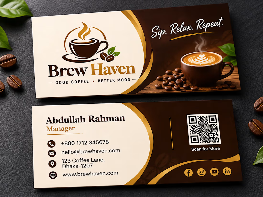
The cream and gold curve against the dark brown makes the Brew Haven card feel warm and premium, and the latte photo does half the branding. Did you test a bigger QR code on the back?

Vaulta: a concept for AI powered crypto portfolio analytics
Most crypto apps show prices and leave the thinking to you. Vaulta’s Analytics screen answers the question people actually have: how healthy is my portfolio right now?
Scrub across the week to see each day’s value. Below the chart, an AI health score, a risk gauge and a breakdown of six holdings turn the numbers into a quick read.
If you were using this app, which would you check first: the health score, the risk score or the chart?