The network for creativity
Join 1.25M professional creatives like you
Connect with clients, get discovered, and run your business 100% commission-free
Creatives on Contra have earned over $150M and we are just getting started
Back to feedPost

Most eCommerce brands make the same mistake.
They blast the same email to 10,000 people.
Same subject line.
Same offer.
Same everything.
Then wonder why open rates are at 12%.
Segmentation is not optional anymore.
It's the difference between spam and sales.
The network for creativity
Join 1.25M professional creatives like you
Connect with clients, get discovered, and run your business 100% commission-free
Creatives on Contra have earned over $150M and we are just getting started





Related posts


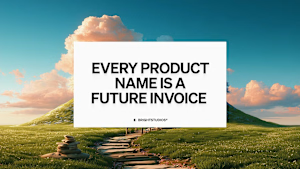
I've helped 100+ founders make brand decisions. The most expensive one is always naming a second product separately.
Intuit paid $12B for Mailchimp, spent years keeping it visually apart from TurboTax, and is now paying again with a global rebrand to reconnect them.
Every separate product name is a brand you'll eventually have to pay to reunite. The bill arrives when you try to cross-sell and your customers can't see the connection.
Before you name product two: write one sentence on how it makes product one more valuable to the same buyer. If you can, it's a capability, not a brand.
thebrightmethod.substack.com
Every Product Name Is a Future Invoice
The second logo always costs more

Great job Daniel congratulations 🎉🎉❤️❤️

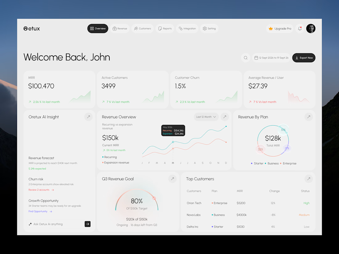
Oetux – SaaS Revenue Analytics Dashboard
The client had a lot of data, but the real problem was making sense of it.
MRR, revenue, churn, active customers, growth, customer performance, goals. Every metric was important, but when everything gets the same attention, users don’t know where to look first.
The existing experience made users spend too much time switching between information and trying to connect the numbers.
So we focused on how SaaS teams actually read their business data. We structured Oetux around the questions that matter most.
How is revenue performing?
Are we growing?
Are customers staying?
Where are we losing revenue?
What needs attention right now?
Then we organized KPIs, revenue trends, customer performance, churn insights, goals, and AI powered insights into one clear experience.
The goal wasn’t to remove data.
It was to organize the data so users could understand it faster.
That’s what we solved with Oetux.
Turning a data heavy SaaS dashboard into an experience that helps teams see their business clearly and make better decisions.



Love the clean layout.

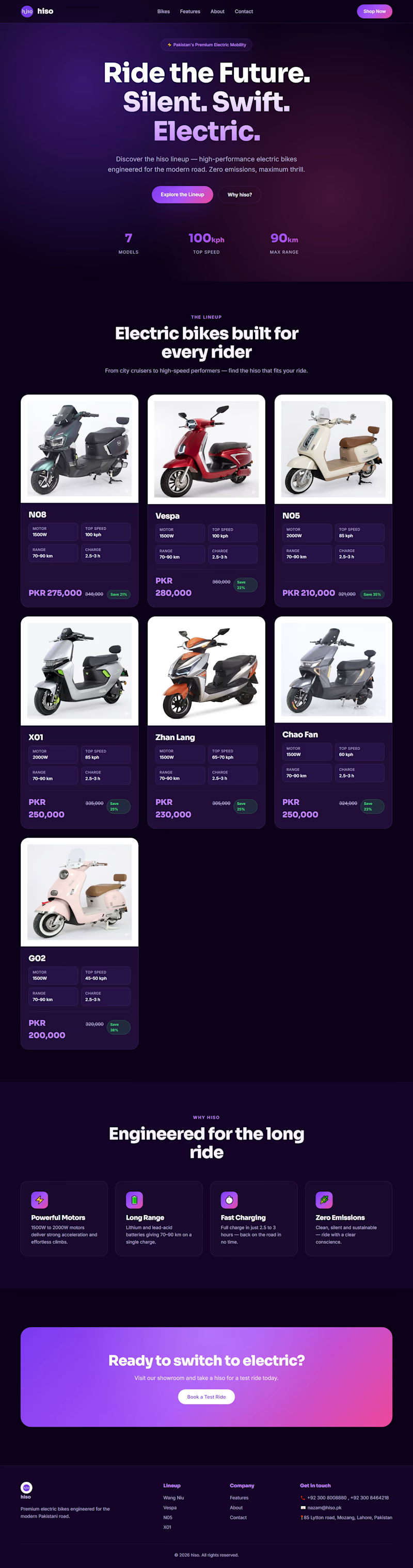
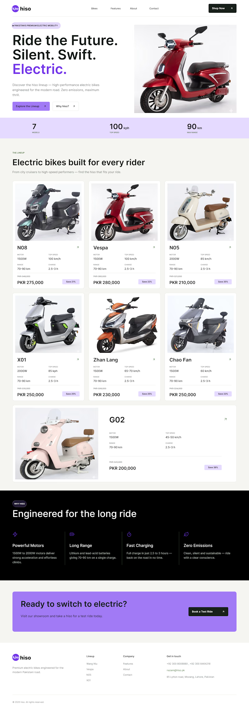
Which one is better ? Old or New
CASE STUDY Time !
I just noticed their website and saw that their color combination is hiding main information and disturbing users to focus on one thing
The theme was too dark with dark text which is making user to focus too much on text and clear price mention makes user things that it's too expensive
MY SOLUTION:
firstly I changed the color scheme
secondly I changed the text color and size
then I change cards style too make it much easier to focus o what user want to see
Then I added a %off tag which makes user to think It's an offer and it could end at any time soo buying right now is a golden oppurtunity.
0 voted
0%
3 voted
100%
3 votes
Closed
