The network for creativity
Join 1.25M professional creatives like you
Connect with clients, get discovered, and run your business 100% commission-free
Creatives on Contra have earned over $150M and we are just getting started
Back to feedPost

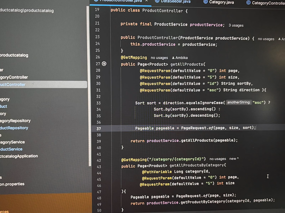
Pagination + Sorting in my E-Commerce backend.
Implemented dynamic pagination and sorting in the Product APIs using Spring Data.
Features:
Page number & page size control.
Sort by any field (id, name, price etc.)
Ascending / Descending order.
Filter products by Category with pagination.
This makes the API flexible and production-ready for large product catalogs.
Tech: Spring Boot + Spring Data JPA

The network for creativity
Join 1.25M professional creatives like you
Connect with clients, get discovered, and run your business 100% commission-free
Creatives on Contra have earned over $150M and we are just getting started











Related posts

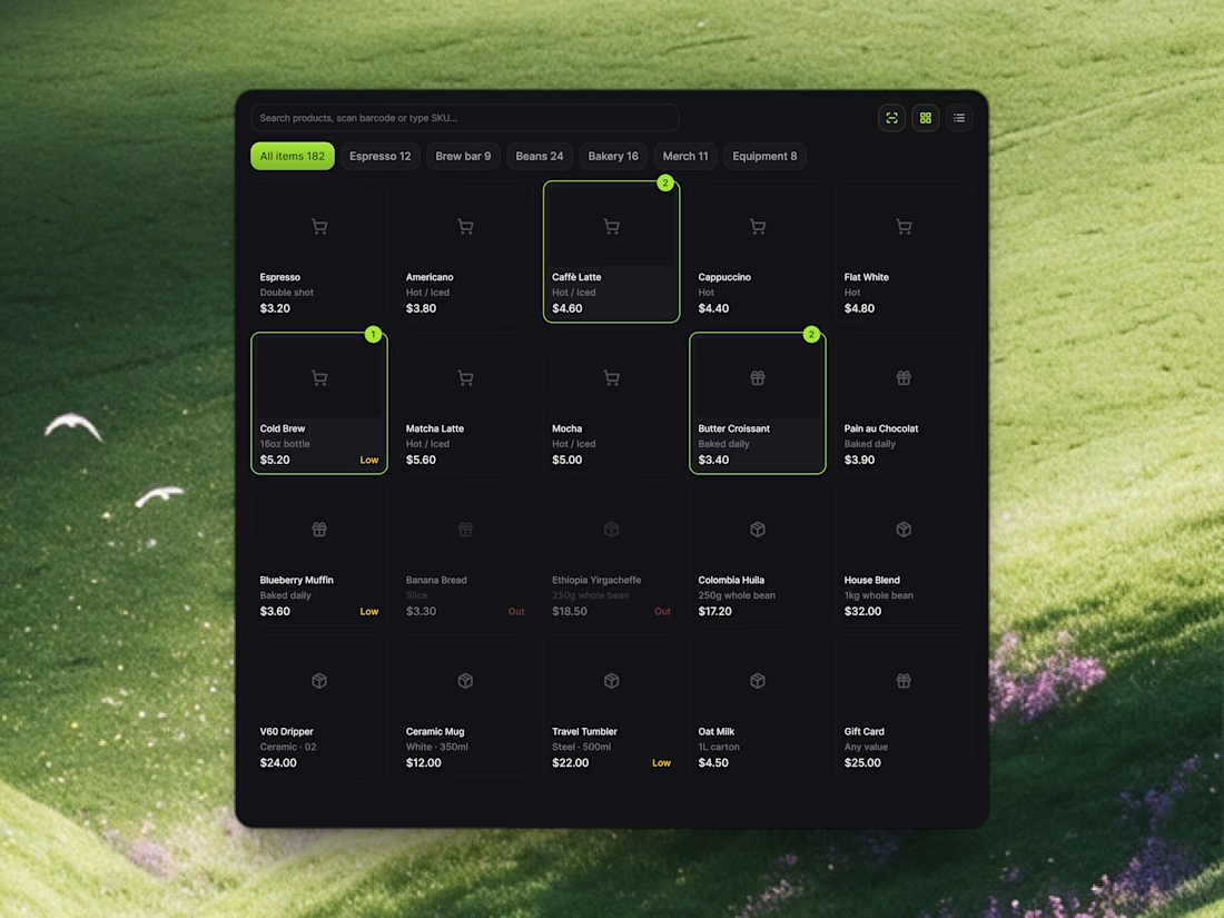
Streamlining Store Operations with Relivo ⚡️☕️
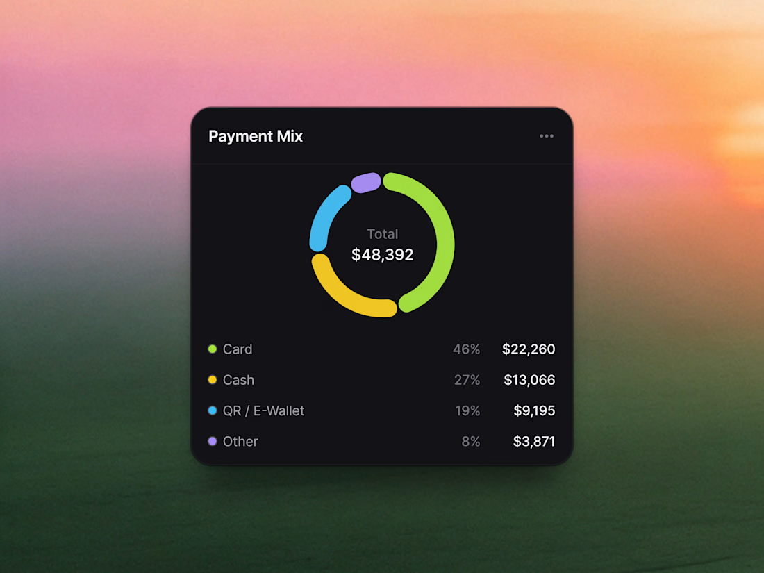
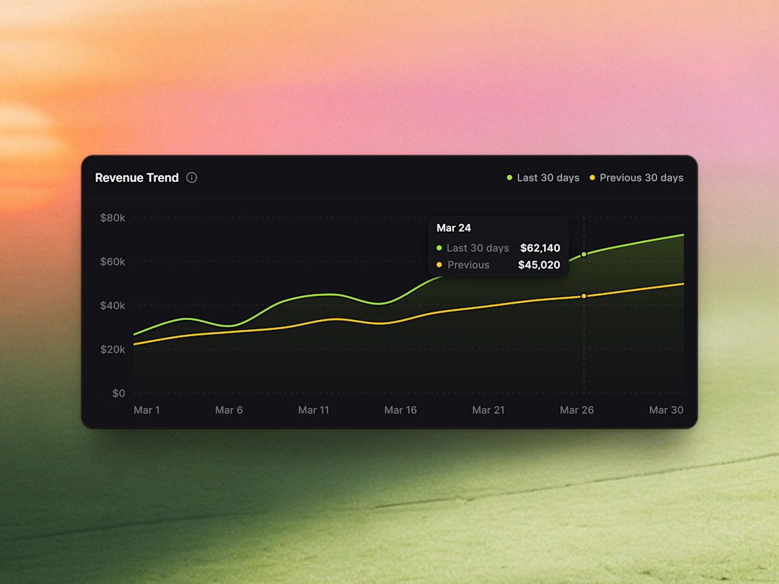
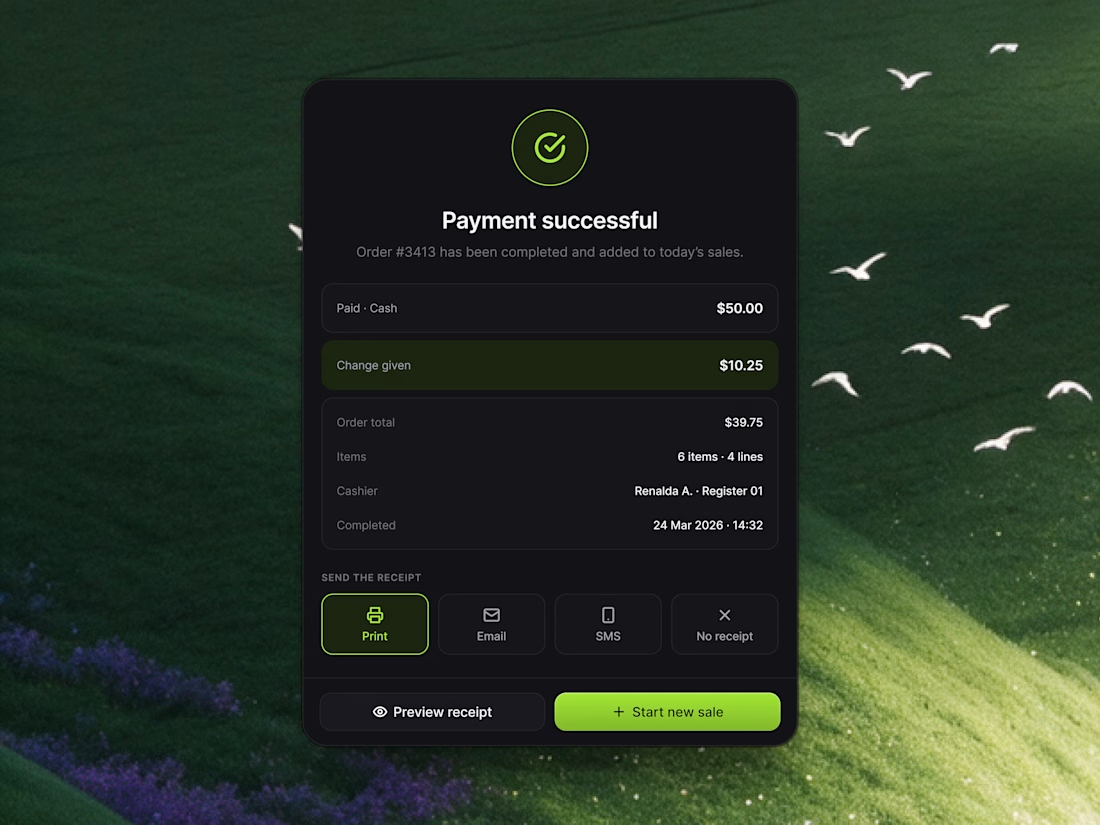
Managing a busy cafe or retail store shouldn't mean drowning in chaotic order tickets or guessing daily profit margins. With Relivo, we engineered modular UI cards that turn sales analytics, checkout confirmation, and inventory tracking into a seamless visual experience.
Highlights of the UI snippet components:
• POS Item Grid: Categorized menu tabs (Espresso, Brew Bar, Bakery) with active item badges and real-time stock alerts.
• Sales Analytics: Segmented payment mix distribution and 30-day comparative revenue trendlines.
• Payment Successful Modal: Instant receipt options (Print, Email, SMS) and one-click "Start new sale" action buttons.
Take a look at the attached 4 snippet cards to explore the layout and typography details!
Would love to hear your thoughts in the comments! 👇


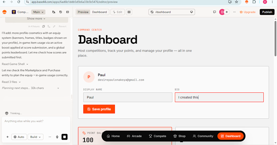
I made this website to allow people to be able to play mini games relax and play with friends while being in different places (Caution: Anyone who says that my account is diffrent from here answer yes but this is my second account my main account credits finsihed and i am broke to buy upgrade sory)


Building a Modern Restaurant Management Dashboard with Lovable (Light ☀️ vs. Dark 🌙)
I’ve been working on the dashboard interface for ReserveTable (Eat Pro Japan), focusing on giving restaurant managers and users a clean, modern, and intuitive interface to manage bookings, tables, and analytics.
Using Lovable, I was able to rapidly prototype and construct a modern UI system complete with smooth component transitions and native theme switching.
✨ Key Design & Tech Highlights:
⚡ Built with Lovable: Leveraged AI-powered design-to-code workflows to assemble clean component hierarchies, responsive search/filter bars, and sleek cards rapidly.
🌗 Seamless Light & Dark Mode: Designed a flexible color system using modern CSS variables / Tailwind tokens so the entire interface gracefully shifts between an elegant light aesthetic and a moody, dark dining ambience.
🎯 Contextual UI Elements: Styled input controls, select menus, and primary CTA buttons to maintain legibility and contrast across both light and dark themes.


For reservation and table states, the same semantic color tokens need to stay clear in light and dark mode. Did you define status tokens once and map both themes to them, or tune those colors per component?