The network for creativity
Join 1.25M professional creatives like you
Connect with clients, get discovered, and run your business 100% commission-free
Creatives on Contra have earned over $150M and we are just getting started
Back to feedPost

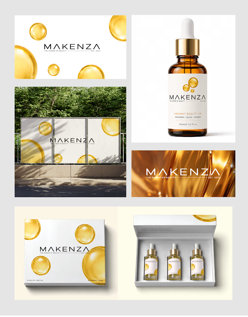
Hey guys, Recently created this logo for my client's cosmetic natural oil brand. I choose a clean and minimal approach. Before sharing with him let me what u guys think.
The network for creativity
Join 1.25M professional creatives like you
Connect with clients, get discovered, and run your business 100% commission-free
Creatives on Contra have earned over $150M and we are just getting started











Related posts




Clean and confident work! The green gradient with the mark feels very modern for fintech - trustworthy but not boring. The app screens look really polished. Curious how you landed on this mark, does it represent growth / movement?

Brand Expressions -- Olivir


Thats so crazy!!!!!! Seeing this I feel we humans are still far better than AI


Approved logo for a mental health and daily habit app built for seafarers and offshore workers.
Can't wait to share more.