The network for creativity
Join 1.25M professional creatives like you
Connect with clients, get discovered, and run your business 100% commission-free
Creatives on Contra have earned over $150M and we are just getting started
Back to feedPost

Most off-the-shelf POS software charges monthly fees, locks you into their hardware, and still doesn't fit your exact workflow.
I build custom POS systems. You own the code. No subscriptions, no vendor lock-in.
Video: https://youtu.be/iWXqQ44Gc94
The Setup: A standard build includes a 3-screen ecosystem (customer kiosk, kitchen display, and waiter app) with instant real-time sync, smart inventory logic, and an admin dashboard. Deployed on Vercel and handed off with a clear written guide.
Pricing: Based on scope. A setup similar to my demo project runs $900–$1,200. Smaller builds cost less, while larger projects are quoted by milestone.
How I Work: Fully async. Requirements, feedback, and approvals are handled entirely in writing. No unnecessary meetings.
The service is listed on my profile. Send over your requirements and I will put together a custom breakdown.


The network for creativity
Join 1.25M professional creatives like you
Connect with clients, get discovered, and run your business 100% commission-free
Creatives on Contra have earned over $150M and we are just getting started





Related posts

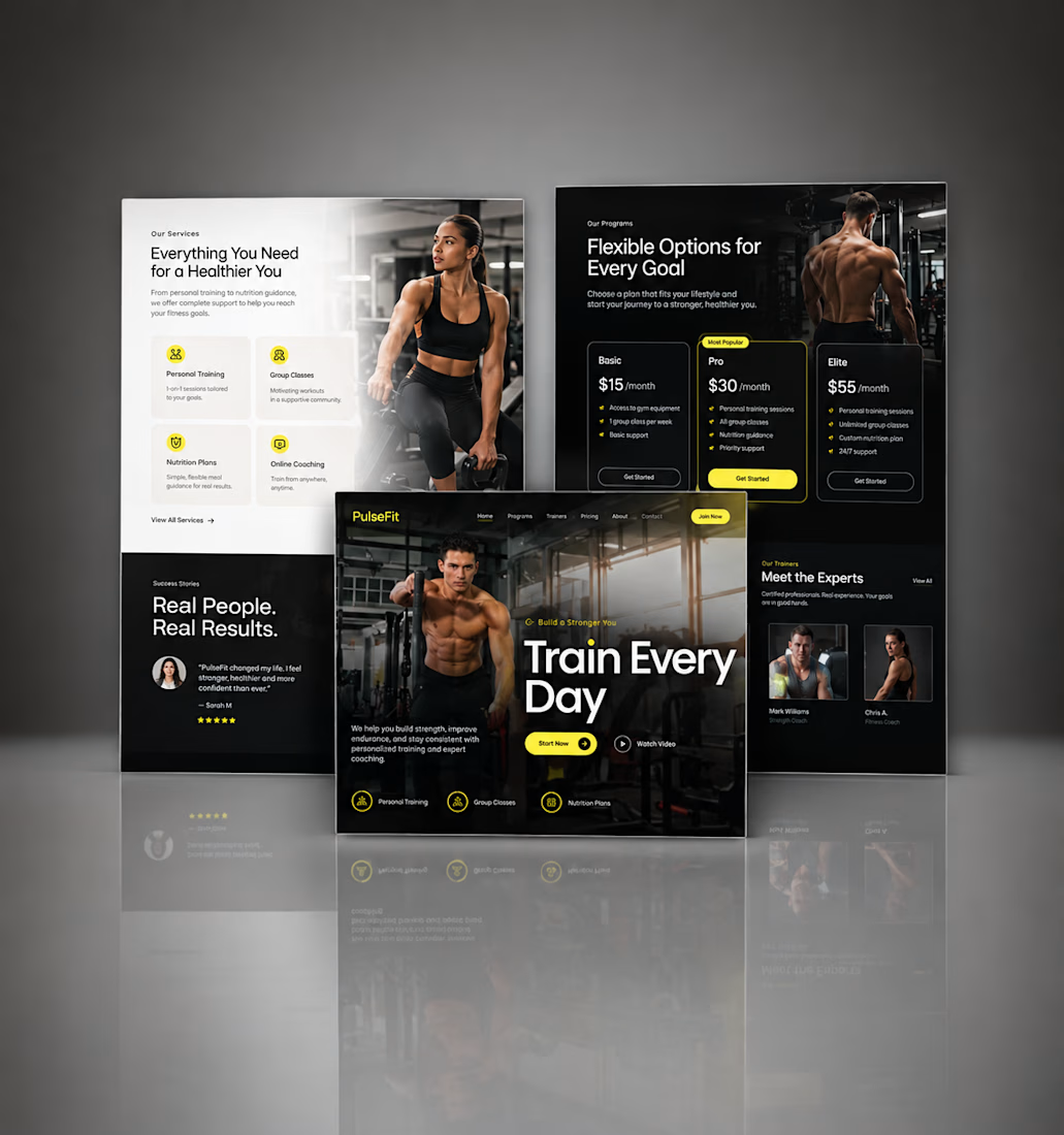
Kajabi Gym & Fitness Landing Page Design
The client needed a focused landing page for their gym and fitness offering that could present the program clearly and encourage visitors to take the next step.
I designed the landing page in Kajabi with a strong visual hierarchy, clear sections for the fitness program, benefits, social proof, and calls to action. The layout was also structured to work smoothly across desktop and mobile.
The result was a clean, focused fitness landing page that makes the offer easier to understand and gives visitors a clear path toward getting started.
#KajabiFitness #KajabiFitnessCoach #KajabiFitnessWebsite #KajabiFitnessLandingPage #FitnessCoachWebsite #FitnessCoachingWebsite #OnlineFitnessCoach #PersonalTrainerWebsite #FitnessLandingPage #GymLandingPage #FitnessProgram #OnlineFitnessProgram #PersonalTraining #WeightLossCoach #FitnessFunnel #FitnessSalesPage #GymWebsite #FitnessWebsiteDesign #FitnessWebDesign




Great work, Hesty. I like how you focused on clear hierarchy, social proof, and strong CTAs instead of just making the page look good. That combination of UX + conversion thinking is what makes a landing page effective.

A small milestone, but one I’m genuinely happy about.
I just earned a new Expert badge on Contra!
It’s a nice reminder of how much I’ve learned through building products, working with clients, joining hackathons, and constantly exploring new ways to build with AI.



What are the steps to get it?

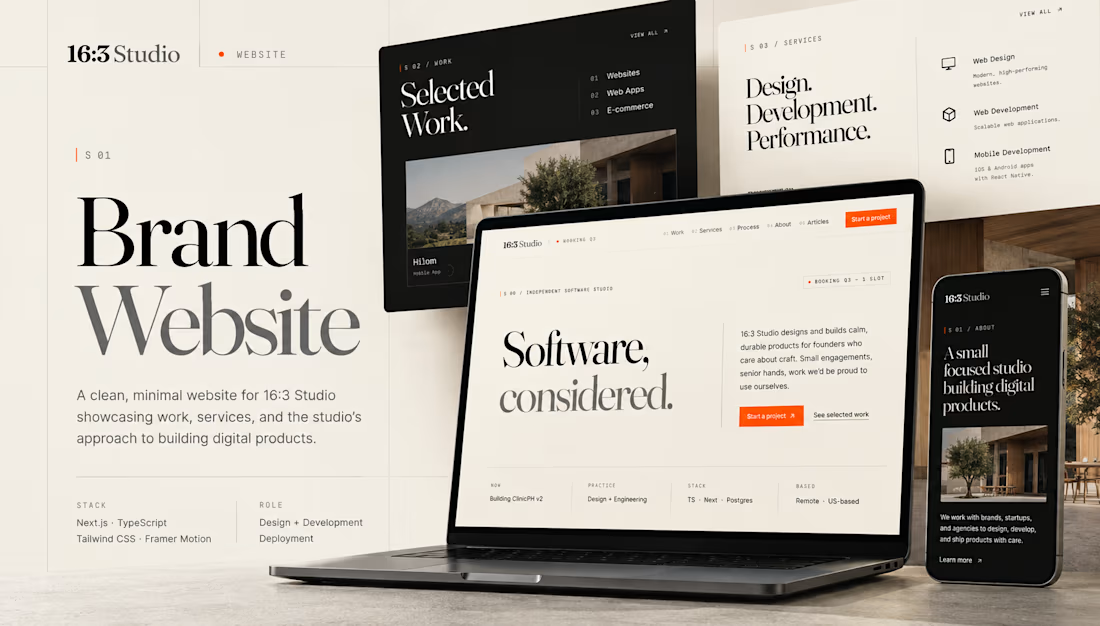
16:3 Studio is my independent software studio website, designed and developed from the ground up to showcase selected work, services, and my approach to building digital products.
The site combines an editorial-inspired visual system with a clean, structured layout, subtle interactions, and responsive design. I focused on creating a distinct studio identity while keeping the experience fast, accessible, and easy to navigate across devices.
Built with Next.js, TypeScript, Tailwind CSS, and Framer Motion, with an emphasis on reusable components, performance, responsive behavior, and polished frontend details.
My role: Design, Frontend Development & Engineering
Stack: Next.js · TypeScript · Tailwind CSS · Framer Motion


The studio site has a clear way to show both the work and how you build it. I like that you kept the motion subtle. Did you have to make any tradeoffs to keep it fast on mobile?