The network for creativity
Join 1.25M professional creatives like you
Connect with clients, get discovered, and run your business 100% commission-free
Creatives on Contra have earned over $150M and we are just getting started
Back to feedPost

Most local business blogs chase the wrong words.
A plumber answering 'why is my water heater leaking from the bottom' gets found by the person about to call today. 'Plumbing services' does not.
I write content around the exact questions a customer types right before they buy.
what do your customers ask you over and over?
The network for creativity
Join 1.25M professional creatives like you
Connect with clients, get discovered, and run your business 100% commission-free
Creatives on Contra have earned over $150M and we are just getting started
Related posts


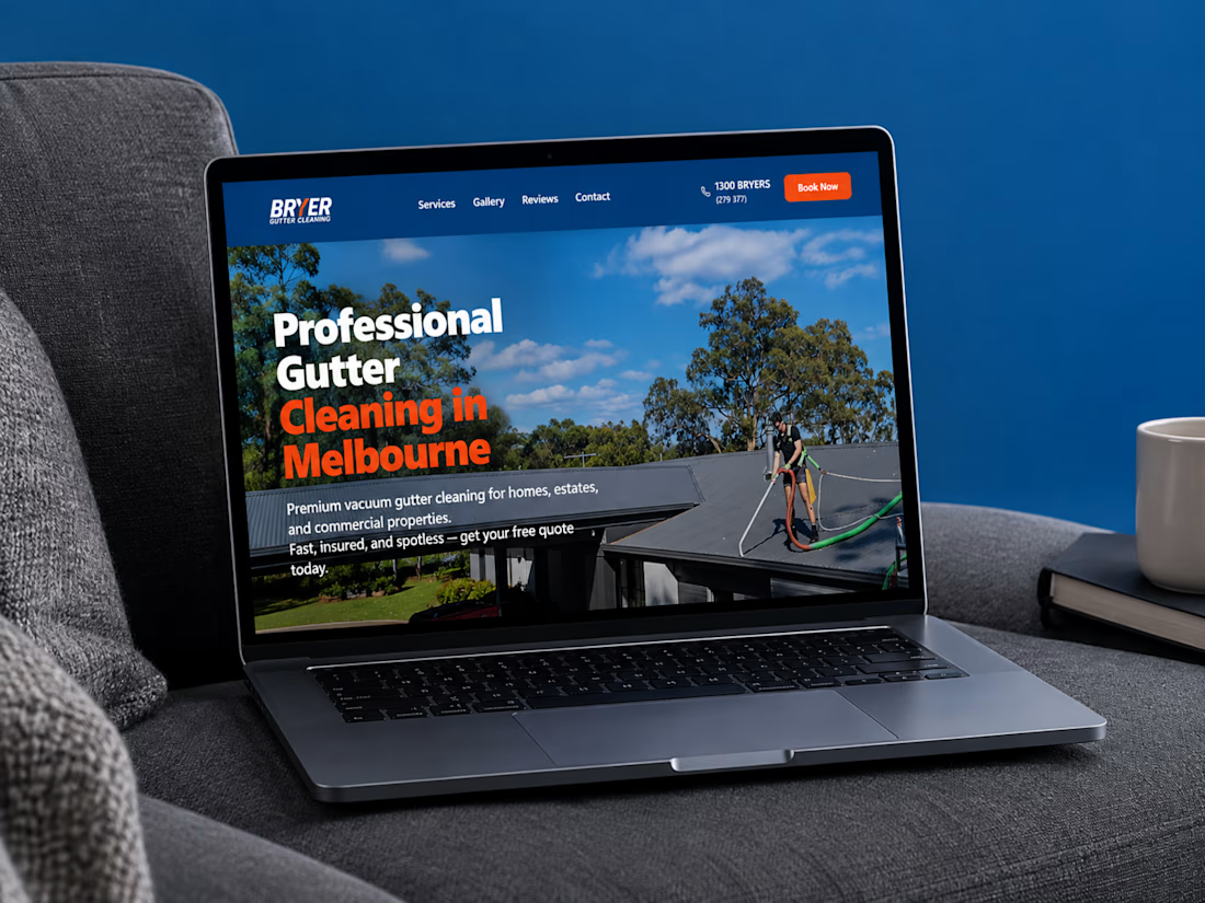
A great website should do more than look good, it should make choosing a business feel easy.
I recently completed a website project for Bryer, a Melbourne-based gutter and solar panel cleaning business.
The goal was to create a clean, professional online presence that communicates their services clearly, builds trust, and makes it easier for potential customers to request a quote.
Now, I’m curious:
When you visit a service-based business website, what matters most to you, the design, the information, or how easy it is to get in touch?
Let’s hear your thoughts! 👇
#WebDesign #Webflow #UXDesign #WebDevelopment #WebsiteDesign #Contra



this is amazing work

Your business doesn’t have a lead problem. It has a follow-up problem.
Form filled Monday. You call back Thursday. They already hired someone else.
The fastest business wins, not the best one.
#SmallBusiness #BusinessGrowth

Leads going cold from slow follow-up is a leak no ad budget can fix. What's your first fix: reply speed or an automated sequence?

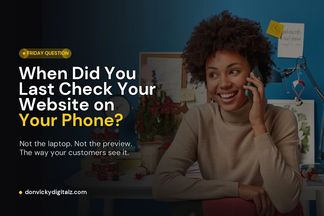
Friday Question: When Did You Last Check Your Website on Your Phone? 📱
Not on your laptop.
Not in the editor preview.
On your actual phone. The way your customers see it.
This week I did exactly that with my own website. And I didn’t love what I saw.
The menu button was plain. The dropdown felt like an afterthought. And the most important button, “Let’s Talk,” was just another line of text in a list.
So I rebuilt it.
✔ A clearer menu button
✔ A proper slide-out menu
✔ A call-to-action you can’t miss
Nothing was “broken.” It just wasn’t helping anyone take the next step.
Here’s a 60-second test you can do right now:
→ Open your website on your phone
→ Tap the menu
→ Try to contact yourself
How many taps did it take? Did anything feel awkward?
Friday question: when did you last check your website on your phone? And what did you notice? 👇