The network for creativity
Join 1.25M professional creatives like you
Connect with clients, get discovered, and run your business 100% commission-free
Creatives on Contra have earned over $150M and we are just getting started
Back to feedPost

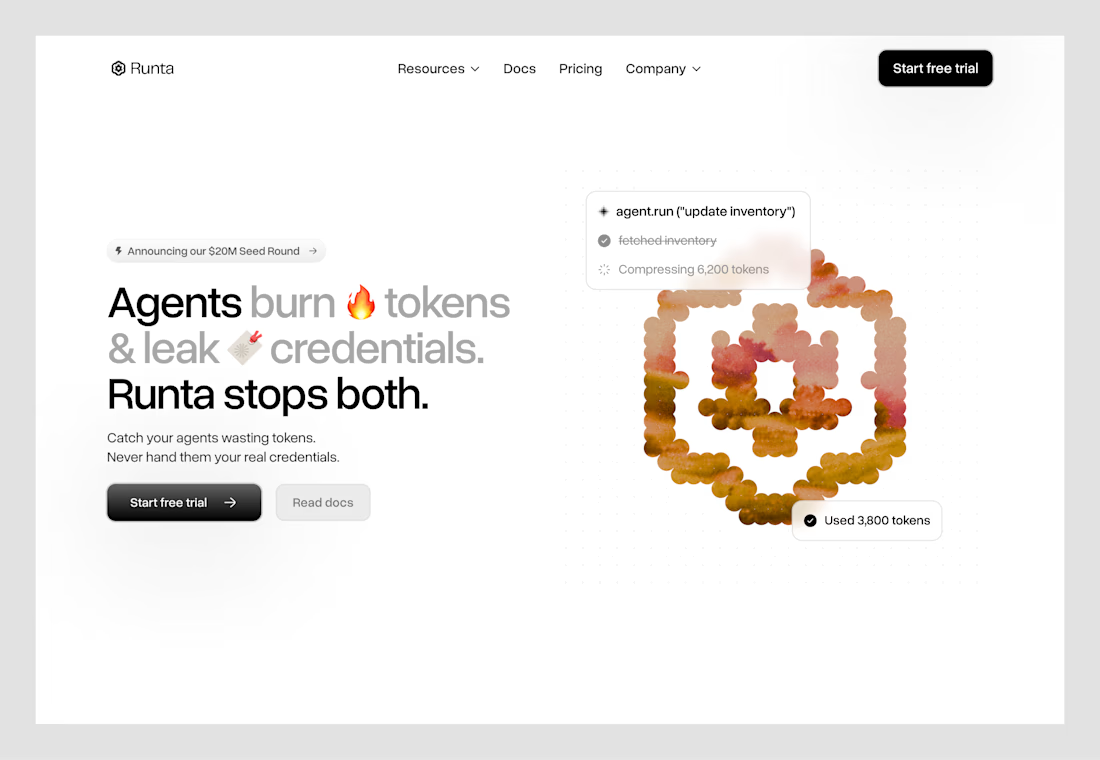
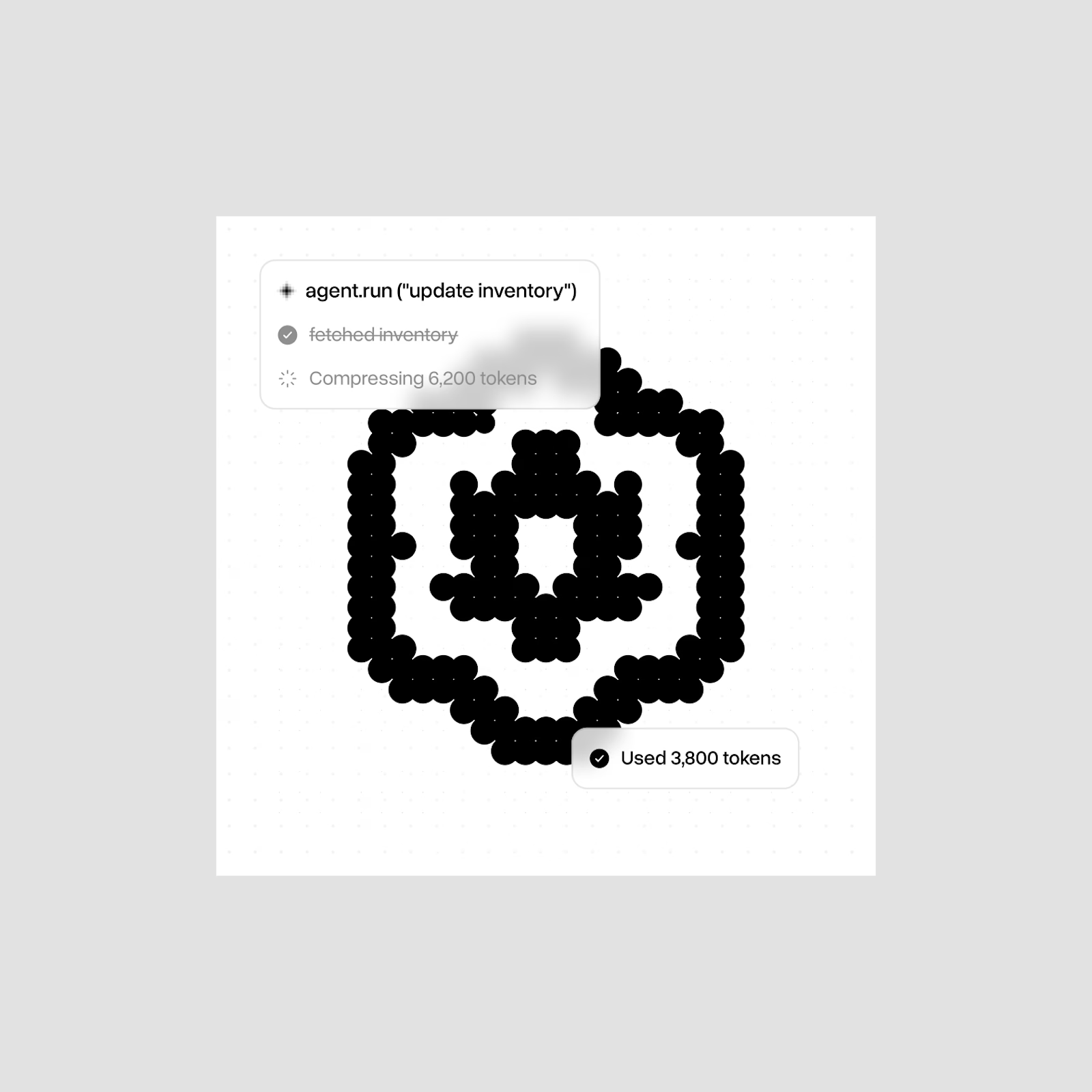
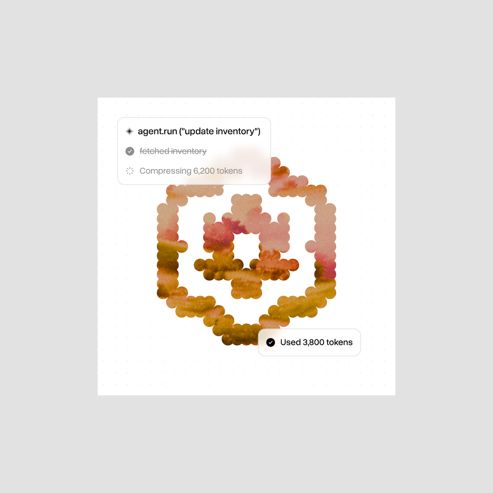
Early hero explorations for a redesign project.


The network for creativity
Join 1.25M professional creatives like you
Connect with clients, get discovered, and run your business 100% commission-free
Creatives on Contra have earned over $150M and we are just getting started









Related posts

A fresh take on Sharpr’s hero section - same product, different first impression.
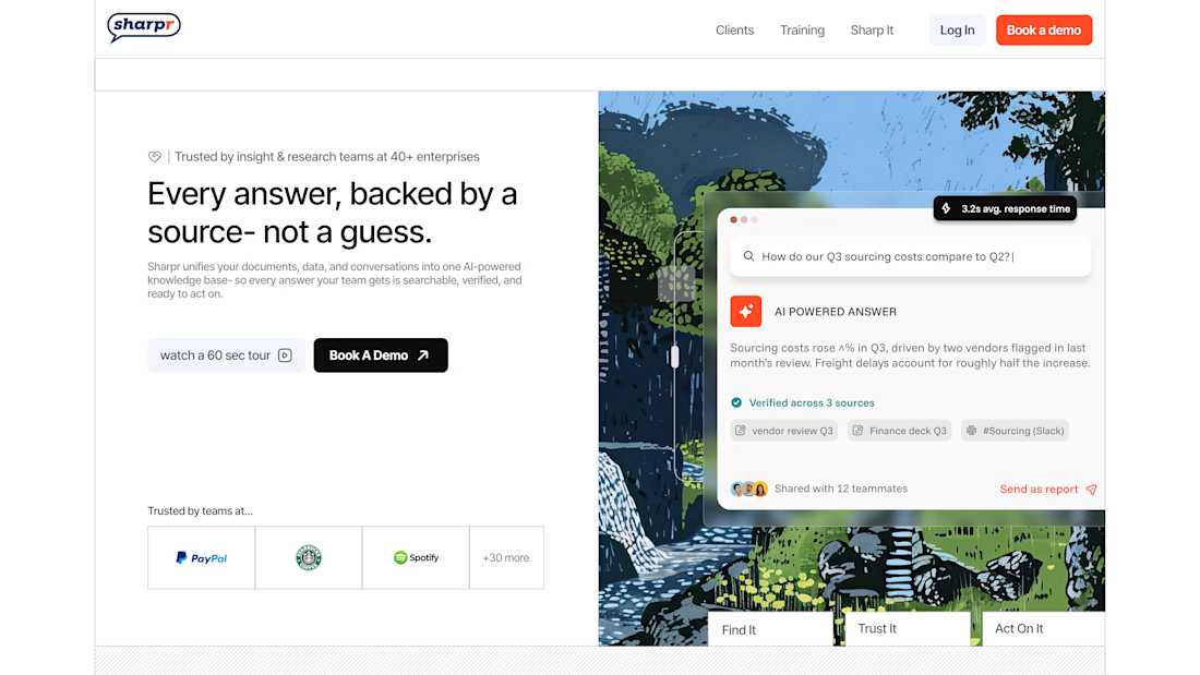


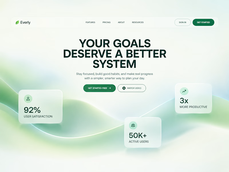
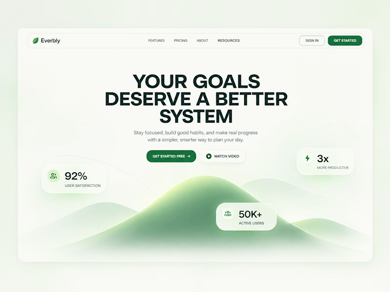
I designed the hero section for this goal-tracking SaaS in two directions:
Same headline, same stats, but the background and card style change the whole mood.
One feels like a deep breath, the other feels like a climb.
Designed in Figma, built in Webflow.
Which direction would you go with? 👇


1 voted
33%
2 voted
67%
3 votes
Closed

Both was so Good. The flowing shapes and soft colours create a refreshing visual experience!
