The network for creativity
Join 1.25M professional creatives like you
Connect with clients, get discovered, and run your business 100% commission-free
Creatives on Contra have earned over $150M and we are just getting started
Back to feedPost

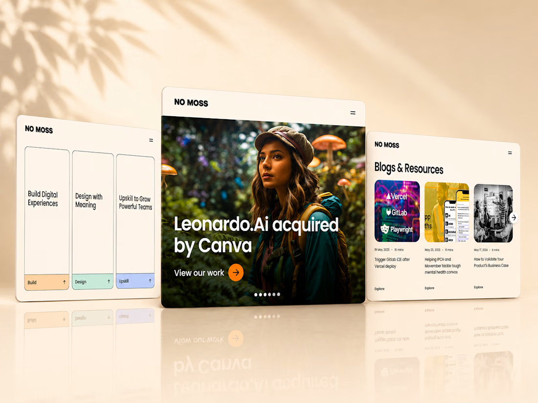
Another quick tip video on how to make your UI cards more engaging with animations in Webflow. Have an amazing weekend all!


Card hover animations are so easy to overdo, but yours look restrained enough to still feel premium. What's your rule of thumb for how much motion is too much on a UI card?
when the animation/visuals overshadows the content, is a good indication that the message will get overlooked and you should tone it down. Its a game of balance, you also need to look how particular animations fit within the whole site and not just in the isolated section/area.
That's a solid rule of thumb, checking it against the whole page instead of just the component in isolation. I'll keep that in mind next time I'm tempted to add one more flourish.
The network for creativity
Join 1.25M professional creatives like you
Connect with clients, get discovered, and run your business 100% commission-free
Creatives on Contra have earned over $150M and we are just getting started
Related posts

41 voted
79%
11 voted
21%
52 votes
Closed

Butterfly mood looks incredibly immersive and lively!🔥






Very professional!


A professional accounting website should inspire confidence from the very first visit. This Accounting Firm Webflow Website was designed to help financial professionals showcase their expertise, simplify client interactions, and generate high-quality leads through a modern, trustworthy digital experience.
One of the biggest challenges was presenting multiple financial services, tax solutions, and business advisory offerings without making the website feel complex. I solved this by creating a clean information hierarchy, intuitive navigation, and strategically placed call-to-action sections that guide visitors toward booking consultations or requesting financial services.
Built as a Webflow Expert, Webflow Designer, and Webflow Developer project, the website features responsive design, CMS-powered content, smooth animations, and optimized performance across all devices. I also utilized Finsweet Attributes, GSAP, Relume, and LottieFiles to deliver a scalable, interactive, and polished user experience.
The result is a fast, secure, and conversion-focused Webflow website that strengthens credibility, builds client trust, and helps accounting firms grow their business online.









Trending

Claude
Claude has entered the design space. How are you using Claude Design?

Contra University
Learn from expert creatives how to earn more using next-gen AI tools.
creativeaiflow
Creative AI workflows are evolving. What tools do you use, and what are their strengths and weaknesses?
freelancerlife
Freelancer life is wins, pivots, and everything in between. What’s yours right now?