The network for creativity
Join 1.25M professional creatives like you
Connect with clients, get discovered, and run your business 100% commission-free
Creatives on Contra have earned over $150M and we are just getting started
Back to feedPost

Overview
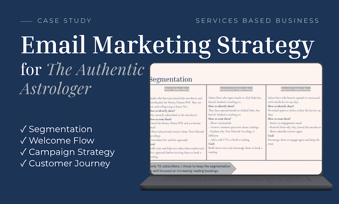
This project was completed as part of a supervised client program for The Authentic Astrologer, a service-based business offering astrology readings. The objective was to improve email marketing strategy and increase reading bookings through audience segmentation and customer journey planning.
My Approach
I analyzed the existing email marketing efforts and developed a strategy focused on:
• Audience segmentation based on subscriber engagement
• Welcome email flow recommendations
• Campaign strategy to encourage reading bookings
• Customer journey planning to nurture subscribers
Deliverables
✓ Email segmentation strategy
✓ Welcome flow recommendations
✓ Campaign planning
✓ Customer journey mapping
✓ Strategic recommendations
Tools
Canva • Google Slides • Google Docs


The network for creativity
Join 1.25M professional creatives like you
Connect with clients, get discovered, and run your business 100% commission-free
Creatives on Contra have earned over $150M and we are just getting started

Challenges
View all


Related posts

Same email. Same list. 2 subject lines. 21 points of difference
1st version said what the email was about. 2nd made the reader feel they were already missing something. Same content inside. Completely different result.
Save this and check your last 5 subject lines. How many described the email instead of leaving a gap?
https://www.instagram.com/p/DdGqhmhidt3
#emailmarketing #subjectlines #openrate #emailcopy #evertherstudio

Just wrapped up this clean and professional hiring announcement flyer for KEMETIC SERVICES LLC.
The brief was simple make it bold, corporate, and easy to convert applicants. I focused on strong typography hierarchy, brand colors, and a layout that communicates trust at first glance.
This is the kind of design that doesn't just look good, it gets results.
Need a flyer, social media design or brand visual that actually converts for your business? Let's create something powerful for your brand.
CALL TO ACTION:
DM me "DESIGN" to get started on your project. Available for new clients worldwide.


Clean design. The strong typography makes the hiring message easy to notice.

TEND — Skincare Brand Identity & Advertising
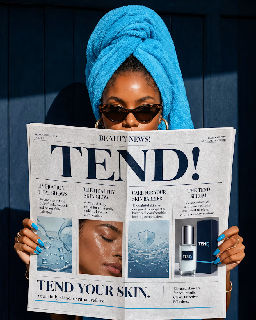
TEND is a conceptual skincare brand built around the idea that healthy skin begins with intentional care. The identity combines understated elegance with a fresh, contemporary visual language to create a brand that feels refined, trustworthy and effortlessly premium.
From the Visual language to the advertising direction, every element was developed to give TEND a distinctive presence in the modern skincare market - where simplicity, confidence and care become part of the brand experience.

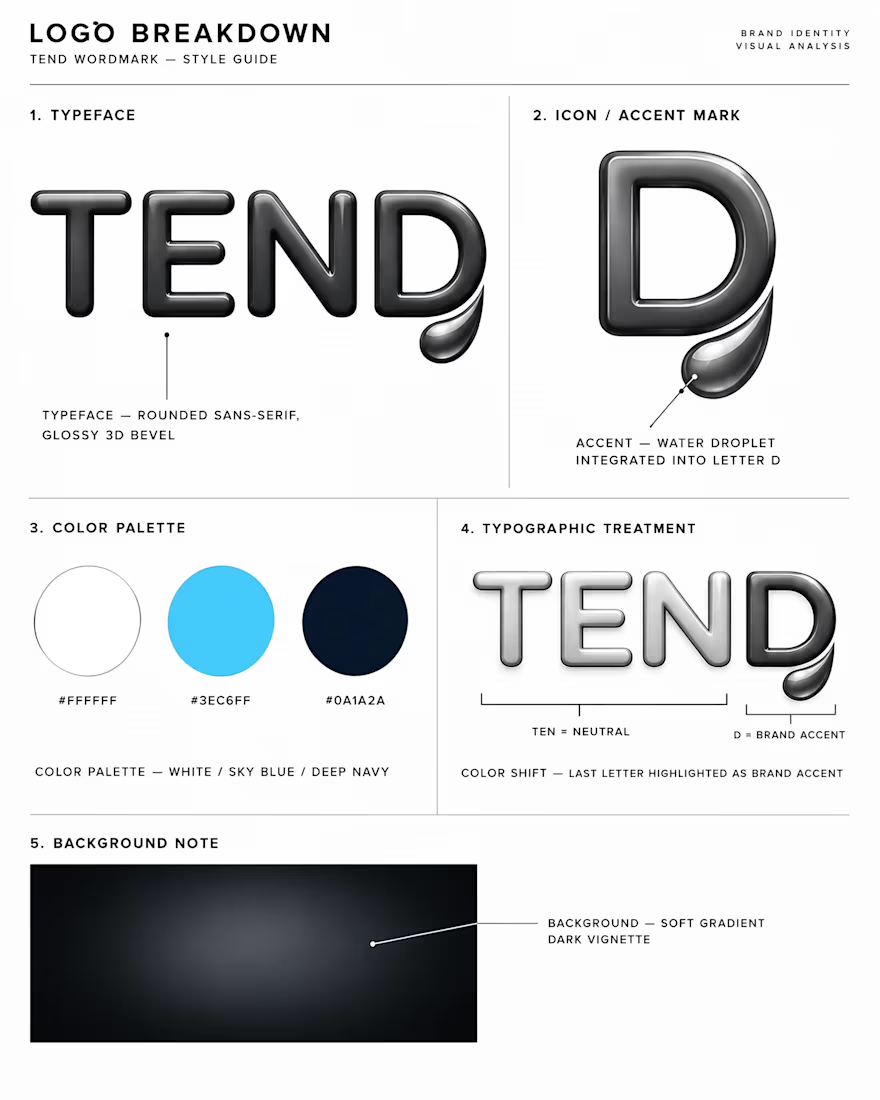

The lit, dimensional wordmark is an unusual call for skincare — that shelf mostly goes flat and matte, so this reads closer to tech than beauty. Curious how the glow holds up once it has to be embossed or foiled on an actual tube.