The network for creativity
Join 1.25M professional creatives like you
Connect with clients, get discovered, and run your business 100% commission-free
Creatives on Contra have earned over $150M and we are just getting started
Back to feedPost

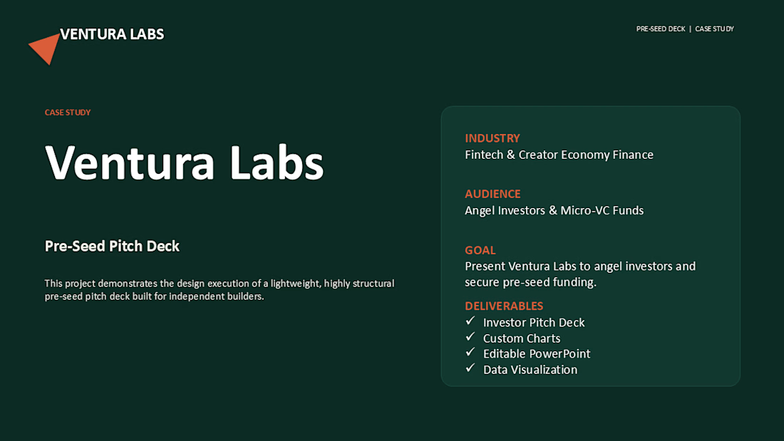
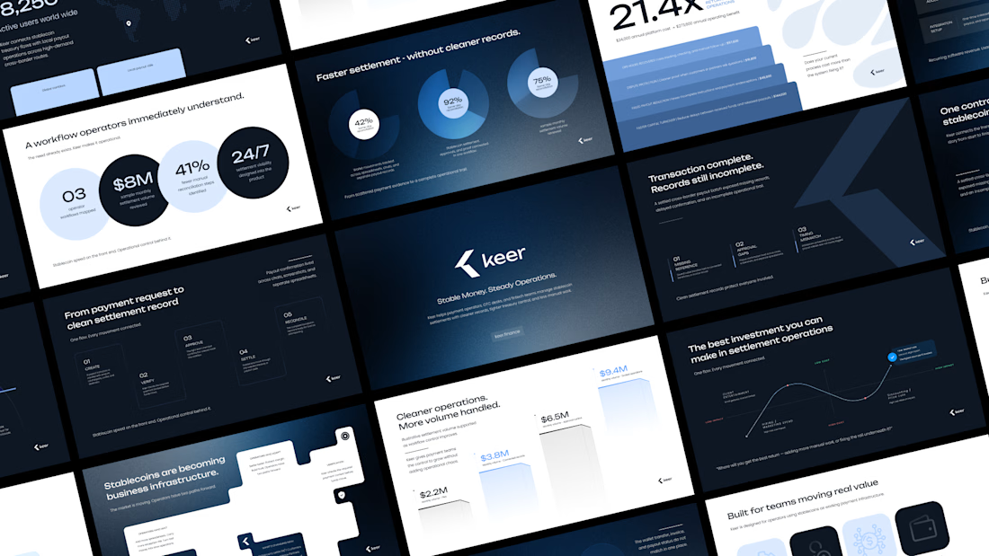
This slide isn't about making things prettier.
It's about reducing the work investors have to do.
Most startup pitch decks don't fail because of the design.
They fail because investors have to work too hard to understand the business.
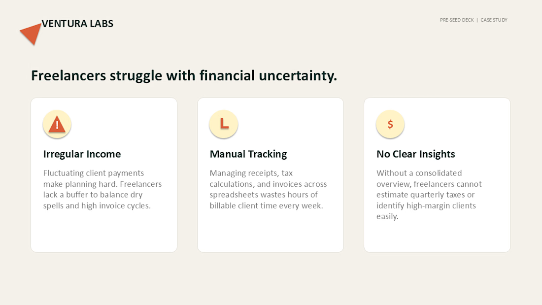
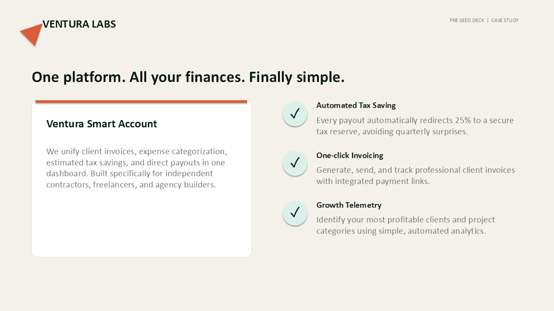
For this concept project, I focused on reducing cognitive load through a clear narrative:
• Define the problem.
• Present one clear solution.
• Use clean layouts instead of decorative visuals.
• Keep every slide focused on a single message.
Designed entirely in Microsoft PowerPoint.
Feedback is always welcome.
The network for creativity
Join 1.25M professional creatives like you
Connect with clients, get discovered, and run your business 100% commission-free
Creatives on Contra have earned over $150M and we are just getting started





Related posts

Minimalism isn't a style choice. It's a discipline.
Anyone can strip a slide down to one line and call it clean. The harder part is knowing what to keep, and why every element that stays has a reason to be there.
This deck runs on that principle. Dark base because contrast is the fastest way to direct attention. One accent color because more than one is a decision you haven't made yet. Grid-locked layouts because when the structure holds, the content doesn't have to fight for space.
I design across industries. Tech, finance, healthcare, consumer brands. But there's something about high-stakes products, the ones where a single presentation can move serious money, that pushes the design thinking further.
This is one of those.
I didn't design this to look like a fintech deck. I designed it to look like a decision has already been made, and the slides are just showing you why.
Does the vibe land for you?
Full case study Keer





minimalism is a discipline,, 100% agree

Most hardware founders pitch their premium products on a standard white background.
They assume clean design always means bright design.
But for a high-ticket physical product, a white canvas actively cheapens your perceived value.
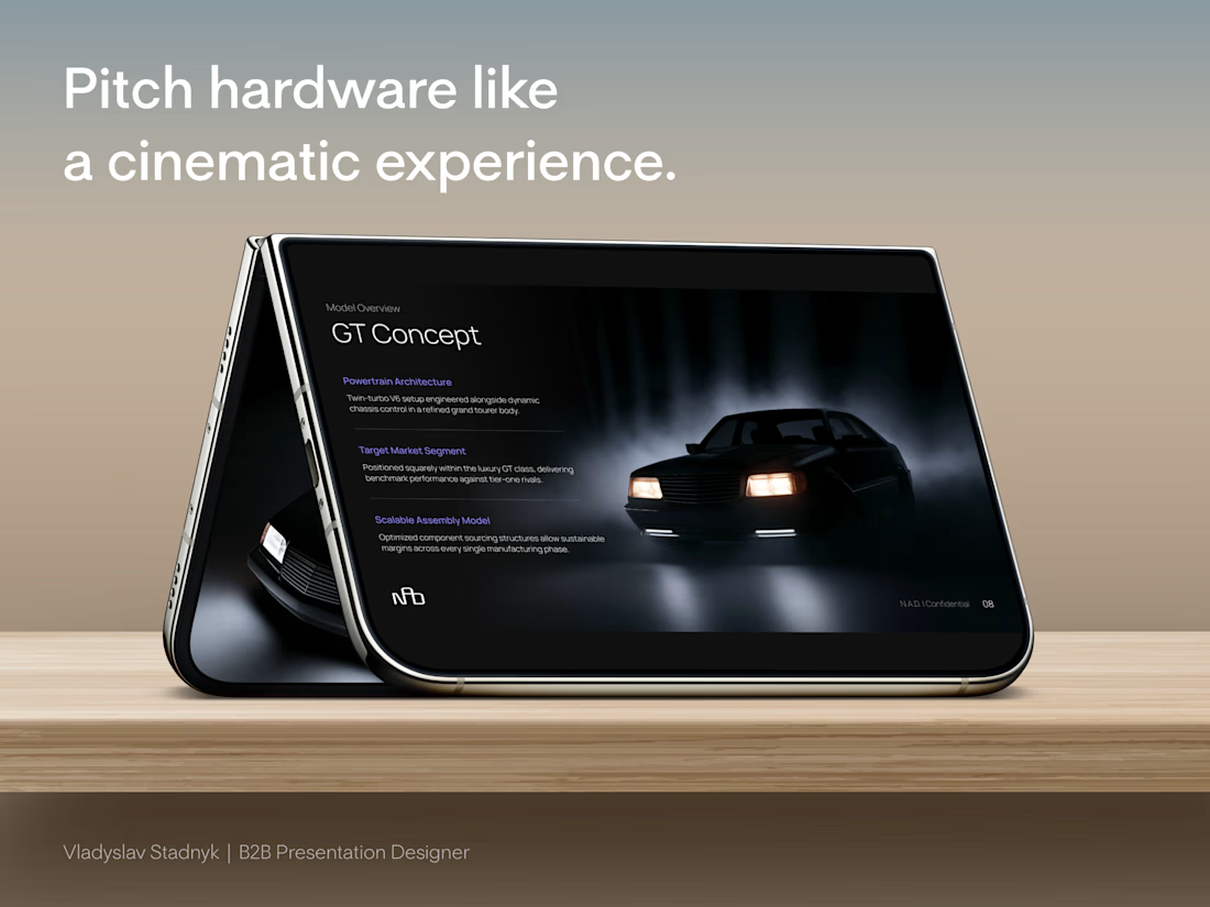
I recently designed the investor pitch deck for a European automotive startup building something completely contrarian. A lightweight, purely analog mechanical car for driving enthusiasts. No complex touchscreens. No heavy electronics. Just raw, purposeful engineering.
To raise capital from European investors, we abandoned the standard corporate aesthetic.
We built all 22 slides in a deep, cinematic dark mode.
This is why the dark aesthetic works perfectly for high-value hardware:
📍 The Spotlight Effect
A dark canvas swallows visual noise. It acts like a spotlight in an empty room, forcing the investor's eye directly onto the curves of the car and your specific manufacturing metrics.
📍 Subconscious Exclusivity
Premium brands rarely use blinding white in their showrooms. Darker tones instantly signal a high-end, exclusive experience before you even speak.
📍 Contrast Power
When we mapped out the detailed cost breakdown, the bright accent numbers against the dark background made the unit economics impossible to ignore.
Your presentation design is not just a container for your business plan. It is the first real test of your brand positioning.
Open your current deck. Does your visual aesthetic actually justify the valuation you are asking for?



Dark-mode pitch decks for hardware hit different — white slides make premium physical products feel like Amazon listings. Background tone is part of the valuation story.

Bunzilla Burger Pitch Deck — A bold, urban investor presentation designed to showcase Bunzilla’s brand story, signature burgers, market potential, and growth vision.