The network for creativity
Join 1.25M professional creatives like you
Connect with clients, get discovered, and run your business 100% commission-free
Creatives on Contra have earned over $150M and we are just getting started
Back to feedPost

Honestly, I feel my day would improve if this little guy lived on my phone dashboard.

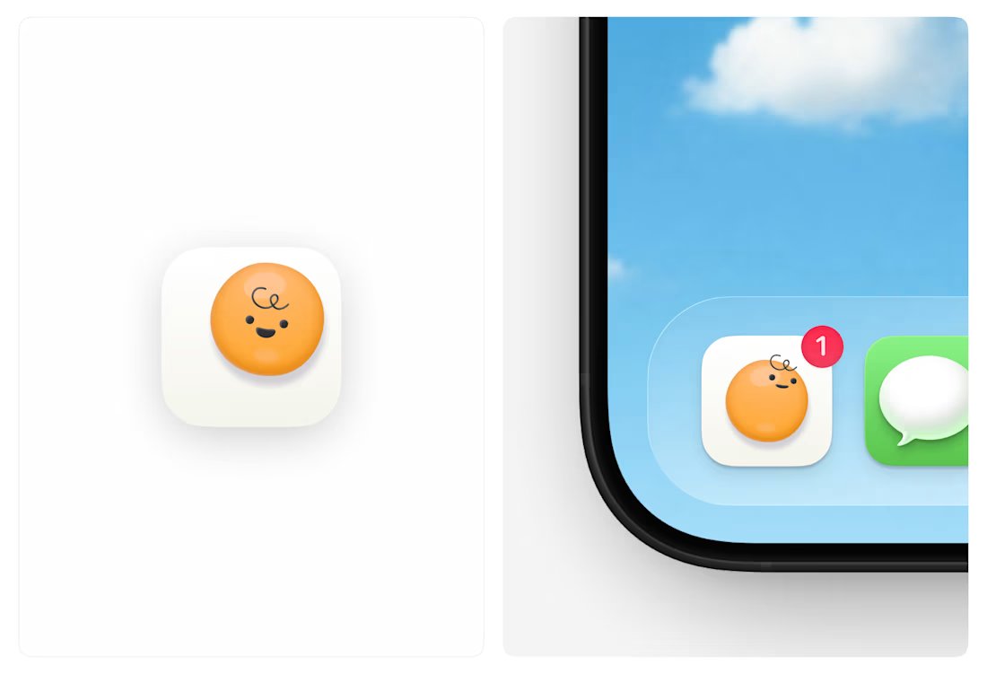

How can you be sad with this little one keeping you company? lol
The network for creativity
Join 1.25M professional creatives like you
Connect with clients, get discovered, and run your business 100% commission-free
Creatives on Contra have earned over $150M and we are just getting started





Related posts

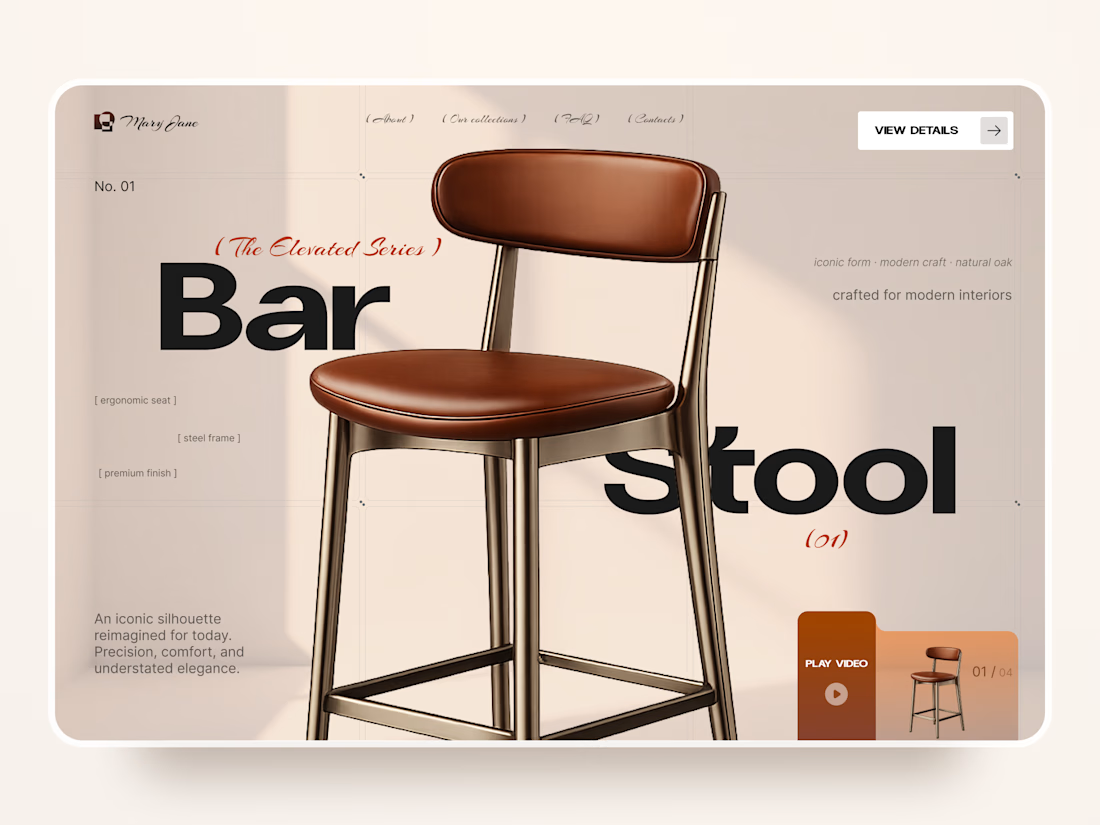
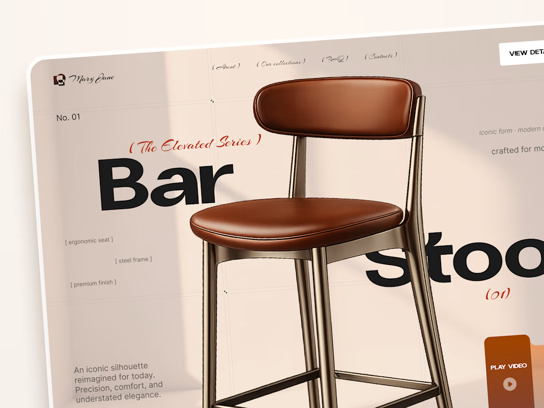
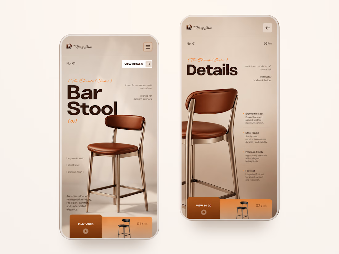
Mary Jane — Bar Stool Product Landing Page 🪑✨
A refined product landing page concept for a modern furniture brand, built around one statement piece
The design combines warm neutral tones, oversized typography, and editorial layouts to give the bar stool a premium, design-focused feel
Special attention was given to:
• Product-first composition
• Clean editorial typography
• Warm premium aesthetic
• Product details and features
• Video and 3D presentation
• Responsive mobile layout
The result is a simple, elegant experience that keeps the product at the center while giving the brand a distinctive visual character 🤎



Nice work

An old client project: a full redesign of a crypto app.
Created the video with Opus 5.5

Top-notch design.


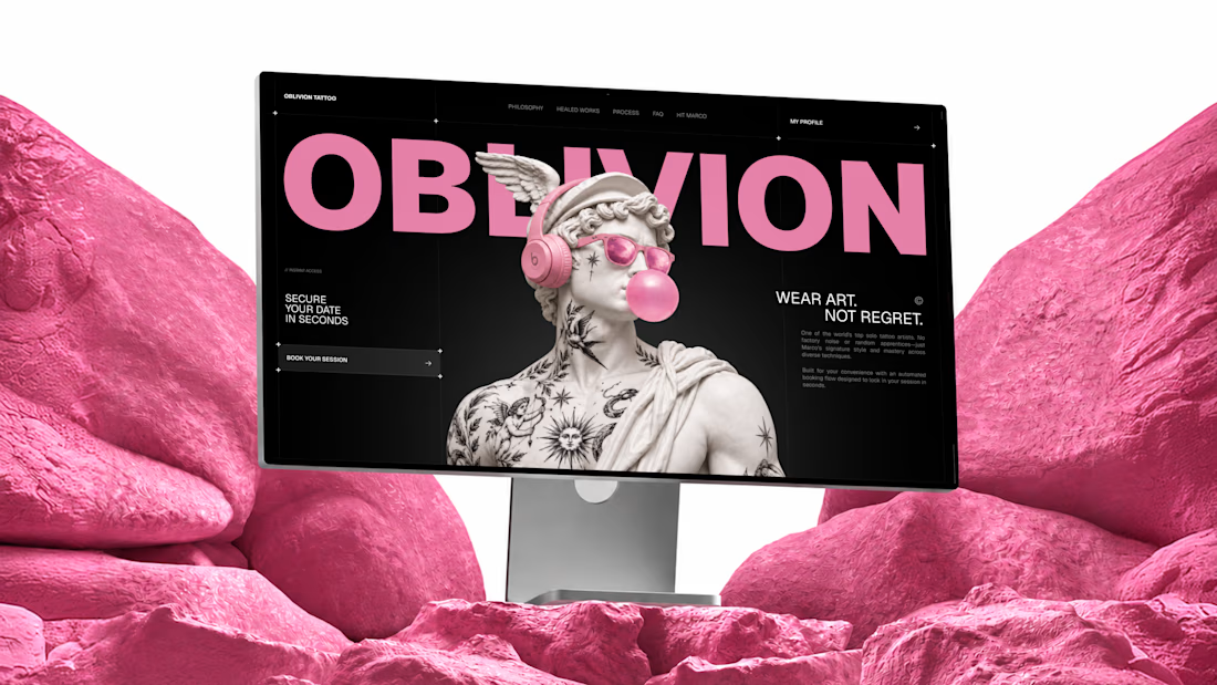
I built OBLIVION Tattoo service for the @Lovable #lovablechallenge
OBLIVION is a private tattoo studio in Kraków, Poland, run by one artist.
As a solo artist, Marco handles every inquiry, reference, estimate, booking, and schedule change himself.
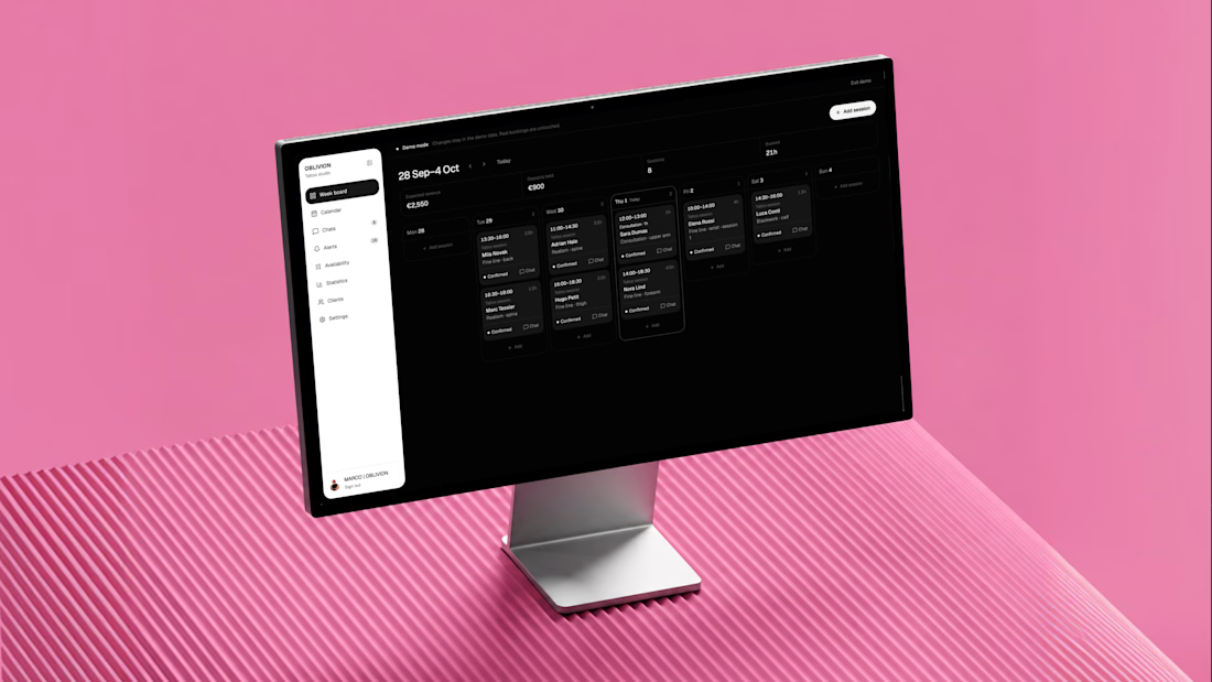
OBLIVION turns complex tattoo inquiries into confirmed appointments by collecting the full client brief, estimating the work, finding real availability, and keeping the entire booking in one connected artist workspace.
One system, three jobs:
1) Attract — custom animated landing page
https://oblivion-tattoo.lovable.app/
2) Book — guided tattoo booking flow
https://oblivion-tattoo.lovable.app/booking
3) Manage — demo artist admin panel
https://oblivion-tattoo.lovable.app/demo
*The public demo admin resets after refresh. The real admin is private, fully persistent, and connected to live bookings, clients, chats, availability, and studio data.
A smoother booking experience for the client, and far less manual work for the artist.